Jaarboek voor Nederlandse Boekgeschiedenis. Jaargang 19
(2012)– [tijdschrift] Jaarboek voor Nederlandse Boekgeschiedenis–
[pagina 147]
| |
Bharain Mac an Bhreithiún
| |
[pagina 148]
| |
opened up a wider space for intellectual discussion and its consequential entanglement in the notions of democratisation and institutional ideology will be addressed. | |
The paperback and the public sphereThe notion of the advent of the mass-market paperback, or poche, bringing about a wider participation in French intellectual life, invites us to consider the concept of the public sphere, that space in which public discussion and reflection takes place and in which public opinion is fermented. Jürgen Habermas defines the public sphere in terms of its role in a bourgeois society: The bourgeois public sphere may be conceived above all as the sphere of private people come together as a public; they soon claimed the public sphere regulated from above against the public authorities themselves, to engage them in a debate over the general rules governing relations in the basically privatized but publicly relevant sphere of commodity exchange and social labour.Ga naar voetnoot3 Defined by Gerhard Hauser as ‘a discursive space in which individuals and groups congregate to discuss matters of mutual interest and, where possible, to reach a common judgment’,Ga naar voetnoot4 the public sphere is closely related to the notion of the informed readership, who through participation in the life of the intelligentsia, are able to contribute to the formation of public opinion. Habermas defines the public sphere, or Öffentlichkeit, in both spatial and cultural terms, pointing to the salon, the café and the press as examples of the public sphere in action. He traced the idea of the public sphere to the ancient Greek agora, or market place, drawing a distinction between private and public realms in the lives of the citizenry and underlining the role of discussion, or lexis, as the sphere within which the public was constituted.Ga naar voetnoot5 The space of discussion to which both Habermas and Hauser refer, occurs both in a range of physical spaces, including the café and the salon, but also in the pages of newspapers. It would seem reasonable to extend this to the Livre de poche. Describing the role of the printed press in the public sphere, Thierry Paquot states that Les capitales possèdent une presse variée et de nombreuses villes (...) affichent fièrement leurs journaux. Cette circulation des idées relève de ce que le philosophe allemand appelle ‘espace public’ (...) L'espace public correspond à la publicité d'une conviction privée qui vient alimenter le débat collectif et participer à l'élaboration d'une opinion publique.Ga naar voetnoot6 | |
[pagina 149]
| |
This notion of publication, the making public of private convictions, is central to the work of French publishers responding to the lifting of wartime censorship after the Liberation. In the euphoria of the immediate post-war years, in a climate of ‘liberté retrouvée’, many new newspapers sprang up, with as many as 28 national and 175 regional papers operating in 1946.Ga naar voetnoot7 While the throwing off of wartime shackles did not have as great an impact on book publishing, the sense of intellectual reengagement with a free press is clear to see. Indeed, since the 1890s when a Manifesto of the Intellectuals had been signed by dozens of artists, writers and professors calling for a revision of Dreyfus' trial,Ga naar voetnoot8 intellectual life in France had depended on an engagement with the public sphere. Without such an engagement, the intellectual as a concept would be quite meaningless. The intellectual in France provided ‘not merely assistance to the cause of justice or support for the defenders of the Republic but a vision of society, of the ways in which the inadequate present might be rendered into a better future’.Ga naar voetnoot9 The publication of books played a significant role in spreading the ideas of the French intellectual, in providing them with the means to reach a public and to thereby affect public opinion. The notion of the democratisation of the book that gained currency after the Second World War was, in this regard, vitally important in extending the reach of the intellectual to a wider readership. In this context, the initiative of the publishing houses in launching a more affordable and easily distributed format in the form of the Livre de poche, not to mention the activities of the various ‘Clubs du livre’, represents an attempt at widening participation in the public sphere. These ‘Clubs du livre’ changed the way in which many French people bought books and encouraged a culture of home display through attractive graphic design that cleverly combined text and image. They showcased the work of talented designers such as Robert Massin and Pierre Faucheux, thereby acting as a precedent for the design policies enacted by the publishing houses responsible for the later paperback formats. In the case of the Livre de poche, a certain desacralisation of the book as an object was envisaged as part of the democratisation project. ‘L'éditeur la présente comme un instrument de démocratisation de la lecture, grace à son bas prix et à son réseau de distribution hors des librairies traditionnelles’.Ga naar voetnoot10 Part of the task of the books' design would be the communication of the publisher's perception of these books as throwaway items. The Livre de poche could be read and then passed from one reader to another, thereby increasing public participation in reading. The challenge of communicating the institutional policy of the publishing houses with regard to the democratization of reading was only part of the task facing graphic designers. The establishment of new formats and ways of reading, that included a mission to extend and engage with the public sphere, was a complex design problem that produced a range of innovative solutions, providing the French book with a specific visual form that has endured into the twenty-first century. | |
[pagina 150]
| |
Graphic design and the public sphereOne of the themes that arise in studying the visual form of the French Livre de poche from 1950 is its engagement with public urban space. The work of the designer Pierre Faucheux, in particular, represents a deep concern for the design of buildings and public spaces, a priority that Faucheux manages to transfer from the three dimensional space of the city to the flat spaces of the designed book, thereby producing ideological messages about the role of the book in the public sphere. This crossover between the book and the city was informed by the designer's architectural background and by the various spatial design projects he had undertaken, including some that directly involved the role of the book in urban space, including the renovation and visual reorganization of the façade of the bookstore La Hune, on Paris' Boulevard St. Germain (fig. 1). 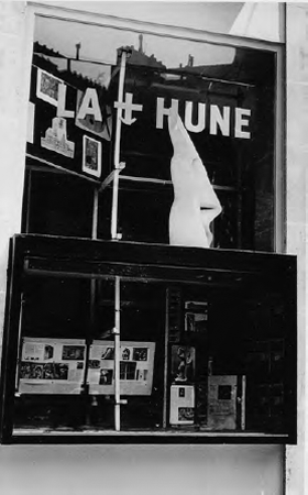 Figure 1: Pierre Faucheux, façade renovation of La Hune bookstore in Paris, 1949
In Faucheux's own words: ‘trois themes ont orchestré ma vie, la typographie, l'architecture et l'urbanisme’.Ga naar voetnoot11 A meeting with Le Corbusier in 1947 had encouraged him to apply the Swiss architect's Modulor system to both the design of the building and that of the book. | |
[pagina 151]
| |
J'ai voulu créer, pour l'utiliser chaque jour, l'écriture de l'architecture et de l'urbanisme, l'écriture des espaces construits, et developer une combinatoire illimitée mots/volumes, phrases/batîments. On peut rapprocher la conception d'un cahier de huit pages dans un livre de celle d'un étage d'immeuble; la création d'une couverture de livre avec la disposition en perspective des batîments d'une ville, c'est une affaire de repartition dans l'espace.Ga naar voetnoot12 Faucheux's work for the book clubs and the Livre de poche demonstrates a blurring of the notions of public sphere and public space, with the city taking on a typographic quality and the book assuming the characteristics of buildings in the urban environment. Surely here we have an example of graphic design's ability to produce ideological messages about the role of the book in the public sphere, as it took on the appearance of public space itself? It is this coding of the small format book with messages pertaining to its role and to the ideology behind the various series issued by different publishing houses that we will now turn our attention.
The increased attention paid to graphic design by publishers from the 1950s onwards, especially in terms of the book cover design, brought the book increasingly into a culture of display that made its presence in the city ever more noticeable. It was not only in the windows of traditional bookshops that the new format editions found a place in the metropolis, however. The small format book was given new channels of distribution that confirmed its presence within a range of sales outlets, including railway stations and the kiosks operated by the publishing house Hachette.Ga naar voetnoot13 The Livre de poche was thereby given a new visibility in the city as it came to occupy an increasingly prominent position in the public space. I would contend that this visual presence represented a contribution by graphic designers to the creation of new spaces for discussion and to the extension of the public sphere. In the increasing prominence of its display and in its eminent portability, the Livre de poche became a familiar feature of city life and of the French urban experience, a position alluded to by the adoption of urban motifs and design approaches from architecture and urban planning in the construction of its covers. | |
The prehistory of the Livre de pochePrior to the launch of the Livre de poche in 1953, French publishing had been experimenting with a new initiative in which the design of book jackets was given a high priority. The various book clubs that operated during the 1950s and 1960s in France provided a testing ground for the development of an institutional design approach on the part of the publishing industry, allowing a range of talented designers to develop their skills in the genre. Both in terms of the marriage of text and image within individual works and the elaboration of visual identities for the various operators in the field, | |
[pagina 152]
| |
graphic design became central to the clubs' strategic approach. The books' appearance was central to the appeal of the clubs, whose target market consisted of ‘une clientèle de jeunes cadres désireuse de se constituer une bibliothèque’,Ga naar voetnoot14 the sort of young professionals who appreciated the book as an object of social prestige to be displayed in the home. The way in which the clubs offered their product to this new market defined the type of design produced, to a certain extent. The ‘Club français du livre’, founded by Jean-Paul Lhopital and Stéphane Aubry in 1947 and the ‘Club du meilleur livre’, founded in 1952, were typical in that they obliged their members to buy a certain number of books per year. They offered competitive prices but, more importantly, a much higher standard in the quality of the materials used, at a time when the standard of the offering in French bookshops was low, both in terms of design and assembly. Pierre Faucheux, one of the principal designers commissioned by the ‘Club français du livre’ explains how the book clubs' means of distribution effected an increase in design standards: Le système de diffusion du Club représentait pour la création une perspective nouvelle: les gens n'allaient pas choisir les livres en librairie et ils avaient l'obligation d'en acheter quatre par an: cela nous offrait la latitude d'éviter les poncifs.Ga naar voetnoot15 It was, therefore, the obligation to buy that allowed the graphic designer to take certain risks and to innovate with the format, thereby avoiding the tired clichés of book design. Another of the characteristics of these books was the way in which specific designs were created for every individual edition, fusing content and appearance, in terms of text and image, in a completely integrated design approach. ‘Le choix de la typographie, du format, des illustrations, de la couverture est spécifique à chaque livre et pensé comme un tout’.Ga naar voetnoot16 Faucheux's design for the ‘Club français du livre’ exemplifies this approach, which all the book clubs shared, while, at the same time, showcasing this individual designer's very personal vision of book design. As previously mentioned, Pierre Faucheux is a designer who approached the book as an architect takes on the space of the city. His architect's eye allowed him to produce book designs that took on the qualities of buildings, with the cover constructed as an architectural façade. These covers were built up around what he called ‘an intransigent set of typefaces’ that formed the foundations, with the layout letting the light in.Ga naar voetnoot17 Sometimes the book jacket would be transformed into a cityscape, as is the case with his design for John Dos Passos' 42e parallèle (‘Club français du livre’, 1949), (fig. 2), which saturates the entire cover, both front and back with an image of Manhattan's towers, the spine marked by a simple oblong carrying the book's title. At other times the cover became a theatrical stage set with the surprising variations of scale characteristic of a surreal mise-en-scène. For Faucheux the cover was to be cre- | |
[pagina 153]
| |
ated within the margins of ‘a black or white mask. The mask is like a window which forms an isolating border between the developing design and its surroundings, transforming this window into a theatre stage’.Ga naar voetnoot18 His Maldoror (1949) and Ubu roi (1950) both display a penchant for architectural block type that expands to dominate the entire field of the page. Robert Massin, Faucheux's assistant and one of the designers who would take their lead from his example, commented that ‘avec le Club français du livre, on a voulu introduire dans le livre courant, objet statique, les méthodes dynamiques du cinéma, de sorte qu'en tournant les pages il se passe quelque chose’.Ga naar voetnoot19 The space of the page was taking on the qualities of the stage and screen, and in so doing, the book was beginning to imitate other media whose engagement with the public sphere involved a spatial and architectural dimension.  Figure 2: Pierre Faucheux. Cover for J. Dos Passos, 42e parallèle. Paris, Club Français du Livre, 1949
The book clubs did not make a huge commercial impact; the average print run for a book published by the ‘Club français du livre’ was only 3000 copies. The importance of the book clubs lies in the precedent they set in terms of the design and marketing of the book in France. They promoted the role of the graphiste as an integral part of the way books related to their readerships, and it was these designers who were ultimately | |
[pagina 154]
| |
responsible for the success and survival of the clubs.Ga naar voetnoot20 With the advent of the poche, the clubs began a slow decline as the publishing houses began to adopt their successfully piloted design strategies. Les clubs ont fait découvrir aux éditeurs les ressources de la création graphique et son pouvoir de séduction (...) le graphiste devient un maillon obligatoire de l'édition d'un livre. Cette evolution est sans doute la trace la plus durable laissée par l'aventure des clubs des années 1950.Ga naar voetnoot21 The book clubs also initiated a process of modernisation within French publishing, a process that began to use design to connect with the readership and to pursue new ways of integrating the ideas of intellectuals within the public sphere. That designers such as Jacques Darche, Jacques Daniel and Robert Massin, who became influential players in the design of the poche, followed Faucheux's lead by integrating design motifs derived from architectural public space, is testimony to the increasing sense of the book as an actor in the public sphere of French life. | |
The Livre de pocheWhen the Livre de poche was initially launched by Hachette's affiliate, Librairie générale française, in 1953, the kind of progressive design that had distinguished the book clubs was not given a high priority. Instead the series was provided with a deliberately downmarket visual identity as a means of encouraging the perception that this new addition to the French publishing scene was a throwaway product that favoured quantity over quality. As such, the Livre de poche intended an assault upon the public sphere that would lead to the book becoming a mass-market everyday object of consumption. As the French book historian Élisabeth Parinet states, ‘Le Livre de poche assume avec assurance cette mauvaise qualité, car il se veut objet de grande consommation, dont on se débarrasse après la lecture’.Ga naar voetnoot22 Selling at only 150 F,Ga naar voetnoot23 a quarter of the price of its contemporary competitors, the poche represented an audacious addition to the French book market. It could not claim to be the first book of its kind in France; there had been several small-format, low price collections since the late nineteenth century. Paperbacks had made a first tentative appearance in Germany in 1931, pioneered by the publisher Albatross, many of whose innovations were taken up by Penguin Books in Great Britain from 1935. Simon and Schuster launched the Pocket Books label in the United States in 1939, a brand that led to the adoption of the translated term Livre de poche in Francophone Québec. According to Élisabeth Parinet, the American paperback book would become one of the symbols of modernity accompanying the GIs in Europe.Ga naar voetnoot24 | |
[pagina 155]
| |
The French market was, of course, isolated from these developments because of language and therefore developed its own model for the introduction of the paperback format. While the Belgian publisher Marabout had launched a generalist collection in 1949, this was not widely distributed in France where the format was originally restricted to the scientific ‘vulgarisation’ of the Que Sais-je? encyclopedia series, which made its first appearance in 1941. France had no equivalent of Penguin Books or the American Pocket Books and so when the Livre de poche arrived in 1953, it did so as a genuinely novel and innovative product. Hachette's strategy was clearly aimed at widening participation in a literary public sphere by cutting costs and increasing the product's presence in the public space. This development emerges at a time when French companies in general were beginning ‘to pay serious attention to their image and identity, both internally and externally’.Ga naar voetnoot25 It is with this increased awareness of consumerism in mind that the visual strategies of publishing houses determined to reach a wider public must be considered. This embryonic cultural embrace of visual identity and marketing would leave an increasing trace on the jackets of the Livre de poche and its competitors as time progressed. The evolution, from the garish illustration of the first titles in 1953 to the implementation of Faucheux's symbolic iconography after 1964, reveals the development of the company's thinking, in terms of how it regarded itself and its relationship with its readership. In order to communicate its cheap mass appeal at its launch, the Livre de poche chose to ignore the groundbreaking graphic design that had become the trademark of the book clubs and to adopt a style that harked back to an earlier era. The covers chosen for Köningsmark, Vol de nuit and Les clés du royaume are characterized by a nineteenth-century ‘réalisme outrancier’ that was still that of the ‘presse de coeur’, home of the sentimental narrative.Ga naar voetnoot26 With its aristocratic horsewoman and heavy blackletter type, the cover of Pierre Benoît's Köningsmark evokes a literal rendering of the novel's narrative, which is built around the love of a young French teacher for a German princess. The illustration and typography belong thoroughly within the realm of easy cliché and do not expect the reader to work hard in their interpretation. Similarly, A.J. Cronin's Les clés du royaume, whose cover features a Chinese Mandarin figure and a young European man in a black cassock, turns out to represent a narrative in which a Scottish priest travels to China determined to win over the locals by spreading the word of God. The covers of Françoise Sagan's Bonjour tristesse (1954) (fig. 3) and Georges Simenon's Le chien jaune (1966) (fig. 4) are further typical examples of the dominant style of the early period. Faithful to the stories contained within these rather tawdry book jackets, such illustrations did little to challenge the imaginations of the new readership and represent a retreat from the avant-garde typography and symbolism of the book clubs. Up until 1964, the covers all followed the same stylistic approach reminiscent of the cinema poster and are clearly aimed at a public literate in the design language of this genre. A style normally seen on the street, pasted to a poster column or mounted on the façade of a cinema, the Livre de poche now applied the cinema poster to the cover of the | |
[pagina 156]
| |
paperback book. The publisher was consciously using a stylistic quotation from public space to underline its intention of making reading a mass pursuit similar to the entertainment of the picture house. Many of the thousands of covers produced during these years were the work of the illustrator Jean-Claude Forest, better known as the creator of Barbarella (a French science fiction comic), and an established figure in the world of the ‘bande dessinée’. The Livre de poche was perhaps engaged in an attempt to span genres and to poach readers from the domain of the comic strip. Like the bd, the Livre de poche was issued on a fortnightly basis and the visual identity pursued clearly hoped to encourage people to apply the same casual attitude to the paperback book as a material artifact as they did to the comic. As Élisabeth Parinet asks, ‘l'ambition affichée n'est-elle pas d'amener à la lecture tout un public populaire?’Ga naar voetnoot27 The publisher clearly felt that its mission to democratise reading was best served by these realist, non-challenging designs, which sat easily with the corresponding poverty of the materials used. What was the reason, then, behind the Livre de poche's change of aesthetic direction in 1964, when Pierre Faucheux, hired by the publisher to redesign the series, jettisoned realist illustration in favour of his symbolic iconography? 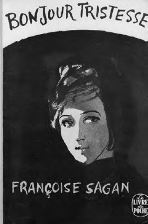 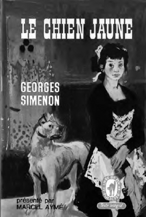 Figure 3, 4: Examples of affiche peint style by an unknown illustrator. F. Sagan, Bonjour tristesse. Paris, Livre de Poche, 1954, and G. Simenon, Le chien jaune. Paris, Livre de Poche, 1966
| |
[pagina 157]
| |
Faucheux, who had founded in 1963 his own studio specializing in book design, used the opportunity afforded him by his appointment to put his conception of the image into practice. ‘Pierre Faucheux a pour mission de faire oublier le style laborieusement illustrative des couvertures du Livre de poche’.Ga naar voetnoot28 He therefore set about challenging the dominance of the somewhat gaudy illustrated poster covers that had become standard practice, replacing them with his ‘iconographie symbolique’,Ga naar voetnoot29 an approach he had already piloted at the ‘Club français du livre’. Rather than follow the example of realist illustration that left little to the imagination, Faucheux preferred to use images that symbolized the content of the book, allowing the reader the opportunity to engage in an imaginative dialogue with the book jacket. Both the image and the typography were enlisted in the new semiotics of the Livre de poche. Faucheux detested illustration and promoted the introduction of iconography as a means of avoiding what he termed ‘l'anecdote illustratrice’.Ga naar voetnoot30 J'ai proposé l'iconographie la plus vivante, la plus exacte et la plus vraie pour accompagner les textes que je mettais en pages. (...) J'ai toujours recherché des associations d'images aussi parfaites que possible, en accord avec le texte et son époque.Ga naar voetnoot31 In the case of the illustration chosen to accompany his maquette for André Breton's Nadja, Faucheux was able to convince the author to allow him to reproduce an original letter signed by the heroine. Other covers saw him indulge in his preference for huge disparities of scale, as he expanded the human face to fit the entire field, as in the cover for Boris Vian's L'herbe rouge, which also surprised with its use of a negative photographic image. Such visual tricks and intrigues were typical of a designer who aimed to ‘casser les habitudes’,Ga naar voetnoot32 an approach he extended to his choice of typography, with each typeface chosen to best match the author whose book Faucheux was engaged in designing. ‘Le caractère, c'est le signal qui donne son ton à l'ouvrage. (...) Il faut toujours tendre à réaliser la plus heureuse union entre la typographie et son environnement’.Ga naar voetnoot33 The concern for both the tone of the type and the environment in which it was to be situated, says a great deal about Faucheux's conception of the spatial dynamics of the paperback book at the Livre de poche, something which sets his work apart from the rather flat covers produced prior to 1964. Having found a suitable iconography, Faucheux would then set about situating it in space. This approach was second nature to a designer whose architectural training informed his design work to such an extent that he entitled his 1978 memoirs Écrire l'espace. As a master metteur en scène, he used the spatiality of the book as a ground that | |
[pagina 158]
| |
took on the qualities of an urban space in which imagery, and especially typography, became an architectural landscape of meaning through which the reader roamed. His cover for Lautréamont's Les chants de Maldoror (1972) (fig. 5) plays up this connection between type and the public space by spraying outsize graffiti letters reading mal do ror in red paint on a white field, which resembles a close-up section of the outer wall of a building in Faucheux's scheme. On other occasions he transports entire façades and city blocks to the covers of books. His design for Exbrayat's thriller, Les messieurs de Delft (1964) (fig. 6) consists of a cover dominated by the façade of a Dutch terrace, the windows glimmering in various shades of red light and the window frames picked out in yellow. Arsène Lupin contre Herlock Sholmès by Maurice Leblanc (1963) sets a shrunken Haussmannian block between two human protagonists in a scene reminiscent of nineteenth century burlesque découpage. For Francis Carco's La rue (1970), another vision of the public space is explored through Faucheux's handling of typography and symbolic iconography (fig. 7), with the book's title rendered as a Parisian street sign obliquely placed upon a grainy photograph of five men engaged in a conversation around a café table, a scene we appear to be looking down upon from street level. In all these examples, Faucheux is concerned with introducing a symbolic iconography that represents the books' content in an oblique manner that plays on connotation rather than realistic or literal representation. He is also bringing the architect's spatial vision to the small, flat format of the Livre de poche, an approach that was repeated to such an extent that it may be read as an attempt to embed coded messages about the role of the book within the publisher's visual identity system. 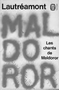 Figure 5: Pierre Faucheux Cover for Lautréamont, Les chants de Maldoror. Paris, Livre de Poche, 1972
| |
[pagina 159]
| |
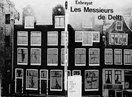 Figure 6: Pierre Faucheux. Cover for Ch. Exbrayat, Les messieurs de Delft. Paris: Livre de Poche, 1964
| |
Beyond FaucheuxFaucheux's many references to the city, its streets, buildings and public spaces are a clear indication of his personal engagement with urban public space, something that was also brought to the fore with his traffic-light inspired ‘Stop, collection Points’Ga naar voetnoot34 design for Seuil's Points paperbacks. Faucheux's covers, with their urban inspiration and frequent evocation of public space, represented a means of connecting the paperback book to the public sphere of discussion and debate, an entity whose spatial aspects are often downplayed. As far as the Livre de poche is concerned, the shift from the realist illustrations of the pre-1964 era to the symbolic iconography pursued by Pierre Faucheux also reveals a shift in terms of the way the publisher viewed its readership, particularly its project of expanding the public sphere through the so-called democratization of reading. The Livre de poche had, in effect, abandoned its attempt to desacralise literature through the application of a uniform design policy that saw erudite works and cheap thrillers wrapped in the same shoddy, somewhat sensational jackets reminiscent of contemporary cinema posters. The notion that readers would dispose of the books after use proved | |
[pagina 160]
| |
to be false and, accepting this reality, the Livre de poche went back to the complex graphic strategies pursued by the book clubs. 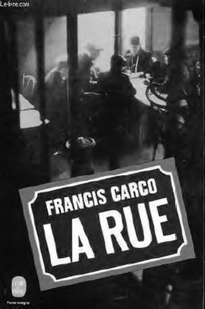 Figure 7: Pierre Faucheux. Cover for F. Carco, La Rue.
Paris: Livre de Poche, 1970 In some ways the recourse to Faucheux might be interpreted as an admission of failure on the part of the publisher - while the Livre de poche, with its cheaper prices and wider distribution networks increased book sales dramatically, this rise in the quantity of books sold was not matched by a concomitant increase in individual readers. According to the vie Plan report produced in the early 1960s, there was no more than an estimated 1% increase in terms of readers and therefore only a modest penetration of new markets.Ga naar voetnoot35 There was, therefore, no great conversion of the masses to reading - no great uptake of literature by the audiences of popular films targeted by the covers of the affiche peint era. ‘L'illusion de la démocratisation de la lecture et de l'émergence de nouveaux publics s'estompe’Ga naar voetnoot36 and the publishers of the Livre de poche and their rivals consequently oriented themselves towards visual identities founded in the graphic design of highbrow good taste. The standards set by the book clubs and by risk-taking designers such as Pierre Faucheux and his disciple Robert Massin would become the dominant style in paperback covers from the mid-1960s, although the Livre de poche would continue to churn out its pre-Faucheux era covers for many of its editions even with Faucheux at the helm as art director. | |
[pagina 161]
| |
Massin's notable contribution to the identity of the poche was the white background and elegant Baskerville type of Gallimard's Folio series, which made its first appearance in 1972 and which, as a visual identity, was charged with differentiating Folio from its competitor, the Livre de poche. Under Massin, it acted as a showcase for the talents of a range of illustrators, such as Alain le Foll, whose challenging work represented a very different approach from the tawdry pre-Faucheux Livre de poche. Analysing the design of the Livre de poche series, whose lowbrow cover illustrations were often incongruous, bland or dated and seldom changed from one edition to the next, Massin concludes, ‘Our concern [at Folio] was to make it so that these little books should be both read and kept’.Ga naar voetnoot37 The connection between a lowbrow design language and the attempt to democratise reading had clearly been broken by this stage. In 1968, in a similar vein, the publisher 10/18 (under director Christian Bourgois) chose the intellectual Polish poster artist Roman Ciéslewicz as its principal designer. Ciéslewicz had emerged from the hermetic tradition of the Polish poster school, known for its fondness of the graphic riddle and visual doublespeak. It seems that the use of the book jacket as a means of connecting with the imaginaries of popular mass culture had given way to an acceptance of the book's restricted appeal and attempts to break into new markets were increasingly focused on measures such as the cutting of the cover price. The trajectory travelled by graphic designers from 1950 led to a rejection of the deliberate pursuit of low quality solutions by the major publishers. The graphic references to the city and public space, through the participation of architect-designers such as Faucheux and affichistes like Jean-Claude Forest (Livre de poche) and Roman Ciéslewicz (10/18) can be read as a recognition, on the part of designers and publishers alike, of the role of the book as an increasingly common presence in public space. The graphics of urban space also served as a symbolic reference to the attempt to take the paperback book to a wider audience, and thereby widen the public sphere. While more books would make it into public circulation, the public circulating them remained limited to the established audiences, and the visual identity strategies of the paperback publishers reflected this by pursuing a highbrow graphic design approach inherited from the avant-gardism of the 1950s book clubs. |
|

