Jaarboek voor Nederlandse Boekgeschiedenis. Jaargang 19
(2012)– [tijdschrift] Jaarboek voor Nederlandse Boekgeschiedenis–
[pagina 51]
| |
Claire Bolton
| |
The em quadrat as basic piece of spacingPrinting with movable type was invented in the western world, probably by Johannes Gutenberg in Strasburg and Mainz in the mid-fifteenth century.Ga naar voetnoot2 Gutenberg's ‘work of the letters’ resulted in letters cast from metal, an alloy of lead, with the letter face on the top of a rectangular body that stood somewhere between 22 mm and 24 mm high.Ga naar voetnoot3 All that the reader sees is the face of the type letters where they have printed on the page. But type was and is much more than the impression on the page. Harry Carter stated that a piece of type is a three-dimensional object and it is the body of the type letter that is as important as the face,Ga naar voetnoot4 as shown in figure 1. All the type letters in a font have to be of the same height and have the same depth of body, so the letters can sit alongside each other in a line. The width of the letters may | |
[pagina 52]
| |
vary to accommodate the widths of different letter shapes. It is the different widths of the type bodies that dictate the ‘set’ of each different font, how close the printed letters are to each other on the page. The depth of the body is usually related to size of the type face - the larger the depth the larger the face that can be accommodated on the body. Along with the type letters there are also pieces of spacing. Here, in the world of letterpress, space is also a three-dimensional object. The spacing has to be cast to the same depth of body as the type letters but can vary in width depending on usage - the thinner spaces being inserted between words and the wider ones used to fill out larger areas such as the end of a short line of text. The basic piece of spacing is the em quadrat, which is the square of the type body. Thinner spaces are proportions of the em quad; an en, which is half an em, a thick which is a third of an em, a mid which is a quarter of an em and a thin, which is a fifth of an em. There can also be hair spaces - thin slivers of metal (or cardboard on occasions) which are used to tighten up a loose line of text, and much thicker pieces of spacing that are two-or three-ems wide. Spacing was not meant to be seen and was cast to a lower height than the letters to prevent it being printed. Happily, for those looking for clues that reveal method, this was not always the case and sometimes the spacing did pick up ink and print. It is with these serendipitous occasions that the evidence of the physical shape of a piece of spacing can sometimes be seen as on the bottom line of a leaf from Berchorius, Liber Bibliae (ib00336000),Ga naar voetnoot5 printed by Johann Zainer in 1474 showed in figure 2. 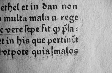 Figure 2: A rising space between two words on the bottom line of a leaf from Berchorius, Liber Bibliae (ib00336000) printed by Johann Zainer in 1474 (author's collection)
| |
[pagina 53]
| |
The em quadrat as basis for line lengthWhen setting text with movable type the printer has to decide the length of line to which he will be working - his measure. The letters are taken one by one and assembled in a composing stick, made from wood to the length of the chosen (and fixed) measure.Ga naar voetnoot6 All the lines of text are then set to the same length. From information given in the catalogue of incunables in the British Library it quite quickly becomes obvious that early printers would often use the same measure for the width of their texts for a number of different editions.Ga naar voetnoot7 For example Johann Zainer printed his chancery-folio editions with a text block that was circa 110 mm wide for at least eight years from when he started in 1473.Ga naar voetnoot8 Johann Sensenschmidt in Nürnberg printed at least eight chancery-folio editions with a text width of circa 130 mm from 1470-71. Anton Sorg printing in Augsburg, started in 1475 with two text-widths for his chancery folios, with some editions having the text set to circa 118 mm and others set to a slightly wider measure of circa 122 mm - perhaps his composing sticks had been made to slightly different measures. Millimetres have been used by bibliographers as a universal standard measurement when cataloguing and describing incunable editions, but fifteenth-century printers were not setting their text widths in the metric scale. On further scrutiny it can be seen that these proto-typographers were using their printers' measure as the basis for the width of their texts, their em quad. Looking at the three printers listed above; Johann Zainer was using his type 116G for printing his first editions - nineteen ems of type 116G measure circa 110 mm; 23 ems of Sensenschmidt's type 114G give a circa 130 mm measure and 24 and 25 ems of Sorg's type 103G give his two set measures of circa 118 and circa 122 mm. These three printers were working in Germany in the 1470s but the same basis for setting the measure of the text block - the em, the square of the type body - will be found with almost all of the incunable printers. It will also be found with all subsequent printers through the intervening centuries until the present day. If one tells a letterpress printer today that the early printers were working to measure based on their em it is a fact so obvious that they would think it is hardly worth commenting on - that is how printers work. Some of the early printers' manuals describe setting the measure using ems, although the earliest, Moxon, does not.Ga naar voetnoot9 Smith, in his Printer's grammar of 1755, discusses using the letter m, ‘where we use m's laid flat’, to make the measure - (Smith is describ- | |
[pagina 54]
| |
ing turning the letter ‘m’ on its side so that the depth of the letter, that is to say, the body size, would provide the measure).Ga naar voetnoot10 Stower's Printer's grammar of 1808 states: ‘It is necessary to observe, that all measures are made of pica ems...’.Ga naar voetnoot11 The compositor would set the measure of his stick with as many pica (circa 12 point) ems as needed for each job.Ga naar voetnoot12 Modern composing sticks are marked in pica ems and printers use an em rule, either marked up in pica ems or sometimes also showing ems of different type sizes, for checking text widths and for calculating the number of lines to a page. The em is the key point behind the thinking, planning and designing of the type page. There is strong evidence that suggests that the em was also the basis for working with the very earliest printed items, earlier than the 1470s examples cited above. The earliest dated piece of printing in German, the Türkenkalender (it005035000) printed in December 1454 shows an imprint of a raised em space at the end of a line on leaf [2v]. This edition is printed in type 164G with unjustified lines, having a ragged right-hand margin. The ends of the lines, beyond the visible text, were filled out with pieces of spacing to a full measure of fifteen ems of type 164G. An em just beyond the end of the fifth line of text has risen slightly, picked up ink and been printed in error, leaving an inked smudge on the paper. This very early piece of printing was set to a measure based on a type 164G em quad (fig. 3).  Figure 3: Leaf from the Türkenkalender (it00503000) with its unjustified setting. A raised and partially inked em can be seen at the end of the fifth line. Lines have been drawn in to show the actual measure of 15 ems of type 164G (F. Geldner, Der Türkenkalender 1454: Faksimile mit Kommentar. Wiesbaden 1975, fol. 2v)
| |
[pagina 55]
| |
The picture of whether or not printers were using their ems as the basis for the layout of their type pages is mixed from the mid-1450s until about 1463. Other items printed with type 164G seem not to be set to a measure based on the em of type 164G.Ga naar voetnoot13 A proof sheet for the 36-line Bible, held in the Jagiellonian Library in Cracow has unjustified setting as with the Türkenkalender.Ga naar voetnoot14 This proof sheet also shows printed pieces of spacing in the margins, none of which are square. The completed 36-line Bible, finished circa 1460, also has unjustified setting with pieces of spacing added to the ends of the lines to fill out the measure. Sometimes, as was seen with the Türkenkalender above, some of the pieces of spacing were inked and printed. These inked marks can give a clue to the actual set line length, which was repeatedly shown to be 96 mm. This measure is not a round number of ems of type 164G but could perhaps have been based on twelve pieces of spacing measuring eight mm wide rather than a type 164G em quad (a type 164G em would measure 8.2 mm wide). 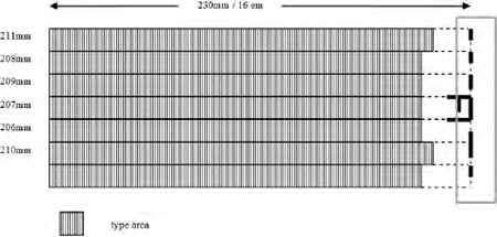 Figure 4: Diagram of top seven lines of text in a copy of Psalterium Benedictinum (ip00106200). Line lengths of text vary but evidence from the inked rising spaces at the ends of the lines show that the full line measure was from 19 mm to 24 mm longer than the visible text, giving a set width of 230 mm, or 16 ems of type 286G (Oxford, Bodleian Library, Arch. B.a.1, fol. [154]v)
However other printers working in the late 1450s and early 1460s were working in ems. Fust and Schoeffer's 1459 Psalterium Benedictinum was printed in their large type 286G.Ga naar voetnoot15 Marks from inked and raised spacing in the copy held in the Bodleian Library indicate a line length of circa 230 mm, which equates to sixteen ems of type 286G (fig. 4). | |
[pagina 56]
| |
Fust & Schoeffer can be seen to be working to ems with their other editions printed during this period. Their Canon Missae, 1458 (im00736000), Psalterium Benedictinum, 1459 (ip00106200) and their Constitutiones, 1460 (ic00710000) are all printed to measures based on their em. However there is no clear evidence for the same way of working with their Rationale divinorum, 1459 (id00403000), although it is very likely it followed the same pattern. Johann Mentelin, working in the same period in Strasburg, does not seem to have been working in ems for his Latin Bible of 1461 (ib00528000) but does seem to have settled on his em as a basis for his measure by 1463 when he printed Aquinas' Summa theologica (it00208000). | |
The em quadrat as basis for other design featuresThe em was not merely used as a base for the line length but was also the base for all the other design features on the printed page. Spaces left for ornamental initials to be added later are commonly found. They are all in dimensions of multiple ems; 2-, 3-, 4-, 5-, 7- and 10-em wide spaces, and are usually of the same number of lines deep. When indenting for chapter headings and/or paragraph headings an em, or two, or more, would be inserted. If wanting hanging indents then again the em would be used to achieve this. The woodcut printed initials are made to fit to an em measure. The illustrations would be cut on pieces of wood that were the right numbers of ems wide to fit into the line measure. This was not just aesthetics. It was essential for the printer to be able to lock up all the various elements in the chase with no movement ready for printing. He could not lock up securely if there was no common factor to which the various elements were made. The technology he was using was dictating the design on the page. Figure 5 shows Johann Zainer printing a woodcut border, a six-line woodcut initial and using hanging indents, all in em dimensions, on the incipit page of his Deutsche Chronik.Ga naar voetnoot16 It should be stressed that an em was not a universal standard measure in the fifteenth century. Each em, and each consequent em-measure, was based on an individual printer's type body. The em was an in-house measurement stemming from each printer's fount(s) of type.Ga naar voetnoot17 A few further examples are shown here. Figure 6 shows the colophon page from Gering, Friburger and Crantz's edition of Barazizius's Epistolae (ib00260500) in Paris in 1470. The ems have been marked up at the side of the text as well as three ems of their type 115R that were used to indent a single line. Single ems were inserted to indent lines further down the page. | |
[pagina 57]
| |
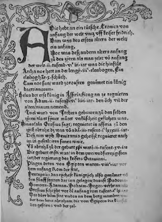 Figure 5: A page from Johann Zainer's Deutsche Chronik (is00765000) showing hanging indents on the left-hand side of one em, a border that is 4 ems wide and a large woodcut initial that is 6 × 6 ems in size, all based on Zainer's type 116G (Ulm, Stadtbibliothek, 15008,1, fol. [a1] r)
Sweynheym and Pannartz in Rome set their Postilla super totam Bibliam still using an unjustified right-hand margin as late as 1471 (fig. 7).Ga naar voetnoot18 Their measure (determined from evidence of inked rising spaces at the end of line in a different copy) was 30 ems of their type 115R with the ends of the lines being filled out with small pieces of spacing. A two-line space, that was also two ems of their type 115R deep, was left for an initial to be added by hand. | |
[pagina 58]
| |
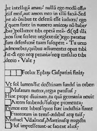 Figure 6: Colophon page from Gering, Friburger and Crantz's 1470 edition of Barzizius's Epistolae (ib00260500) marked up in ems of their type 115R. King's library exhibition, London 1939, 42)
Nicolas Jenson working in Venice shows his use of ems of his text type 111R for indenting his chapter headings as well as for a large, eleven-line initial space, as seen in the example from his Pliny at figure 8.Ga naar voetnoot19 As printing skills developed, and more complicated layouts were attempted, this foundation for working, based on an in-house measurement, became increasingly necessary. For instance to be able to set some of the complicated settings of the Bible with marginal notes and perhaps two commentaries required the careful management of measurements. To show this more clearly three more complicated settings are discussed below to show how ems were used to enable the printer to assemble the various parts and not have everything fall apart. | |
[pagina 59]
| |
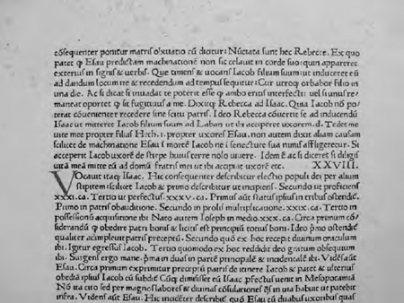 Figure 7: Top section of page from Nicolaus de Lyra, Postilla super totam Bibliam (in00131000) printed by Sweynheym and Pannartz in Rome, 1471-1472, showing the 2×2-em space left for an initial (author's collection)
| |
Three more complicated settings1. Werner Rolewinck, Fasciculus temporum (ir00253000) printed by Nicolaus Götz, Cologne [not before 1474]This printing was the first of 24 editions of this title. The printing of this text has given rise to discussion by scholars because of the complexities involved in translating the design, with its time line running through and its interconnected areas of text, from manuscript to print. Johan Martens in his 1999 article suggests that Götz struggled to make a smooth translation between the technologies.Ga naar voetnoot20 However unsuccessful his technical abilities, and the resulting printed page, may have been, Götz was basing the layout on the em of his type 98G. As can be seen in figure 9, Götz divided his basic text area | |
[pagina 60]
| |
on this leaf into three columns (indicated here with bold black lines on the left-hand side of each column). The columns measure ten, eleven and twelve ems in width. The circles are cut on blocks of wood measuring six ems and four ems square - some have been shaded here with hatched lines to help show this. Further these woodcut circles have a space cut out of their centre, also measured in ems, to hold some inserted type. Götz has had problems with his time line, which he has printed from rows of short double lines cast on single em bodies - unfortunately these do not line up (poor casting?) and the visual effect is more of staggered steps than a continuum. Some of the areas of space have been marked in on this illustration to help show how Götz used ems to fill his white space on the page. In the space at the foot of this page a few raised and inked ems can be seen - evidence that Götz did not manage to lock up all the elements in this forme very securely. Other printers approached this ambitious piece of typesetting with more sophisticated methods, such as a line cast in one piece for the time line, but they all, crucially, had to base their layout on the em quad of their typeface. 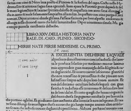 Figure 8: Leaf from Nicolas Jenson's 1476 edition of Pliny's Natural History (ip00801000) with ems of type 111R marked on (author's collection)
| |
[pagina 61]
| |
 Figure 9: A leaf from Nicolaus Götz's printing of Fasciculus temporum (ig00253000) showing use of ems as a basis for combining the different elements on the page; type, woodcuts and a running timeline. The width of the columns is ten, eleven and twelve ems respectively. (Köln, Universitäts- und Stadtbibliothek, enne138, digital image number 96)
| |
[pagina 62]
| |
2. Biblia Latina, with Postilla by Nicolaus de Lyra (ib00619000) printed by Anton Koberger, Nürnberg, 1497This leaf is a fairly typical example of text and commentary (gloss); some editions were simpler and some were more complicated, depending on the number of commentaries and references to be included. Here the text is set in two columns of the larger type, with reference letters in the right-hand margins of both columns (fig. 10). The text is surrounded by two columns of commentary, de Lyra's Postilla, set in a smaller typeface. A broad pattern of working would have to have been established, one that could be followed however many lines of text or gloss there were on any page. Koberger managed a large printshop, working on an almost industrial scale and there could have been a number of different compositors working on this Bible at one time.Ga naar voetnoot21 The main text in type 91G was set in two touching columns, each twelve ems wide, including an en space (or a small reference letter) at the beginning of each line and an en space at the end of each line. The commentary was set to a measure or 23 ems of type 74G, again including an en space at the beginning and end of each line. After five lines of 23 ems at the top of the page the column narrows to nine ems wide, still including an en at the beginning and end of each line, until the foot of the page where it returns to the 23 em measure. An extra en has to be inserted between the longer lines of the two commentary columns at the head and foot of the page and however many lines of type 74G ems needed to fill out the remaining space at the head and foot of the text type 91G. Finally the outermost margin columns were made up and added with spacing of type 91G ems. | |
3. Franciscus Columna, Hypnerotomachia Poliphili (ic00767000) printed by Aldus Manutius, Venice, 1499This leaf shows one of many examples of elegant Aldine page design, here based on the em of the text face, Aldus's type 115R. The dimensions of the woodcut illustration are based on the type body size and measure nineteen lines of text deep by 23 ems of type 115R wide.Ga naar voetnoot22 The typesetter has elegantly tailed off the text in a cul-de-lampe shape by reducing the amount of text and increasing the amount of spacing on the lines. For the most part the spacing is equal on either side of the narrowing text, but there are slight differences in the final six lines although they are barely noticeable to the eye (fig. 11).Ga naar voetnoot23 | |
[pagina 63]
| |
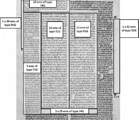 Figure 10: A leaf from Biblia Latina (ib00619000) printed by Koberger in 1497. The measures in the two different type sizes are marked up as is also some of the spacing, showing how the forme was constructed (author's collection)
| |
ConclusionsThese are only a few examples but they all show how the physicality of type letters and pieces of spacing dictate the design of the page, exemplified by the use of the em as the printer's linear measure. It is hoped that this short article will help raise awareness of the technical basis for the design of early (and later) printed books. The technologies introduced in the last few decades have moved the book making process rapidly away from hands-on typesetting with its inbuilt design parameters. However, to understand the book production revolution of the fifteenth century, it is essential to be able to relate to the technology behind it.Ga naar voetnoot24 | |
[pagina 64]
| |
 Figure 11: Leaf [k5]v from Hypnerotomachia Poliphili (ic00767000) showing ‘cul-de-lampe’ shaping of the text on the page based on the em of type 115R (from S. Morison, Four centuries of fine printing, 2nd rev. edn. London 1949)
|
|

