TS. Tijdschrift voor tijdschriftstudies. Jaargang 2010 (nrs 27-28)
(2010)– [tijdschrift] TS–
[pagina 45]
| |||
AbstractMet de introductie van Apple's iPad en de groeiende vraag naar eReaders en smartphones opent zich een breed scala aan nieuwe mogelijkheden voor het digitale tijdschrift. Waar in het verleden gedigitaliseerde tijdschriften veelal niet meer omvatten dan scans van het origineel, bieden eReaders, smartphones en Tablet PCs een kans om de lezer van een vernieuwende, interactieve en multimediale ervaring te voorzien. Dat tijdschriften de sprong naar digitale varianten zullen moeten maken om relevant te blijven in een digitaliserende wereld lijkt evident; de vraag rijst echter wel welke invloed het inruilen van de lineaire structuur van het gedrukte werk voor de interactieve hypertekstuele structuur van de digitale variant heeft op de tijdschriftervaring. Dit artikel poogt een kritische blik te werpen op de nieuwe generatie digitale tijdschriften aan de hand van een van haar voorlopers, het multimediamagazine Aspen. Dit tijdschrift, dat verscheen tussen 1965 en 1971, wilde radicaal breken met het traditionele, gebonden magazine door terug te keren naar ‘the original meaning of that word in the sense of “a storehouse, a cache, a ship laden with stores”.’ Om dit te bewerkstelligen verscheen Aspen niet alleen ongebonden in een doos, maar bevatte ieder nummer naast een verscheidenheid aan papieren materiaal ook een flexidisc met muziek of audiofragmenten. Aspen ook het eerste tijdschrift dat bewegend beeld bevatte, in de vorm van een spoel Super 8 film. Aan de hand van een studie van enkele van de meest innovatieve nummers van Aspen wordt in dit artikel gezocht naar historische parallellen met de huidige ontwikkelingen in de wereld van het digitale tijdschrift. Aspen's unieke vorm maakte het mogelijk om het lezerspubliek op een vernieuwende manier aan te spreken, maar de idealistische aard van het magazine leidde ook tot problemen. Door middel van een vergelijkende blik maakt dit artikel zichtbaar dat een halve eeuw later veel van de voordelen en nadelen van het ongebonden tijdschrift terugkeren in het digitale magazine. | |||
Keywords
| |||
[pagina 46]
| |||
The past went that-a-way. When faced with a totally new situation, we tend always to attach ourselves to the objects, to the flavor of the most recent past. We look at the present through a rear-view mirror. We march backwards into the future.Ga naar voetnoot1 | |||
Going nonlinear: challenges for the magazine in a digital worldThat the traditional, paper-based magazine has arrived at a decisive crossroads is rapidly becoming a cliché. In an increasingly digital world, which favors the interactive over the static, the nonlinear over the linear, the user-centered over the designer-centered, and mixed media over single media, the magazine has little choice but to reinvent itself or perish. The developments listed here, often loosely lumped together under the term Web 2.0, present an urgent call for action for the magazine industry, which increasingly finds itself faced with digital threats similar to those that have been occupying the publishing, newspaper, movie and music industries for the past decade. With the continuing success of Amazon's Kindle and the recent release of Apple's iPad, new media have appeared on the market, posited snugly between the smaller laptops and the Smartphone; portable, yet equipped with large enough screens to provide for a comfortable reading experience, the eReader and tablet computer provide their users with a versatile platform to access information from a wide variety of sources at any given moment. The case of the iPad, with sales exceeding one million within a month of its American release, illustrates that the tablet computer has successfully carved out a niche of its own in the media landscape. In an effort to capitalize on this new market Condé Nast, publisher of twenty-eight magazines, some of them (Vogue, The New Yorker, Vanity Fair, Wired, etc.) among the most recognizable of the trade, announced in March of this year that it would release iPad versions of five of its most popular publications by summer 2010. It is hard to overemphasize how much of a ‘game-changer,’ to use Wired magazine's qualification, the iPad really is.Ga naar voetnoot2 Much more than the digital magazines that have been around for years and that have often amounted to little more than scans of the original publication, the iPad offers a locus for true interactivity, prompting the user into what Roland Barthes termed a writerly, instead of a readerly, experience.Ga naar voetnoot3 In fact, it is these interactive, nonlinear aspects of the medium that should be further explored by the designers of digital magazines, if these publications are to offer any true competition in the flood of competing information that media consumers are bombarded with every single day. One productive theoretical approach to the new generation of digital magazines is hypertext theory, as first developed by Theodore Nelson in the early 1960s. Nelson, then a Master's student at Harvard University, envisioned an information structure which | |||
[pagina 47]
| |||
would be non-sequential and open-ended, inviting the reader to traverse the text via an anti-hierarchical system of links, a feature he called ‘zippered lists.’ Much like the digital magazine, Nelson's proto-hypertext required a writerly approach, inviting its users to engage in active exploration of its labyrinthine structure. Barthes' distinction between readerly and writerly proves apt, then, when distinguishing ‘ordinary’ digital texts from hypertexts. In fact, Barthes' study S/Z (1970), in which he first introduced the terms readerly and writerly, offers a convincing description of what a functional hypertext may look like. As Barthes envisioned it, in an ideal hypertext the networks are many and interact, without any of them being able to surpass the rest; this text is a galaxy of signifiers, not a structure of signifieds; it has no beginning; it is reversible; we gain access to it by several entrances, none of which can be authoritatively declared to be the main one.Ga naar voetnoot4 Hypertext scholar George Landow also stresses how the ‘hypertext blurs the boundaries between reader and writer’ and thus necessitates a very active reader, one who is willing to critically navigate his way through a nonlinear information jungle, and a potentially unreliable one to boot.Ga naar voetnoot5 Whereas in the 1960s Nelson's hypertext remained to a large extent hypothetical, for the average contemporary Internet user these problems of information overflow and questionable reliability have become a hallmark of the Web experience. How should magazines then employ the potential provided by the reified hypertext and the opportunities offered by Web 2.0? Although the advocates of Web 2.0 have been legion, 2009 and 2010 also saw a steady stream of publications questioning some of its key features, many of them written by prominent members of the Internet community.Ga naar voetnoot6 There is no need to explore their many objections to current Internet developments too extensively here, but it should suffice to note that many of these objections may also hold for the fledgling digital magazine. Thus, for example, when in his recent study You Are Not a Gadget (2010) Jaron Lanier observes that increased online interactivity has transformed the Internet from both an idealistic means of transnational communication and a potential Borgesian information repository into a vast expanse of mediocrity, this may also serve as a caveat for the digital magazines currently under development. Of course interactivity may pave the way to democratization and finally realize the aspiration of many magazines to become a true forum for conflicting opinions; nevertheless it may be good to bear in mind that quantity does not equal quality and that on the Web, perhaps even more than anywhere else, ‘collectives can be just as stupid as any individual - and in important cases, stupider.’Ga naar voetnoot7 | |||
[pagina 48]
| |||
Amid these conflicting opinions and, moreover, as the digital magazine is as of yet such a novelty, it proves hard to look into the future and predict in which direction technological, economical, social and cultural developments (not necessarily in that order) will lead the industry; it may, however, prove useful to look into the past for clues. In this article I propose that the loose leaf magazine, as published in numerous incarnations in the twentieth century, provides particularly interesting parallels with its modern day digital equivalent, among which are nonlinearity, interactivity, multimediality and a writerly approach to readers. It should be noted that although loose leaf magazines had been around since the Russian Constructivist experiments of the early twentieth century, their true boom came in the 1960s, a period which constituted a watershed moment in media history, much like our own.Ga naar voetnoot8 It could thus be valuable to compare these two media crossroads and the types of magazine they produced in order to shed some light on the current situation. The magazine I propose for comparison here is Aspen, the American multimedia magazine in a box published in ten issues by editor Phyllis Johnson between 1965 and 1971. Although Aspen was only one of many loose leaf magazine ventures in the 1960s, it is a particularly fruitful choice for comparison, because of its high production values, extensive print runs (between 15,000 and 20,000) and its three-dimensional, multimedia approach to the magazine concept. Aspen's inception was also directly influenced by the media theory of the age, most notably by the works of Marshall McLuhan, to which it devoted an entire issue in 1967. Whereas other magazines may have consisted wholly of loose printed matter, Aspen's content was more versatile. Not only did issues at times contain flip books, kites, newspapers, posters, foldouts, postcards, and other paper-based materials, nearly each issue of Aspen also contained a flexi disc with music or audio fragments. In 1967 Aspen also became the first magazine to include film, in the form of a reel of Super 8. Each of Aspen's issues was guest edited and many of its editors and designers have by now become hallmarks of 1960s culture. Aspen's contributor list also reads like a sample sheet of the 1960s cultural landscape, including John Cage, Timothy Leary, J.G. Ballard, Jack Smith, Ossie Clark, John Lennon, Yoko Ono, Steve Reich, Kate Millet, Susan Sontag, Dennis Oppenheim, and many others. It should be needless to say that what follows cannot pretend to give a comprehensive overview of Aspen, nor can it explore all possible analogies with the digital magazine.Ga naar voetnoot9 This article should thus be interpreted as a first impulse to further study. In | |||
[pagina 49]
| |||
what follows I have chosen to first give a brief recapitulation of Aspen's inception in 1965, as it sheds some light on editorial intentions with the magazine. This is followed by short discussions of two of the magazine's more innovative issues and concluded by a note on Aspen's eventual demise in 1971 and possible analogies to our own times. Insofar as Aspen's format may have been quixotic, over time it has not only become an art historical curiosity, but in many ways its successes and failures can also prove highly relevant for our own day and age. | |||
Rethinking the magazine concept: Aspen, the magazine in a boxIn 1965, when former Women's Wear Daily and Advertising Age editor Phyllis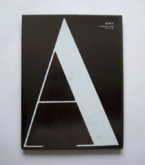 Fig. 1: Box for Aspen 1 (1965), design by George Lois.
Johnson visited the fifteenth annual International Design Conference in Aspen (IDCA), Colorado, she went home keen to radically reinvent the magazine concept. The edition of the IDCA Johnson visited was devoted to ‘Configurations of the New World’ and featured speeches by such luminaries as architect James Rouse, designer George Nelson and Secretary of the Interior Stewart Udall. What the 1965 IDCA shared with its previous incarnations was a starry-eyed idealism, an unshakeable conviction that many of the modern world's problems could be repaired through astute design.Ga naar voetnoot10 As the IDCA's promotional materials, reproduced in Aspen 1 (1965), stated: ‘[h]ardly a day goes by when we are not reminded that 1984 is here [...] it becomes literally correct to describe today's world as new.’Ga naar voetnoot11 With this new world in mind Johnson set out to design a magazine to match. The first issue of Aspen appeared in December 1965 and came packaged in a glossy black 12" by 10" box, adorned by a single, oversized Bodoni letter A. The issue contained seven sections, five of which were booklets, supplemented by a flexi disc, and a | |||
[pagina 50]
| |||
folder of loose advertising sheets. The booklets, devoted to the IDCA, skiing and local wildlife, mostly extolled the virtues of Aspen, ‘one of the few places in America where you can lead a well-rounded, eclectic life of visual, physical and mental splendor;’Ga naar voetnoot12 the flexi disc provided jazz music to match. The issue also included a letter to the reader by hand of Phyllis Johnson, in which she explained how the magazine intended to return to ‘the original meaning of that word in the sense of “a storehouse, a cache, a ship laden with stores’.”Ga naar voetnoot13 Thus, each of Aspen's boxes was intended to reward the inquisitive reader, and, as Emily King has noted, did so by communicating intelligence, instead of opulence.Ga naar voetnoot14 In addition - and contrary to traditional magazine design logic - Aspen toyed with the concept of the gift box, garnering attention by veiling instead of revealing its contents. Accordingly, hardly any of the boxes and folders Aspen produced throughout the years yield much of a clue as to their contents. These practices led to an innovative magazine experience, in which Aspen's guest editors gradually received more and more freedom to fill the boxes with intricate labyrinthine information structures. For Aspen's first two issues, however, Johnson retained an iron grip on the magazine's content, maintaining Aspenite idealism as its centerpiece. For the design she drew upon her acquaintances in the advertising world, in particular those associated with what would later be called the advertising creative revolution of the mid-1960s. Thus, via a mutual friend, Johnson approached Esquire cover designer George Lois to work on the first issue, who agreed to do the job pro bono. Although Lois had been in advertising since the late 1950s, by the time Aspen 1 was published he had evolved from ‘one of the street fighters of the creative revolution’ to a byword for provocative, groundbreaking design.Ga naar voetnoot15 Lois’ covers for Esquire were, in the words of Steven Heller, ‘acerbic critiques of contemporary society, politics and manners that subverted the conventions of mainstream magazines.’Ga naar voetnoot16 It is, then, all the more conspicuous that Aspen 1 betrays little of Lois' design qualities. In fact, Johnson and Lois' ideas of what would constitute a three-dimensional magazine had soon proved incompatible. Realizing that Aspen's flat box still adhered mostly to two dimensions, Lois proposed to add a third dimension in the form of a pop-up version of the Herbert Bayer tent which had been inaugurated as the IDCA's new accommodation that year. But, despite her innovative intentions, Johnson's concept for Aspen was still firmly rooted in the traditional magazine concept, causing her to flatly reject Lois' pop-up. As Lois remembers, Johnson's unwillingness to fully exploit the possibilities of the magazine's format made him feel constricted: | |||
[pagina 51]
| |||
I did this sensational pop-up and she said: ‘Well, I don't know, I'm not so sure that's so interesting.’ And I said: ‘What?!’ [...] ‘What are you talking about? We all go crazy about it.’ I did the tent and it was designed by Herbert Bayer and in a sense it had become for anybody who goes to Aspen, the symbol of Aspen. I was totally blown away and she rejected it and we just finished the job and I said goodbye to her. It was a pain in the ass job to do. [...] I'm working with [Esquire's] Harold Hayes, I'm changing the world with magazine covers and he's not just leaving me alone, he's telling me go, go, go and I walk into this woman and I'm doing it pro bono, free, and she's tying my hands, she's handcuffing me.Ga naar voetnoot17 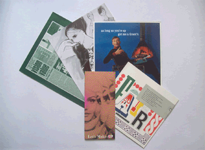 Fig. 2: Selected loose leaf advertising in Aspen 1. Shown is advertising for the Seven Arts Book Club, Adele Simpson designer clothing, Grant's whiskey, IBM and Fabergé.
Harold Hayes once remarked that Lois' talent was so significant because it was ‘impossible to control or regulate, and [...] that if anyone or anything ever succeeded completely in doing so, it would simply disappear.’Ga naar voetnoot18 If Johnson's obduracy did not stifle Lois' talent fully, it for certain severely curtailed it; the design of Aspen 1 is adequate, but decidedly far from as visionary as Lois' work for Esquire, or for that matter as Aspen's later issues. Lois and Johnson's divergent views are exemplary of the highly idealistic, and impractical side to Aspen's format, which negated part of its commercial viability. The magazine's approach to advertising provides a clear illustration here. Much like anything in the box, ads in Aspen were loose leaf, collected in a folder labeled the ‘Ad Gallery’ and placed at the bottom of the box. Although the loose leaf approach allowed for a versatile | |||
[pagina 52]
| |||
reading experience, it also meant that each of the sections of the box would have to fight for the reader's attention, and the advertising most of all. Here an interesting parallel appears with the digital magazine: once unbound, the reader is no longer forced to at least flip past the advertising and advertising agencies will thus have to restyle and reintegrate their ads into the magazine context to entice readers in innovative ways. In the case of Aspen Lois remembers discussing this with Johnson: You could easily lose [the advertisements], or throw them away. [...] I thought it was silly. The only thing that could have been interesting [would have been] if advertising agencies thought of ways to put something in there that maybe popped up, that you would take out and maybe would hang or pop up or use as a gimmick. I said [to Phyllis Johnson]: ‘Why don't I just make a pamphlet out of the advertising?’ But she said: ‘No, no, no, it's very exciting when you open it up and you take the ads out,’ and I said: ‘You take it out and you throw it away.’Ga naar voetnoot19 Of course advertising designers in a digital environment have infinitely more tools at their disposal to capture the reader's attention than those confined to paper, but the fact remains that the freedom to read in a hypertextual fashion entails the freedom to disregard ads. As such, traditional magazines, in which any blend of ads and other content is often still anathema, will have to revise their views on integrated ads, if advertisers are to remain interested in buying space within their digital pages. If the Aspen case may serve as an illustration, here Johnson's idealistic view of advertising clearly failed to bloom. Although Johnson's letter in Aspen 1 had hinted at possible future inclusion of ‘a ski lipstick, a tiny salt spoon, a new perfume,’ none of these ventures ever materialized.Ga naar voetnoot20 In fact, after its sixth issue, Aspen would silently discontinue its advertising altogether. | |||
‘All media work us over completely’: Aspen and Marshall McluhanAspen's first two issues had presented its readership with an innovative reconceptualization of the traditional magazine, but had, in turn, exploited the new format but sparingly. While the loose content encouraged non-sequential reading and both issues had included flexi discs with music, so far the shape of the paper-based material had been guided by the form of the box and most of the contents had, in fact, been variants on ordinary stapled booklets. All this changed, however, with the publication of Aspen's third effort, Andy Warhol's Fab issue (1966), designed by music journalist David Dalton. This issue was succeeded in early 1967 by a box fully devoted to the media theories of Marshall McLuhan, soon to make his entrance as the high guru of multimedia, intermedia and the like with the publication of The Medium is the Massage (1967). Whereas the magazine's earlier issues had steered clear of ‘ordinary life,’ offering the alternative of an isolated Rocky Mountains spa, Aspen would, in fact, from now on devote each subsequent issue to a different countercultural or artistic movement. In this | |||
[pagina 53]
| |||
process Aspen's third and fourth issues play a transitional role. They are artifacts of the cultural apogee of pre-1968 America, still unspoiled by My Lai, the Weathermen and Kent State. Both issues also show a magazine in limbo, on the one hand struggling to match an innovative format with equally innovative content, on the other hand unwilling to break fully with its rustic roots. Even though there is too little space at this point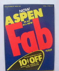 Fig. 3: Cover art for Aspen 3 (1966). Design by David Dalton.
to fully discuss Aspen's Fab issue, David Dalton's idiosyncratic reinterpretation of the magazine's format remains clearly visible in future issues, and thus begs a moment's notice. Dalton met Andy Warhol at a 1961 Christmas party, and for a short time he and his sister Sarah had been the artist's first assistants. By 1966, however, his relationship to Warhol had become more impersonal, as the latter moved into his studio The Factory, surrounded himself with self-appointed stars, and became the center of a media frenzy. Nevertheless, when approached by Phyllis Johnson to work on an Aspen, Warhol quickly hired Dalton to design an issue devoted to Pop Art. Dalton's box represents Aspen's first attempt to let the form of each individual item be decided by its contents, a practice he playfully combined with Pop Art's customary reappropriation of everyday objects as art. Thus when deciding on the design of the box, Dalton remembers simply making a trip to the supermarket: [D]efinitely the most graphic, eye-popping things in the supermarket were the laundry detergents. All of that stuff [was] a swirling vortex, it was just amazing. So, Fab, anyway was really appropriate, because it was around the time of The Beatles, obviously, and so that expression ‘fab’ was still in use. We got permission from, whoever that is, Procter & Gamble [...] to use it. They didn't have a clue, they didn't really understand what we were doing.Ga naar voetnoot21 Dalton's design for the box is ingenious in at least two ways: the detergent theme cleverly combined Warhol's penchant for brand names with the cult of newness so commonplace in the fast-paced world of consumer products to stress the new direction the magazine was taking. On the inside the contents also reinvented everyday items to suit Pop Art's agenda of transmuting the ordinary into art; thus, for example, the Ten Trip Ticket Book reinterpreted this everyday object for the drug-infused 1960s, printing excerpts from papers presented at the 1966 Berkeley LSD Conference on each stub, and the reversible Underground Movie Flip Book provided Aspen's first interactive feature. At first glance the choice to devote the third issue of Aspen to Warhol seems out of key, all the more since the artist's violent anti-art attitude contradicted the high | |||
[pagina 54]
| |||
humanism expounded by both the IDCA and the magazine's earlier issues. Closer examination, however, shows that the choice for two subsequent issues devoted to Warhol and McLuhan may have been a deliberate attempt to position the magazine within the contemporary critical and artistic discourse on America's changing mediascape. In this respect Aspen's McLuhan issue (1967) plays a pivotal role. Released shortly before the publication of The Medium is the Massage, Aspen's fourth issue shared its groundbreaking design with McLuhan's book. The Medium is the Massage, designed by Quentin Fiore and produced by Jerome Agel, was arguably the first book for the television generation: profusely illustrated, it presented McLuhan's theory in bite size chunks of text by way of what Agel called ‘a Cubist production.’Ga naar voetnoot22 Aspen 4, also designed by Quentin Fiore, shared this agenda to ‘[call] into question the uniformity and continuity of the space of the book.’Ga naar voetnoot23 For McLuhan the collage was the ideal vehicle for his message as it steered away from traditional reading's monomania - one word at a time - instead opting for a mosaic form. McLuhan argued that the collage was, in fact, present in many different media at the time and had become the ideal way to address what he termed the experiential ‘allatonceness’ of modern life. As such, in his 1964 study Understanding Media, he observed that the newspaper from its beginnings, has tended, not to the book form, but to the mosaic or participational form. With the speed-up of printing and news-gathering, this mosaic form has become a dominant aspect of human association; for the mosaic form means not a detached ‘point of view,’ but participation in the process.Ga naar voetnoot24 McLuhan realized that many modern media had become totally immersive and participatory, literally becoming extensions of our human faculties and influencing everyday life in myriad ways, many of them unperceived by the average American. Since Aspen's format was also aimed at a multisensory, immersive experience, the choice to wed it to McLuhan's writings was a logical one, a fact advertising for Aspen emphatically stressed at the time by forthrightly stating that ‘Aspen Magazine is a McLuhanism.’Ga naar voetnoot25 The contents of the McLuhan box represented various approaches to the new media trends McLuhan observed in society. Thus John Cagecontributed his rambling, chance-derived Diary: How to Improve the World (You Will Only Make Matters Worse), a text he himself described as ‘a mosaic of ideas, statements, words, and stories;’ a mock printing proof of several pages from The Medium is the Massage formed a literal mosaic; and a blurry multi-exposure picture of light-drenched hippies at the San | |||
[pagina 55]
| |||
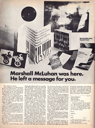 Fig. 4: Advertising for Aspen 4, in Evergreen Review 48, August 1967.
| |||
[pagina 56]
| |||
Francisco Avalon Ballroom visualized McLuhan's concept of ‘allatonceness.’Ga naar voetnoot26 Although the items in the box hardly formed a unity, designer Fiore found this to be an advantage, since the patchwork-like quality of the contents allowed for an exploration of McLuhan's theories from several angles. Additionally, Aspen's mosaic distribution of information would, so Fiore hoped, occasion some unexpected interactions between the various materials, a fact the box underlined by repeating McLuhan's maxim ‘When information is brushed against information...’ at various locations in the issue.Ga naar voetnoot27 Much like The Medium is the Massage, Fiore intended Aspen 4 to be an experiential statement of concern, or, in his own words, an attempt ‘to convey, in a simple and attractive way, the effects of the then ‘new informational technologies’ on real life.’Ga naar voetnoot28 What is then the relevance of Aspen's McLuhan issue for our discussion of the digital magazine? As Aspen emphasized, the boxed magazine was in many ways a first attempt at a paper-based incarnation of McLuhan's theories. It further expanded the experiment attempted in The Medium is the Massage by adding sound in the form of a flexi disc and by moving beyond the limits of the bound book. Much like the digital magazine Aspen 4 showed that the box could function as a small information universe of its own, in which its ‘readers’ would be invited to freely roam in search of possible connections between the disparate materials, only loosely guided by the editor's hand. Aspen's McLuhan issue shows the potential of magazines to communicate a coherent message, without restricting themselves to a static layout; its writerly readers were incited to find their own way among McLuhan's meandering theories and within the freeform locus of the box. The digital magazine should be able to further expand this dynamic approach, resulting in a many-leveled information network; in fact, Aspen's next publication, the double Minimalism issue, would not only become the magazine's most ambitious venture yet, but also became its closest approximation to a proto-hypertext. | |||
Enter/exit anywhere: Brian O'Doherty's Aspen 5-6When approached in 1966 to design an issue of Aspen, Irish-American artist Brian O'Doherty decided to turn his box into a mailable mini-museum. Inspired by Stéphane Mallarmé, to whom the box is dedicated, O'Doherty envisioned a self-contained universe, a multi-tiered labyrinth characterized by numerous interconnected contributions and centered around the three themes of time, silence and language. Included in the box are thirteen printed materials, five flexi discs, a miniature sculpture by Tony Smith in eight parts, an 8mm film reel and a folder of advertisements. O'Doherty's introductory booklet divides the material into the three abovementioned themes, but also identifies six movements: Constructivism, Structuralism, | |||
[pagina 57]
| |||
Conceptualism, the ‘tradition of paradoxical thinking’ (i.e. presumably Dada), objects, and ‘between categories.’Ga naar voetnoot29 For O'Doherty these movements were ‘to trap the contents of the box in different configurations,’ inciting readers to see the various possible connections between the issue's different sections.Ga naar voetnoot30 O'Doherty was the first Aspen editor to be given utter freedom during the design process, freedom he used to create what is - at least, art-historically speaking - Aspen's prime legacy. His objectives, in any case were clear: his issue was to be a monument to what he identified as a ‘crucial moment in the 1960s,’ that is, the transition from Minimal Art to Conceptualism: I was laser-focused. I knew exactly what the issue should be: a summary of my[self] and some of my colleagues and [...] Modernism's ancestors as a platform on which I perched my colleagues and myself. [...] I was aware, perhaps before the others, that we were inserting a hinge into history on which it would turn.Ga naar voetnoot31Propelled along by a young artist's energy O'Doherty's ‘hinge’ would result in ‘an intricate network of correspondences woven by the box's players [which] spread its web across time and space, creating a dense circuit of interrelated information.’Ga naar voetnoot32 Acutely aware of his unique position in cultural time and space - that of an ‘urbane polymath working in the eye of the storm’ - he set out to commission work by colleagues, ancestors and fellow-travelers.Ga naar voetnoot33 The original plan soon outgrew its skin, resulting in the magazine's only double issue. The yearlong 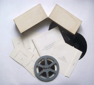 Fig. 5: Box and selected contents from Aspen 5-6 (1967). Design by Brian O'Doherty.
design process also clearly stretched Aspen's budget, resulting in several unpaid contributors, including Roland Barthes and translator Michael Benedikt. Aspen 5-6's intricate contents and wide scope - it contains work by more than twenty-five artists spanning the first six decades of the twentieth century - precludes a thorough analysis here, an analysis which at any rate would require a comprehensive art historical contextualization. Nevertheless, O'Doherty's boxed maze represents Aspen's most successful attempt to approach the hypertext and it is this structure which begs | |||
[pagina 58]
| |||
further attention here. In order to fathom O'Doherty's intricately meandering network of cross-cultural links it is necessary to first examine the packaging it arrived in. As is the case with other Aspen issues, the box enclosing the various contributions to Aspen 5-6 is part of an overall design plan, but O'Doherty explored its possibilities much more profoundly than previous editors had done. Breaking with the customary flat box, O'Doherty designed a two-part white monolith, constituting a Minimalist sculpture in its own right. As the two box halves allowed for several arrangements this also added a level of interactivity to the packaging heretofore unexplored in Aspen. Once inside the box, the reader is first presented with a contents sheet, which includes an index and sets forth the abovementioned movements and themes. It also contains a long quote from the work Placement as Language, supposedly written by a Sigmund Bode in 1928. When tracing the quote, however, one soon notes that not only does the cited work not exist, moreover, Bode is one of O'Doherty's many aliases, this one dating back to his days in Ireland.Ga naar voetnoot34 As O'Doherty explained later, the choice for a fictitious source arose from the fact that no real text existed which covered the complex ‘festschrift of authors commissioned and commandeered (with a young man's cheek and confidence) to dance to [his] music.’Ga naar voetnoot35 The text itself distinctly refers back to Mallarmé, as O'Doherty has Bode ponder how objects ‘may perhaps be conjugated in such a way that their positions imply ‘verbs’ in the spaces (silence) between them.’Ga naar voetnoot36 If the Bode text functions as a legitimization of O'Doherty's use of categorization within the issue, it also shows his awareness of the severe writerly demands the issue would make of its readers when he has Bode write that to decipher the box's intrinsic grammar should ‘[constitute] a test for the reader.’Ga naar voetnoot37 One key to understanding O'Doherty's intentions with his Aspen issue can be found in the small booklet of essays included in the box, which contains work by Roland Barthes, Susan Sontag and George Kubler. The booklet functions as a theoretical groundwork and, as such, serves to prepare the reader for O'Doherty's multi-interpretable approach to art history; it also contains the issue's main claim to fame, the first publication of Roland Barthes' seminal essay ‘The Death of the Author,’ which was commissioned specifically for this Aspen box. When placed within the overall structure, each of the essays is connected to one of the box's three themes: thus Barthes' text explores the language of fictional works; Sontag's ‘The Aesthetics of Silence’ investigates various manifestations of silence in the arts; and Kubler's essay contends that the concept of style is irreconcilable with that of historical duration. | |||
[pagina 59]
| |||
Barthes' essay with its claim that it is the reader who constructs a textual experience and not a tyrannical author-figure, since each text is ‘only a tissue of signs, a lost, infinitely remote imitation,’ justifies O'Doherty's hypertextual approach, which also incites readers to make their own particular connections.Ga naar voetnoot38 As O'Doherty recalls, Barthes' Post-Structuralist approach to the reading experience, also faithfully reflected his own aesthetic credo at the time: I should say that for me new pastures had opened when I realized that art need not, was not, about myself. The idea of finding yourself and making art from that fiction was not something I wanted to pursue. It reeked of romantic agony, and was not for me. All of us at the time were very much against emotional excess. Barthes responded very well to the ideas I put forth, said ‘I may have something for you’ or some such phrase. In time, ‘[The] Death of the Author’ arrived. I saw it as high[ly] explosive. [I] was thrilled to get what I knew was game-changing and historic.Ga naar voetnoot39Barthes' abandonment of the author-centered universe resounds throughout the issue, inviting readers to find their own possible parallels among the both temporally and spatially disparate parts. That the box succeeds in doing this on several levels at the same time is a point that cannot be illustrated here without getting too far off the subject, but perhaps a few illustrations will suffice. By including, for example, an extract from Alain Robbe-Grillet's Nouveau Roman La Jalousie (1957), O'Doherty implied that Robbe-Grillet's reduction of the novel to an exercise in mathematics connected the author's  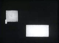 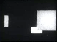 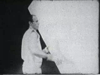 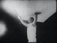 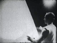 Figs. 6-11: Stills from Hans Richter, Rhythm 21 (1921) and from Robert Morris and Stan VanderBeek, Site (1964).
endeavors to those of the Minimal Artists with their love for grids and permutations. Similarly, O'Doherty coerced former Russian Constructivist Naum Gabo to read an English translation of ‘The Realistic Manifesto,’ written jointly with Anton Pevsner in 1920 and one of the key texts of Constructivism. Once more, Gabo and Pevsner's plea for a functional art devoid of all forms of embellishment may imply it to be a historical predecessor to Minimal Art, a link certainly not ubiquitous in the United States at the time. Both links, however, are never made explicit. They are there for the reader to find, providing that he or she possesses enough cultural capital to make the connection. That this form of proto-hypertextual experiment may also result in unexpected connections can, as a final example, be | |||
[pagina 60]
| |||
illustrated by briefly discussing two short films included on the 8mm film reel. The first film is German filmmaker Hans Richter's Rhythmus 21 (1921), which was long hailed as the first abstract film ever created.Ga naar voetnoot40 The second short film, Site, was produced by Minimalist artist Robert Morris together with filmmaker Stan VanDerBeek in 1964. Even a superficial viewing of the two films exposes their clear similarities: although one film is abstract and the other is not, the use of geometric shapes and in particular the way the white rectangles at times occlude the camera seems to imply that Morris' 1964 film has at least some debt to Richter's 1921 film. Brian O'Doherty recollects that at the time he also saw clear parallels, but also that Morris, when confronted with the similarities, claimed never to even have seen Richter's film, let alone be influenced by it.Ga naar voetnoot41 Here the link, as in much of O'Doherty's sinuous creation, truly only exists in the eye of the beholder. | |||
The way Aspen went: some caveatsEven though Aspen did not end with issue 5-6, but its later publications, devoted to cultural phenomena ranging from Performance Art to the burgeoning psychedelic movement of the late Sixties, never again achieved the structural complexity of the Minimalism issue. Lack of funds also rapidly began to erode both Aspen's publishing schedule and its three-dimensional aspirations, with the box often being replaced by a variant on a portfolio or folder. In ever more radical post-1968 America, Aspen's format also swiftly began to lose its relevance. Whereas in 1965 the opulent boxes could still profess a belief in adroit design as a way to ameliorate the world, the magazine's once progressive nonpolitical humanism rapidly turned into an anachronism in a period in which the Vietnam War revealed itself to be the true ‘engine of the sixties.’Ga naar voetnoot42 Combined with a prolonged struggle with the United States Postal Service over mailing rights, financial malaise eventually led to the magazine's demise with issue ten in 1971. Prone to decay and the loss of individual items, Aspen's boxes soon became curiosities and disappeared into library and personal collections, only to regain attention when adapted for the Internet in 2002, a technological development the magazine in many ways adumbrated. Despite the obvious dissimilarities between digital and loose leaf magazines, the preceding illustrates that they, nevertheless, share several key qualities in design, approach to readership, use of advertising, etc. This may be illustrated by briefly glancing at some of the initial reactions to the first new generation digital magazine available, Wired magazine's iPad application, which was released on May 25, 2010.Ga naar voetnoot43 The | |||
[pagina 61]
| |||
application, which sold 24,000 copies within twenty-four hours after its release, ranking number one in the paid downloads for the device, met with mixed reviews. The positive reviewers lauded its rich media, which included a clip from Pixar's new Toy Story movie and a virtual tour of the Pixar studios. The magazine was also lauded for overcoming some of the interface issues designers for the iPad are routinely faced with. Thus PC World's Harry McCracken noted that Wired's digital version does a ‘remarkably good job of reformatting pages to look good in either portrait or landscape mode - an origami-like challenge that makes my head hurt just thinking about it.’Ga naar voetnoot44 The San Francisco Chronicle noted how the iPad's use of advertising is both enticing and ineffective, as the interactive format lures readers towards the ads, but the application's interface at the same time allows readers to skip advertising relatively easily.Ga naar voetnoot45 Here, for one, the parallels with Aspen seem quite clear, as the boxed magazine faced much the same predicament. “Much of the criticism aimed at the digital version of Wired pertained to the magazine's static adherence to a linear format more or less adopted from its paper-based ancestor. Thus, in an astute but damningly negative review, the blog InterfaceLab suggested the application to be a return to the 1990s world of the interactive CD-ROM, or ‘a glorified slide show.’Ga naar voetnoot46 As the InterfaceLab review shows, in this regard Aspen was clearly ahead of its time and the modern day digital magazine may in fact benefit from closely studying Aspen's anatomy. Retaining a rigid, linear structure results in digital magazines that are still little more than the electronic equivalent of bound pages, even if niftily navigated with one's fingers. If the digital magazine is to break with its paper ancestor, if, in fact, it is to avoid McLuhan's prediction that when it comes to new media we tend to ‘look at the present through a rear-view mirror,’ Aspen's proto-hypertextual approach could, despite its evident drawbacks, serve as a fine historical example.Ga naar voetnoot47 If the digital magazine is to truly evolve away from, and not imitate, the traditional magazine that has served us so well in the past centuries, it will have to, as one of the above reviewers noted, ‘go outside the box.’Ga naar voetnoot48 There is little doubt that Phyllis Johnson would have agreed heartily. •> maarten van gageldonk is a PhD candidate at Radboud University Nijmegen. He is writing a dissertation on the influence of Grove Press and Evergreen Review (1957-1973) on the introduction of European avant-garde literature into the United States. |
|

