Jaarboek voor Nederlandse Boekgeschiedenis. Jaargang 26
(2019)– [tijdschrift] Jaarboek voor Nederlandse Boekgeschiedenis–
[pagina 11]
| |
Andrea van Leerdam
| |
[pagina 12]
| |
history can be summarized as follows.Ga naar voetnoot3 A year after the Latin editio princeps, a German translation appeared in 1523, also in Strasbourg.Ga naar voetnoot4 Dutch was the first subsequent vernacular in which the work was translated (1536). French and English followed in the mid-sixteenth century (1549 and 1558, respectively). Reprints in all of these languages appeared until well into the seventeenth century. However, only one reprint in Dutch is known, published in 1554 by Jan Roelants in Antwerp.Ga naar voetnoot5 This article will focus on Berntsz's edition in Dutch from 1536. Berntsz extends the series of illustrations from the 1522 Latin editio princeps considerably. According to Bart Jaski, he adds ‘all sorts of unnecessary images’, which make the book look ‘more frivolous and also rather botched’ in comparison to the Latin edition.Ga naar voetnoot6 Apart from dozens of scholars and other figures engaged in conversation, Berntsz adds two series of planet personifications, two series of the zodiac signs, four astronomers' busts, personifications of the four complexions, five small portrait busts of kings and emperors, and numerous decorative borders. Such ‘unnecessary’ and ‘frivolous’ images may, in fact, reveal new layers of meaning when we approach them, not from an aesthetic point of view, but instead from the perspective of information design. As I will demonstrate by the case study of the Dutch Chyromantia, the scholar figures exemplify how even illustrations that are not required for understanding the text, contribute to the book's visual rhetoric. I will also demonstrate how their mise-en-page is a crucial factor in the process of meaning-making by book designers as well as readers. To understand the effects of the page layout, I will explore the usefulness of the concepts of text-flow and page-flow. These concepts have been introduced in 2008 by applied | |
[pagina 13]
| |
linguist John A. Bateman for the analysis of multimodal documents.Ga naar voetnoot7 He defines multimodal documents as page-based artefacts that combine multiple (textual and visual) modes of presenting information with the intention of achieving ‘an orchestrated collection of interwoven communicative goals’.Ga naar voetnoot8 A foundational assumption underlying multimodality research is that the interaction of multiple presentational modes (such as written text, pictures, diagrams, photographs) opens up an array of possible meanings beyond those that can be created through a single mode. In order to analyze how these meanings take shape, and what the implications are for effective information design, Bateman's concepts of text-flow and page-flow describe how textual and visual elements are combined on a page. Although the emerging field of multimodality research focuses predominantly on present-day media (websites, newspapers, advertisements, textbooks, etc.), the definition of multimodal documents may equally incorporate older media. By applying analytical tools from this field to early modern books, I aim to contribute to interdisciplinary cross-fertilization between contemporary and historical media studies. In what follows, I will first discuss my approach of the early printed, illustrated book as a multimodal document. Then the analysis of the scholar illustrations will focus on the key themes of authority, familiarity, and engagement. Finally, I will discuss the concepts of text-flow and page-flow, and propose how they may be adjusted to benefit the study of early modern books. | |
Early printed books as multimodal documentsAn obvious explanation why Jan Berntsz added dozens of scholar figures to the already elaborate illustration programme, is that he had these woodcuts readily available. His Chyromantia is by no means the earliest edition in which they occur. They were used to illustrate many different works, most of them printed by Jan van Doesborch and Jan Berntsz, who collaborated in Utrecht in the early 1530s and who frequently exchanged printing materials.Ga naar voetnoot9 This type of explanation has long characterized the scholarly attention for early woodcuts. Based on technical, economic or stylistic arguments, it focused on questions of attribution and dating by identifying which printers reused or copied each other's materials.Ga naar voetnoot10 Information design offers a different approach, focusing more | |
[pagina 14]
| |
on the (intended) reading process: as various scholars have observed, choices in design always reflect assumptions held implicitly or explicitly by the designers on how a message can be conveyed effectively.Ga naar voetnoot11 Therefore, even if Berntsz was merely looking for space-fillers or decorative material, we may still ask why he chose these recurring scholar figures rather than any of his other stock images. Why did he think them fitting, adequate, or at least not hampering the book's commercial potential? Taking as a starting point the notion that design embodies ideas of effective communication, this article approaches books as material objects functioning in social contexts. This approach has gained firm ground over the past decades in the context of a wider ‘material turn’. There is a growing interest among scholars of book history, history of knowledge, and media archaeology, among others, for the materiality of the book - including such aspects as size, mise-en-page, typeface, illustrations - as an important factor affecting the ways in which a book's content is received and interpreted.Ga naar voetnoot12 This development opens up fruitful new perspectives on woodcut illustrations in early printed books. Focus is shifting from predominantly aesthetic and economic approaches to the roles woodcuts play in processes of meaning-making and knowledge transmission.Ga naar voetnoot13 These newly emerging perspectives enhance our understanding of European print culture and visual culture, in which the flourishing print market in the sixteenth-century Low Countries played a substantial role. Approaching the early modern illustrated book as a multimodal document, thereby drawing on frameworks from multimodality studies, may further enrich our understanding of early print culture.Ga naar voetnoot14 Partly as a result of the material turn, there is now a striking overlap in the research questions addressed by scholars of historical books and by scholars of present-day communication and media. These questions address, among other things, the relations between texts and images, the functions of book illustrations, and the ways in which reading and learning processes are guided by matters of | |
[pagina 15]
| |
layout.Ga naar voetnoot15 Despite these shared interests, an exchange of methodologies for the studies of historical and present-day multimodality is not yet common practice. Applying multimodality frameworks to a more diachronic range of sources offers promising avenues for scholars of contemporary as well as historical media. | |
Scholars as ‘talking heads’: a framework of auctoritasThe small woodcuts of scholars in the Dutch Chyromantia have not been studied systematically before. A first step in attempting to grasp their meanings is taking a closer look at their appearances within the Chyromantia, before turning our attention in the second part of this section to other Netherlandish books in which they appear. Analysis of their recurrent appearances uncovers how they contribute to the construction of authority for the knowledge presented in the text. Woodcuts of scholars as well as other stock figures making gestures of dialogue occur in each of the six parts, called books, of which the Chyromantia consists. The first book deals with chiromancy, the second with physiognomy, the others with various aspects of astrology, including the influence of the planets on diseases and cures, and the four ‘complexions’ or temperaments.Ga naar voetnoot16 All of these ‘dialogue figures’ added by Berntsz distinguish the Dutch Chyromantia from the Latin and the German as well as the later French and English editions. The dialogue figures come in different sizes, styles and appearances - male as well as female, busts as well as full-length figures, some clearly identifiable as scholars by their outfits and attributes, while for others it is less clear who or what they represent (figure 3b). Especially puzzling is the appearance of five small busts of kings and emperors in the book on physiognomy (figure 3a, bottom right): it is not clear whether they are meant to illustrate facial types described in the text (Charles v, known for his protruding chin, appears in the chapter on the mouth), or whether they are used as de-individuated dialogue figures like many of the other woodcuts.Ga naar voetnoot17 What all of the dialogue figures have in common is that their presence is not required for a proper understanding of the text, and that their gestures and gaze directions express conversation. These characteristics make them suitable for multifunctional use. Indeed, all of them had already appeared in dozens of books printed by Jan Berntsz and/or Jan van Doesborch, which explains their variety in styles and formats. | |
[pagina 16]
| |
My analysis will focus on a set of six small half figures that are clearly intended to represent scholars. They are depicted wearing berets or more exotic looking long drapelike headgear, holding a book or a scroll, or making conversation gestures with their hands (figures 3a+b, 4, 8). Their outfits resemble those of humanist scholars, for example in the author portrait of Johannes Indagine in the Latin Chyromantia (figure 2) or the famous portrait of Erasmus by Hans Holbein the Younger, while the more exotic outfits remind us of pagan philosophers as they are stereotypically depicted in, for example, Hans Weiditz's woodcuts for Polydorus Vergilius' Von den Erfindern der Ding (Augsburg 1544).Ga naar voetnoot18 The woodblocks of the six scholar figures in the Dutch Chyromantia are reused multiple times within the book, occurring thirty times altogether. The scholar in image 3b, for example, pointing his finger to an open book in front of him, appears no less than eleven times throughout the 1536 edition. The scholars' connections to the text are not always evident. Because the figures are less wide than a text column, the running text continues next to them. In two instances, a scholar image appears next to a passage that refers to a classical authority (fol. N1v: ‘[...] dit is ooc gheschreuen van Alexandro Aphrodiseo’, fol. X3v: ‘[...] Van dese scrijft Aristoteles seer veel’), suggesting that the images represent the scholars mentioned in the text. In all other instances, however, the text they accompany does not identify them in any way. They differ in this respect from the other images in the volume. Many of the diagrammatic illustrations that were copied after the Latin Chyromantia are explicitly referred to in the text, and the series of planets, zodiac signs, complexions etc. added by Berntsz are also clearly related to the text passages they accompany. Moreover, these added images have a structuring function because they are usually positioned at the beginning of a chapter. This does not apply to the scholar images. While a few of them mark the beginning of a chapter or paragraph, others appear in the middle of a text passage, making them impractical as structuring aids. Further clues as to what the scholar figures mean and why they are used so frequently, can be found in other printed works in Dutch from the same period. The six scholarly half figures appear in various instructive and informative works published in Dutch in the first half of the sixteenth century. Jan van Doesborch initiated the insertion of small, reusable scholar woodcuts already before 1520.Ga naar voetnoot19 This illustration practice has been briefly noted by Yves G. Vermeulen and Piet J.A. Franssen, who consider it to be typical to Van Doesborch.Ga naar voetnoot20 They do not discuss how Van Doesborch's blocks of scholarly half figures, | |
[pagina 17]
| |
and similar stock figures, were reused, copied by and exchanged within a network of printers, most notably Willem Vorsterman, Jan Berntsz, and Jan Roelants.Ga naar voetnoot21 Vermeulen describes the figures as ‘authorities’ busts' because they often accompany a textual reference to an authoritative scholar. 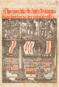 Figure 1. Title page of Chyromantia Ioannis Indagine, Utrecht: Jan Berntsz, 1536 (Utrecht University Library, R fol 456 rar)
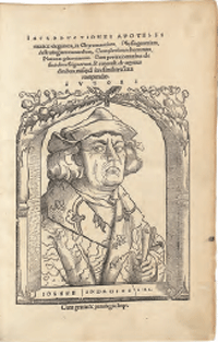 Figure 2. Title page of Johannes Indagine, Introductiones apotelesmaticae elegantes, Strasbourg: Johann Schott, 1522 (Munich, Bavarian State Library, Res/2 Anthr. 3, urn:nbn:de:bvb:12-bsb00085171-6)
References to auctoritates like Hippocrates, Dioscorides, Aristotle, or Avicenna indeed abound in vernacular books on medicine and astrology. As visual equivalents to this type of references, the scholar images perform an important function in conveying au- | |
[pagina 18]
| |
thority and trustworthiness.Ga naar voetnoot22 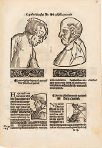 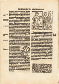 Figure 3a+b. Small scholar woodcuts among illustrations of facial types and ‘dialogue figures’ in Chyromantia Ioannis Indagine, Utrecht: Jan Berntsz, 1536, fols. N3r and O1v (Utrecht University Library, R fol 456 rar)
Possibly the most extreme example of this illustration practice is Van Doesborch's 1532 edition of Den groten herbarius, a herbal containing 435 short chapters on plants and their medicinal qualities and applications.Ga naar voetnoot23 Apart from a plant illustration at the beginning of each chapter, the volume includes numerous scholar figures. Van Doesborch not only uses the set of six that Berntsz reused four years later in his Chyromantia, but also a handful of other half figures executed in a different style.Ga naar voetnoot24 Many page openings have at least one scholar figure, but on some page openings there are even five (fols. H1v-H2r, O4v-P1r; figure 4), or seven of them (fols. Q2v-Q3r). By far the majority - though not all - of their occurrences coincide with a textual reference | |
[pagina 19]
| |
to a scholar. However, there is no consistency in which image is used to represent which scholar; within a single volume, different images may represent the same scholar, and a single image may be used to represent different scholars.Ga naar voetnoot25 The figures therefore do not seem intended to represent a specific individual. This is also suggested by the fact that they occur in cases where no particular scholars are mentioned in the text, as in the Chyromantia. Whatever the inconsistencies in the scholars' positioning, their frequent recurrence runs like a thread of scholarly authority through the books. Vermeulen's term ‘authorities’ busts' is apt, not in the sense that they represent specific authorities - they clearly do not - but rather because they personify auctoritas in a more general, de-individuated sense. 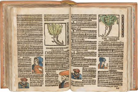 Figure 4. Five scholar woodcuts on a single page opening in Den groten herbarius, Utrecht: Jan van Doesborch, 1532, fols. H1v-H2r (Antwerp, Collectie Stad Antwerpen, Hendrik Conscience Heritage Library, G 142285)
To my knowledge, this specific way of inserting scholar images is nowhere as prevalent as in the Low Countries. Yet the iconography of the scholars was not typically Netherlandish. Vermeulen has noted a similarity between the half figures used by Van Doesborch and those depicting prophets in the fifteenth-century Biblia pauperum blockbook.Ga naar voetnoot26 Another fifteenth-century influence can be pinpointed: Hartmann Schedel's Nuremberg | |
[pagina 20]
| |
Chronicle from 1493.Ga naar voetnoot27 This monumental volume contains hundreds of half figures of which the Netherlandish scholar figures are reminiscent (figure 5). An important difference, however, is that in the chronicle, the biblical, mythological and historical figures are always identified in a caption, even though each woodblock was reused multiple times to represent different persons. Undeniable influence of the Nuremberg Chronicle is visible in the medical compendium Tfundament der medicinen ende chirurgien, compiled by the Antwerp physician Petrus Sylvius and first printed by Willem Vorsterman in 1530.Ga naar voetnoot28 Vorsterman uses scholar figures in several places to mark the beginning of a new section. Some of his scholars are literally copied after Schedel's chronicle (figure 6). 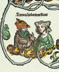 Figure 5. One of the hundreds of small busts in Hartmann Schedel, Liber chronicarum, Nuremberg: Anton Koberger, 1493, detail of fol. 42v (Heidelberg University Library, b 1554 a Folio inc)
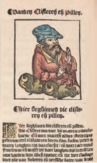 Figure 6. A scholar figure copied after Schedel's Liber chronicarum in Petrus Sylvius, Tfundament der medicinen ende chyrurgien, Antwerp: Willem Vorsterman, 1530, detail of fol. G5v (The Hague, kb National Library of the Netherlands, kw 228 a 10)
To summarize, it seems that Van Doesborch and a number of other Netherlandish printers appropriated an existing type of images, and put it to a new type of use as inter- | |
[pagina 21]
| |
changeable ‘talking heads’ within the text. The scholars are stock images, not tailored to fit a specific text nor intended to represent a specific individual. But they do serve a purpose; the printers deploy them time and again to visualize the scholarly foundations of a text. Although their presence is not limited to medical and astrological works, it seems typical to these genres that they appear so frequently.Ga naar voetnoot29 | |
Trustworthy knowledge in the vernacularThat the insertion of ‘talking heads’ became something of a Netherlandish convention, suggests they may have had a twofold, self-reinforcing effect: they convey trustworthiness to a Netherlandish audience not just by visually invoking auctoritas, but also by doing so in a familiar form that situated them in a Netherlandish context.Ga naar voetnoot30 In Berntsz's Chyromantia edition, the rhetorical strategy of creating trust through familiarity manifests itself in various ways. I will discuss three of them. First, already on the title page, the Dutch edition overtly presents itself as a vernacular book. It proudly states that the text is ‘now perfectly translated for the first time from Latin into our common Dutch language’ (‘nv eerste wten latijn in onse gemeen duytsche tale translateert ende perfectelick ouer gheset’). Secondly, any Latin terms that have been retained - in the text or as labels in some of the woodcuts of hands - are provided with a translation in Dutch, either in the margin next to the image, or in the running text.Ga naar voetnoot31 Thirdly, the volume includes a lengthy, eleven-page preface by the anonymous Dutch translator (‘Prologhe oft Voorrreden [...] Biden ouersetter’). Its verbose - and rather defensive - praise of the arts of chiromancy, physiognomy and astrology contains an interesting allusion to a local context. Elaborating on the importance of physiognomy to painters, the preface states that the essence of painting lies in capturing human emotions and expressions in lines (i.e. drawing), and that this is even more essential than applying color. After discussing a number of examples from Antiquity, the translator praises ‘the other Apelles, Albert Durer’ for his mastery of this art, to which he adds that ‘two Parrhasios and Zeusides, Johan Schorel and Johan Mabuse’ are also unsurpassed (fol. B4r). While this testimony to the reputation of three contemporary artists is already interesting in itself, the passage is relevant here because it transposes the relevance of Indagine's work to a local context. The Netherlandish painters Jan Gossaert (also known as Jan Mabuse, c. 1478-1532) and Jan van Scorel (1495-1562) worked for renowned patrons | |
[pagina 22]
| |
and influenced many artists in the Low Countries.Ga naar voetnoot32 Both had specific connections to Utrecht: Gossaert had worked for the Utrecht bishop and, between 1517 and 1524, had lived at the episcopal castle in nearby Wijk bij Duurstede, where Van Scorel is said to have been his pupil. Van Scorel was indeed living and working in Utrecht at the time when the Chyromantia was printed there. The preface, with its numerous examples and anecdotes in defense of chiromancy, physiognomy and astrology, betrays that the status of these arts was contested.Ga naar voetnoot33 This may have caused Berntsz to feel all the more urgency to emphasize the book's auctoritas. The uncommonly prominent name of the author in the main title, Chyromantia Ioannis Indagine, may also be seen in this light.Ga naar voetnoot34 Paratextual features in the Chyromantia, like the preface and the title page, thus testify to two strategies of creating trustworthiness: emphasizing auctoritas, and introducing local elements. The scholar figures contributed to both. An intriguing question is who the audience of this visual message of trustworthiness may have been. Little is known about the early readers of the Dutch Chyromantia - unfortunately, we do not know whether any painters actually owned a copy. In any case, the numerous illustrations as well as the folio size must have made the book quite expensive. The recurring presence of scholar images suggests that scholars in fact were not the primary target group of the Chyromantia and other books in which they appear. After all, it would not be necessary for them to see their own community represented every other few pages - although we cannot exclude that certain scholars enjoyed encountering their peers on the pages. Instead of visualizing the intended audience, the scholar figures might be considered ‘a reflection of ideal conditions of use’, as Jean A. Givens concludes for an illuminated medical manuscript of c. 1430 that includes busts of reading and talking scholars in the margins.Ga naar voetnoot35 In the case of the Netherlandish books, no less important seems to be the reflection of ideal - scholarly - origins of the knowledge presented in the text. The owners of vernacular instructive books like the Chyromantia were likely to be found among the well-to-do citizens and intellectuals in the Low Countries, including medical practitioners of various sorts.Ga naar voetnoot36 | |
[pagina 23]
| |
Conversing across the page: text-flow and page-flowThe way the scholar figures convey authority is not only shaped by their overtly scholarly (humanistic or exotic) outfits and their ubiquity, but importantly also by the way they are positioned on the pages, as we will now see. Recent studies demonstrate that exciting new insights are to be gained from approaching the early modern page as a rhetorical unit from the perspective of information design.Ga naar voetnoot37 Bateman's concepts of text-flow and page-flow seem particularly well-suited for such an approach. By comparing the Dutch and the Latin Chyromantia editions, I will explore to what extent these concepts can help us understand the rhetorical effects of the scholar figures' mise-en-page, and help to clarify how these effects set the Dutch Chyromantia apart from the Latin edition. Bateman conceives of text-flow and page-flow as ‘semiotic modes’, or means of signifying. Readers construct meaning by decoding the combinations of signs on a page. These signs may belong to different semiotic modes, for example written text, graphics, photography, or the use of color. Bateman defines text-flow as: the semiotic mode of linear written text [that is found] whenever it is the one-dimensional line of the developing text that provides the basic organising scheme [of the page]. Figures, pictures, diagrams tend in this mode to be situated ‘near’ to their referring text or to rely on explicit textual cross-references [...]. The spatial nature of the page does not carry significant meanings in its own right.Ga naar voetnoot38 Page-flow, by contrast, is the semiotic mode where linearity is no longer the main organizing principle and a document [utilizes] the full two-dimensional spatial extent of the page for expressing rhetorical and other functional organisations.Ga naar voetnoot39 | |
[pagina 24]
| |
Bateman thus proposes a dichotomy of linear text-flow versus spatial page-flow, in which the rhetorical meaning of space is the key distinguishing characteristic. In the case of text-flow, meaning is constructed primarily through the linear order of written text. In the case of page-flow, which is a ‘composite semiotic mode’, a page consists of ‘building blocks’ in multiple (visual and/or textual) modes whose spatial relationships affect their meanings.Ga naar voetnoot40 Thus, in the case of page-flow, the way in which elements are combined on the page potentially supports ‘the communicative intentions of the document’.Ga naar voetnoot41 How may the Latin and the Dutch editions of the Chyromantia be characterized in terms of text-flow and page-flow? In many respects, their layouts reflect what Bateman would define as text-flow. Taking the first two books, on palmistry and physiognomy, as an example, it is clear in both editions that the linear unfolding of the text provides the main organizing principle, in which the images of hands and faces are embedded (figures 7 and 8). The two-dimensionality of the page plays a role as an organizing scheme as well, but in an aesthetic rather than a rhetorical sense. For example, most of the images of hands and faces are either at the top or at the bottom of a page, or in the middle with a more or less balanced division of text above and below it. Moreover, Berntsz more consistently than the publisher of the Latin edition Johann Schott, seems to have taken care to break up the text in chunks, starting each page with a new sentence, and never cramming text next to the large images. Whereas both editions clearly use text-flow, in the Dutch edition, the scholar figures seem to realize an inclination towards page-flow. They belong to a different semiotic mode than the diagram-like images of hands and faces, and therefore require a different kind of decoding. Typically set within the text columns, with the text continuing next to them, in practically all cases the figures are facing the text: most often the text in their ‘own’ column, sometimes the text in the adjacent column or on the facing page, but they never look ‘outside’ of the book (figures 3a+b, 4, 8).Ga naar voetnoot42 This mise-en-page has effects at various levels. In the first place, it realizes a close assimilation of text and image: there is hardly any spatial distance and there are no framing borders between image and text, which means a reader cannot ignore the scholars while reading. With their speech gestures, they might even give the impression of actually speaking out the text. The images are visually and spatially connected to the text, even when they are not necessarily connected to it in terms of content.Ga naar voetnoot43 It is the page layout that integrates both modes, thereby enabling readers to create additional meanings (e.g. textual authority, speaking authorities). Apart from the level of image-text interaction, the scholar figures also have effect on the level of interaction among images. The scholars seem to be communicating across and beyond the text, even across pages, as if engaged in conversation with each other. This effect is created by their frequent appearances across the book, and in particular when | |
[pagina 25]
| |
multiple scholars are visible on a page opening (figure 8). At this level of perception, there is no imposed reading order which determines when the reader is supposed to look at the scholar images. In other words, they are not part of the linear text-flow. In this respect, they differ from the images of hands and face types, which have a clear place in the text-flow because they are positioned either above or below the text, or they are explicitly referred to in the text. The mise-en-page of the scholar figures thus allows readers to forge multiple connections between images and text, and between images throughout the book. Therefore, although text-flow may still be said to be the dominant mode, an element of page-flow is at work here as well. It is realized through the combination of the scholars' orientation towards the text, their gestures of conversation, their arrangement on the page, and their recurrence across pages. Together, these characteristics endow them with layers of meaning, expressing authority and dialogue, which are not achieved by the text or by a single scholar image alone. 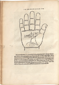 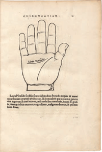 Figure 7. Johannes Indagine, Introductiones apotelesmaticae elegantes, Strasbourg: Johann Schott, 1522, fols. B5v-B6r (Munich, Bavarian State Library, Res/2 Anthr. 3, urn:nbn:de:bvb:12-bsb00085171-6)
| |
[pagina 26]
| |
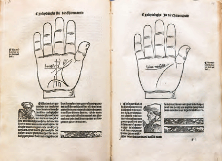 Figure 8. Chyromantia Ioannis Indagine, Utrecht: Jan Berntsz, 1536, fols. E4v-F1r (Utrecht University Library, R fol 456 rar)
Understanding spatiality in this way as a rhetorical element may also help us interpret what is probably the most curious arrangement of images in the Dutch Chyromantia. Accompanying a discussion of the shapes of lines on the fingers is a depiction of three separate fingers, copied after the Latin edition (figures 9 and 10). The fingers have been combined with another woodblock, depicting a bearded man in full length wearing a long gown and a wide hat (a scholar?). The arrangement makes it appear as if he is looking and gesturing towards three huge fingers. Seen in the context of other scholar figures in the book, however, this peculiar Tom Thumb suggests a further level of interaction that the scholarly figures evoke. They not only interact with the text and with each other, but also with the analytical images of hands, fingers, faces, and astrological constellations. All these different forms of interaction and dialogue on the page may realize yet another level of engagement: they invite the reader to follow their example and join in the interaction. The case of the Chyromantia shows that text-flow and page-flow can be useful concepts in the analysis of historical multimodal documents - more useful, in fact, than Bateman himself suggests. He positions both modes emphatically, yet in a rather imprecise way, in a chronological development: ‘early books’, according to Bateman, are always characterized by text-flow, whereas ‘with the move towards more modern texts’, closer cohesion between various elements on the page emerged, until finally, ‘[i]n more | |
[pagina 27]
| |
recent pages still, this has changed completely’ with spatial composition becoming a key element of meaning-making.Ga naar voetnoot44 Many book historians are not likely to share this linear and even rather teleological view. Instead, my comparison of the Latin and the Dutch Chyromantia editions illustrates that text-flow and page-flow may be seen to co-occur in the early modern book - not only in a single book, but even on a single page - in various degrees: some pages have more page-flow than others. 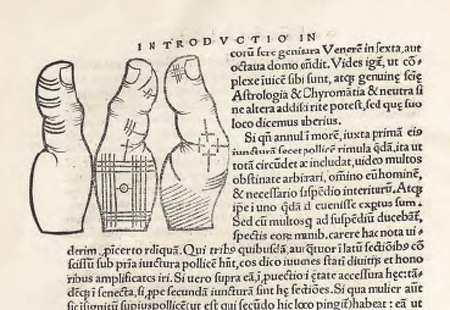 Figure 9. Johannes Indagine, Introductiones apotelesmaticae elegantes, Strasbourg: Johann Schott, 1522, detail of fol. d2v (Munich, Bavarian State Library, Res/2 Anthr. 3, urn:nbn:de:bvb:12-bsb00085171-6)
| |
ConclusionThe stock images of scholars that Jan Berntsz added to the Chyromantia illustration programme were in all probability not intended to clarify the text in any way. Indeed, the Latin Chyromantia demonstrates that the text can very well be presented without these illustrations. Yet they perform a distinct rhetorical function, invoking trust and active engagement with the knowledge presented in the book. This rhetoric is also reflected in other books from the Low Countries in which the scholar images are used in similar ways. | |
[pagina 28]
| |
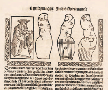 Figure 10. Chyromantia Ioannis Indagine, Utrecht: Jan Berntsz, 1536, detail of fol. H3r (Utrecht University Library, R fol 456 rar)
In choosing these images, Berntsz thus followed what by the 1530s had become a conventional visual strategy, particularly in instructive and informative books. Jan van Doesborch, with whom Berntsz collaborated, was probably the initiator and in any case a major user of multifunctional, reusable woodcuts of scholars and other figures engaged in dialogue and interaction. By adding this type of images to the initial illustration programme, Berntsz situates the book in a Netherlandish context, just like he does by adding a preface by the Dutch translator in which famous artists with local connections are praised. The concepts of text-flow and page-flow turn out to be useful analytical tools for understanding the dynamics of the early modern page. It seems fruitful, however, to conceive them not as strictly distinct modes, as Bateman does, but rather as a continuum. Especially in comparative studies of mise-en-page, the notion of a continuum between text-flow and page-flow can alert us to differences and similarities, and help us interpret these in terms of rhetorical effects. At the same time, we need to take into account that meaning-making, both by book designers and readers, transcends the level of the page. The case of the scholar images illustrates that it is not just their form and | |
[pagina 29]
| |
their arrangement on the page, but also their recurrence throughout the book (as well as in other books) which brings about the suggestion of continuous dialogue and thus stimulates the reader to join in this dialogue. So in addition to ‘one-dimensional’ text-flow and ‘two-dimensional’ page-flow, we might need to establish a ‘three-dimensional’ concept like document-flow to identify how spatiality constructs meaning across pages.Ga naar voetnoot45 With respect to the intended readership, we saw that the vernacular books in which the scholar images occur were likely not primarily aimed at scholarly readers. The images of conversing and reading scholars may have done even more than inviting a reader to follow their example - we may imagine that they flattered an aspiring reader by giving him or her the sense of being part of this learned company by reading the very book in which they are depicted. |
|

