Jaarboek voor Nederlandse Boekgeschiedenis. Jaargang 22
(2015)– [tijdschrift] Jaarboek voor Nederlandse Boekgeschiedenis–
[pagina 45]
| |
Goran Proot
| |
[pagina 46]
| |
the Southern Netherlands, the focus has for a long time been predominantly on type, and in particular on the transition from the use of black letter to roman type.Ga naar voetnoot5 Recently, other elements of the typographic evolution in books have also been included in the analysis. At the same time surveys have become more scientific and precise in their approach.Ga naar voetnoot6 While older studies focused more often on specific, often eye-catching elements on titlepages, such as the use of red ink, decorated borders, or the presence of printers' devices, recent studies have widened the scope of typographic elements under consideration and address much larger datasets than ever before. The 2012 study of founts used in seventeenth-century vernacular books published in the Southern Netherlands, for instance, was based on a set of bibliographic descriptions of 4,389 editions.Ga naar voetnoot7 The size of this sample of the book production in the southern part of the Low Countries made it possible to distinguish the transition from black letter to roman type in different text genres. In addition, a group of 866 title-pages from the period 1541-1700 was analysed in more depth,Ga naar voetnoot8 allowing the tracking of this evolution in the body of the book back to the introduction of new founts, or even to the specific uses of founts, such as roman, italic, small caps, full caps, italic caps and civilité (a cursive variant of black letter),Ga naar voetnoot9 on title-pages. A recent survey of title-pages of books published in the Southern Netherlands between 1541 and 1660 went beyond analysis of type for the first time.Ga naar voetnoot10 In addition to the appearance of different founts on the title-page, also the colour of ink and the arrangement of text and, to some extent, the relative size of the text on the page were studied. Not only was it recorded that the line printed in the largest type size shifted downwards over time, but, additionally, changes in the way lines of text were arranged in paragraphs with ‘regular’ and ‘special’ shapes were recorded. For the beginning of the period (the 1540s and the following few decades), it was noted that paragraphs in the shape of a ‘rummer’ (paragraphs with tapering lines with two or morelines at the top spanning the entire measure of the text area) were rather commonly used. With time, however, this practice eroded, first on Latin title-pages, then, with an extension of a few decades, on Dutch language title-pages. This pattern of imitation by the vernacular a short while after its introduction on Latin title-pages reappears in other design ele- | |
[pagina 47]
| |
ments, such as the use of the single vine leaf, a fleuron borrowed from antique epigraphy.Ga naar voetnoot11 On the basis of this broader analysis of typographical features, it was concluded that typographers in the Southern Netherlands maintained different designs for Latin and vernacular title-pages, but that the differences between both slowly disappeared. As a result, title-pages in both the language of the intellectual elite geared towards an international public and in the vernacular for regional audiences came to resemble each other more than ever from the second half of the seventeenth century onwards. In this article, I will add another element to the typographical analysis of title-pages, one that has hitherto never been discussed in depth for a region as wide and a period as extended, in this case, the hand-press production of the Southern Netherlands from 1501 until 1700. It concerns the phenomenon of what I would like to term ‘typographical discontinuity’. This could be defined as a rupture, break or crack in the physical presentation within an information unit. First I will discuss the phenomenon of typographical discontinuity and explain the methodology developed to study it. After a discussion of the corpus of title-pages forming the bedrock of the analysis, I will present the quantitative results. This will be followed by a discussion and conclusions. | |
DefinitionTypographical discontinuity is a kind of rupture in the way a piece of information is formally presented. This definition consists of two important elements: on the one hand there is the notion of ‘a piece of information’; on the other hand there is the way in which this piece of information is presented in a book. Typographical discontinuity concerns both content and form and the way in which those two elements relate to each other. In the definition of this term, this relationship is characterised as ‘discontinuous’; it contains a break, a rupture or a crack - therefore, it could be described as illogical. The way in which a certain piece of information is formally rendered in print appears to be incongruous with the content. When we use the term typographical discontinuity, we are saying that form no longer fully reflects content. What remains hidden in this definition is the fundamental concept of what is ‘logical’ and ‘illogical’. Any assessment of an object of art or the product of a craft is embedded in a cultural framework of social norms and expectations. Of course, something that may be considered ‘normal’ in one culture may be considered ‘strange’ in another one. We should remember that the typographical presentation of information is itself a kind of cultural expression, and as a consequence, it has always to be interpreted within its context. In the words of Bonnie Mak, ‘[...] the construction of the page can be read as evidence of its social history.’Ga naar voetnoot12 | |
[pagina 48]
| |
For example, until 1940, it was still the norm in Germany to print a novel entirely in the black Gothic font known as Fraktur, whereas outside the German-speaking world, roman type had been the norm in the southern part of Europe since the late fifteenth century and certainly from the sixteenth centuries, as well as, in the Low Countries, since the second half of the seventeenth century.Ga naar voetnoot13 But a few years later, this was no longer the case. In the early 1940s it was decided on a political level that Fraktur script was no longer acceptable.Ga naar voetnoot14 In this example, new social norms changed the cultural practice quite abruptly, resulting in an immediately perceptible change in the physical appearance of the printed book. Use of Fraktur for text in Germany shortly after 1941 could therefore be defined as typographically discontinuous with the prevalent norm; a few years earlier, that would not have been the case. Generally, however, the situation is much less explicit. Usually, the typographical metamorphosis evolves rather slowly and takes several generations to be completed. This example concerning Fraktur shows how aspects of the appearance of books can be out of step with the prevailing book culture on a macro level. In this case it is immediately evident, but if changes occur on a micro level - somewhere within the body of a particular book - the situation is often much less obvious, and cases may be even more difficult to assess when dealing with artefacts produced centuries ago. Each physical element of the early modern book has a history and a reason for being as it is, but often we are no longer aware of these. What was, for instance, the typographic norm for the design of an edition of the classics in Antwerp in 1575, or in 1625, or in 1725? Why do specific fleurons suddenly appear, and sometimes disappear again? Why did printers in the seventeenth century increasingly use horizontal lines in the imprint on title-pages? Why did they change them into double horizontal lines in the second half of the eighteenth century, and sometimes even into triple lines? Who started the custom to print large first capitals as caps rising above the first line instead of drop caps? The typographical code has never been recorded in full, either by contemporariesGa naar voetnoot15 or by anyone in our own times, and so it often remains intangible. For present-day scholars surveying books recently produced, this does not constitute a problem. Through our daily contact with the omnipresent book, in general we intuitively understand the form of the book and how that is related to its content. But for books produced in the early modern period, from the time of Gutenberg until the end of the hand-press period at the beginning of the nineteenth century, it is often much more difficult to understand the typographical code and to detect typographical discontinuities. Sometimes, they are quite obvious and easy to interpret, as for instance in the duodecimo edition of the Don Quixote published by Pierre Humbert in Amsterdam in 1735.Ga naar voetnoot16 Throughout the book, the text measures 70 mm for twenty lines | |
[pagina 49]
| |
of roman type, but at the end of both the first and the fourth volumes, the type size is suddenly reduced to 65 mm for twenty lines.Ga naar voetnoot17 The reason for this is obvious: the only way the printer could prevent the text spilling over onto a new gathering and thus an extra sheet of paper was to reduce the type size in the middle of a sentence. 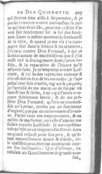 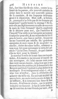 Figure 1a and 1b. Change of type size at the end of a recto page, in the middle of a sentence. The type on the recto page measures 70 mm (20 lines), on the verso only 65 mm (20 lines). Miguel de Cervantes y Saavedra, Histoire de l'admirable don Quichotte de la Manche. Amsterdam: Pietre Humbett, 1735, 12o, 6 vols. Image by courtesy of Bibliothèque Mazarine (Paris), copy: 8o 66103 vol. 1. fols. R11 recto-verso (stcn 182931870)
In this contribution I will focus on one specific type of typographical discontinuity on title-pages of editions published in Flanders between 1501 and 1700. It concerns the way in which a text is printed on one line and - though the meaning of the text continues - how the typographical choices are altered on the next line. This is a phenomenon with which curators and readers are familiar, but yet, to my knowledge, until now there has been no survey addressing it. | |
[pagina 50]
| |
MethodologyTo avoid ambiguity, I will consider only typographical discontinuity on word level and only if a word on the title-page is broken in two parts whereby the first part appears at the end of a line and the second part on the next line.Ga naar voetnoot18 Early modern compositors did not always use a hyphen in those cases; therefore I will include all broken words at the end of lines, both those with or those without a hyphen. Furthermore, I have distinguished only between three kinds of discontinuity, illustrated by figure 2. First of all, I recorded the transition, on word level, of one size of type to another. In those cases, typically, the first part of the word appears in a larger fount and the second part in a smaller type. For instance, the first part of the last word on the third line is printed in larger type than the second part, ‘insti- tvtionvm’. The second kind of discontinuity concerns a transition of case, fount or type family. An example is the word just above the middle of the title-page on the ninth line in the same image (figure 2): ‘recen- tiorum’. The compositor switches in the middle of the word from roman upper case to lower case. A comparable transition happens on line sixteen, where the first syllable of the word ‘NO- uiomago’ is printed in sloped caps, but the rest is in regular italic lowercase. Transitions from roman to gothic type, to italics, or to civilité type, in any direction, fall into this category as well. The third category considered here is colour and comprises any transition on word level from black printing ink to red printing ink or the other way round. Other colours did not turn up in my survey. Colour added by rubricators or illuminators is not taken into account. As a matter of fact, all three examples referred to above also include a transition of colour (figure 2). In what follows, I will systematically refer to those three categories of typographical discontinuity as transition in size, in fount and in colour. The same discontinuities can be recorded for information units greater than word level. A part of a sentence (in grammatical terms: a constituent) can consist of two or more words, part of which can be presented typographically differently from the rest.Ga naar voetnoot19 A clear example of this is the 1542 title-page published in Antwerp by Joannes Steelsius.Ga naar voetnoot20 On the first line appears only one word, ‘Valerius’ in roman type. On the second line is printed ‘maximvs’ in full caps, which are about three times smaller than the ascender ‘l’ on the first line. Both parts belong to the same constituent (‘Valerius Maximus’) but are printed in different ways. It is not always as easy to judge discontinuity on constituent level. Figure 3 may be more complex than it appears at first glance. In Dutch, | |
[pagina 51]
| |
‘Den Spieghel va[n] Oodmoedicheyt’ forms one constituent. The colon at the end of the second line marks the beginning of another one on lines three and four. Within the first constituent the words on the first line are printed in a much larger size than the word ‘oodmoedicheyt’ on the second line, which seems to form an illogical typographical break. In translation this title reads ‘The mirror of modesty’ - couldn't it be that the compositor, typographer and/or the author had ‘modesty’ (‘ootmoedigheid’) printed deliberately in a smaller type size? In other words, to what extent does the physical appearance of this example represent typographical discontinuity rather than just being a case where form is intended to fit content? 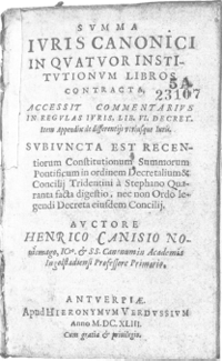 Figure 2. Title-page of a 1643 Antwerp edition, showing three different kinds of typographical discontinuity on word level: change of type size and of colour (end of line 3), change from caps to lower case (line 9), and change from italic caps to italic lower case and of colour (line 16). Henricus Canisius, Svmma Ivris canonici. Antverpiae: apud Hieronymvm Verdvssivm, 1643, 8o. Image by courtesy of Diederik Lanoye, ku Leuven University Library, copy bres r5a23107 (stcv 12857006)
It must be admitted that this example represents the exception. For the sake of clarity, however, I will give the results for typographical discontinuity both on word level and on constituent level, but I will focus my analysis on the former category. In fact, the results for both levels are very similar. | |
[pagina 52]
| |
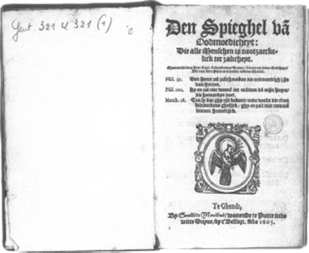 Figure 3. Change of type size in the middle of a constituent, at the beginning of the second line. ‘Oodmoedicheyt’ may have been printed in a smaller type size on purpose to reflect its meaning (‘modesty’). Corn. Columbanus Vrancx, Den spieghel va[n] oodmoedicheyt: die alle menschen is nootzaeckelick ter zalicheyt. Ghendt: Gaultier Manilius, 1605, 8o. Image by courtesy of dr. Hendrik Defoort, Ghent University Library, copy g.000321 (stcv 3140542)
| |
CorpusThe corpus of this survey consists of 1,709 title-pages of books published in the Southern Netherlands between 1501 and 1700. For the first group of works published between 1501 and 1540, the dataset contains 132 title-pages. The second group, for the period 1541-1600, consists of 746 title-pages and is, relatively speaking, the one that is best documented. The third group covers the entire seventeenth century and includes 831 title-pages. Apart from the difference in sample size, there are other differences between the three subsets. For the oldest title-pages printed before 1541, I used a combination of digital surrogates of title-pages available online via the Short Title Catalogue Flanders (stcv), the Universal Short Title Catalogue (ustc), a number of works printed by the printers Dirk Martens and Willem Vorsterman consulted in the Royal Library in Brussels, and also editions in the holdings of the Folger Shakespeare Library in Washington, dc, and the Bibliothèque Mazarine in Paris. Although these cannot be considered a tru- | |
[pagina 53]
| |
ly random sample of that period, the patterns they indicate may nevertheless give a good first indication of the trends in which I am interested.Ga naar voetnoot21 Groups 2 and 3 are large enough for the purpose of this article. All title-pages from the second group are derived from Torad, Typografische Ornamenten Repertorium van Antwerpse Drukkers 1541-1600 [Repertory of Typographical Ornaments of Antwerp Printers 1541-1600], an online database composed by Kristof Selleslach (Museum Plantin-Moretus).Ga naar voetnoot22 In fact, this database contains about 1,850 title pages of Antwerp editions only, about 400 in Dutch and about 1,200 in Latin. For the purposes of this study, inter alia, I analysed almost all Dutch language title-pages in this database (358) in addition to a random selection of Latin title-pages (388).Ga naar voetnoot23 Group 3 consists of 831 title-pages randomly selected from the stcv.Ga naar voetnoot24 They originate from various printing shops in the Southern Netherlands, from those based in Antwerp, Brussels, Ghent, Louvain, Bruges, Courtrai, Hasselt and Mechelen. About half of the works from which they are derived are in Dutch, the other half are in Latin. All title-pages induded in this study have in common the fact that they are dated, either in an imprint or, for works from the first group, in the colophon or elsewhere. In case of any doubt about the period in which a book was produced, the data concerning it were discarded. Despite the differences in composition, for the purpose of this survey all three groups provide sufficient information about the overall trends, and groups 2 and 3 are substantial enough to distinguish between Dutch and Latin language title-pages. | |
ResultsGraphs 1, 2 and 3 display the quantitative results of this survey. The first graph illustrates the trends for typographical discontinuity on title-pages on word level for changes in size, fount and colour. All three features appear with increasing frequency in the period 1521-1550. In the course of the following 150 years, the typographical discontinuity on word level slowly decreases until it has completely disappeared by the end of the seventeenth century. | |
[pagina 54]
| |
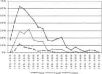 Graph 1. Discontinuity on word level. Change in size, fount and colour on word level on title-pages of books published in the Southern Netherlands between 1501 and 1700 (n = 1,709)
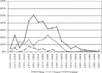 Graph 2. Discontinuity on constituent level. Change in size, fount and colour on constituent level on title-pages of books published in the Southern Netherlands between 1501 and 1700 (n = 1,709)
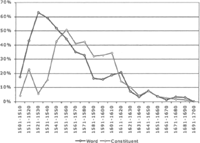 Graph 3. Discontinuity of size on word and on constituent level on title-pages of books published in the Southern Netherlands between 1501 and 1700 (n = 1,709)
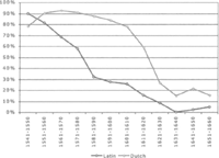 Graph 4. Discontinuity of any kind on title-pages of Latin and Dutch-language books published in the Southern Netherlands between 1541 and 1660 (nLatin = 650; nDutch = 632)
Similar trends are discernible on constituent level (graph 2). Graph 3 displays the results for the most important kind of discontinuity, that is transition in size, both on word level and on constituent level. This comparison suggests that discontinuity of size on constituent level emerges on title-pages somewhat later than on word level, but from the 1550s onwards, both features describe the same curve. For methodological reasons explained above, the main focus here is on the information shown on the first graph. The period until 1530 constitutes a period of constant growth: more and more title pages display discontinuity of size on word level. Between 1521 and 1530, this feature is visible on 63% of the title-pages in this survey. From that | |
[pagina 55]
| |
period onwards, the phenomenon of typographical discontinuity starts to erode, between 1531 and the 1580s quite rapidly, and afterwards at a slower pace. It takes about a century for this feature to dwindle further from about 17% on title-pages in the period 1581-1590 to zero in the final decade of the seventeenth century. The numbers for each kind of discontinuity are different, but the overall trends are more or less the same. The differences of intensity are related to the practice in the printing shops. It is evident that the second kind of typographical discontinuity (change of fount) requires the existence and presence of different founts. Around 1500, there was only one type of fount in use in the Southern Netherlands: black letter. Roman type was introduced by Dirk Martens at the beginning of the sixteenth century and from there the new fount was adapted for works in Latin by most printers around 1540. By that time, it had begun to appear on title-pages of works in the vernacular as well.Ga naar voetnoot25 This helps to explain the slower increase of the change of fount on word level on title-pages. The numbers for change of colour are very limited. This is due to the fact that only a small fraction of title-pages were printed in more than one colour.Ga naar voetnoot26 However, generally speaking, the overall trend is the same as for size and type fount. Graph 4 provides details about the difference between title-pages of Latin and Dutch books for the period 1541-1660. This graph shows any of the main kinds of typographical discontinuity (size, fount, colour). For Latin books, it shows that this custom diminishes at a rate of about 10% per decade between 1541 and 1580. In the next decade, the graph shows a decrease of 26%, from 58% in the 1570s to 32% in the 1580s. From then onwards, the downward trend slows down. During the next 70 years, typographical discontinuity almost completely disappears from Latin title-pages. This is different for works in the vernacular. The phenomenon reaches its apex in the 1560s, when it appears on about 92% of all Dutch language title-pages. During the following four decades, it decreases only very slowly, to 78% in the first decade of the seventeenth century. But from then on, the graph shows a drop at a very high rate during the next 30 years, reaching 15% in the 1630s, a level which is more or less maintained until the 1650s. From graph 1 it has become clear that the trend goes further downward until the end of the century. | |
New approaches to book designThe trends emerging from this analysis confirm previous observations about the layout and design of early modern books from the Southern Netherlands, specifically those about the use of type, the use of articulation aids (e.g., single vine leaves and paragraph marks) and the overall dispositio of title-pages.Ga naar voetnoot27 Very soon after the introduction of new | |
[pagina 56]
| |
founts and the proliferation of different type sizes, these materials are used to create specific designs on title-pages of both Latin and vernacular works, including typographical discontinuities of different kinds. Thus far, I have not been able to identify the earliest title-pages showing typographical discontinuity, but the phenomenon spreads from the first decade of the sixteenth century onwards, as books in this region begin, increasingly, to feature what we would recognise as title-pages.Ga naar voetnoot28 Within one generation, typographical discontinuity becomes a real trend - within a few decades it appears on the majority of all title-pages. Unlike the single vine leaf, which appears from the late 1510s, it is not a fashion. It is fairly persistent, but when the typographic custom of breaking up words or larger information units begins to erode, its fate is sealed. As is the case with many other layout trends, it is unstoppable, and finally, after more than 150 years, the last traces of this typographical custom are gone and the phenomenon of typographical discontinuity has vanished. The way in which typographers begin to design Latin title-pages in the 1530s and the following decades is soon imitated for works in the vernacular. Here again, a practice that is geared towards international audiences comes with time to be considered apt for local markets as well. At this point, it remains a question whether this is an example of what Hans Naumann (1886-1951) defined as ‘gesunkenes Kulturgut’, implying a ‘higher’ culture which trickles down to a ‘lower’ culture,Ga naar voetnoot29 or whether it is just a matter of rationalisation, where printers pursue more streamlined processes for the design of all books irrespective of language or market - or whether it is perhaps a combination of cultural, economie, and other factors.Ga naar voetnoot30 As for the question as to why what happened happened, I would like to propose the following hypothesis. Unlike other elements of layout, such as articulation aids, or specific arrangements of paragraphs to create special shapes, typographical discontinuity on word or constituent level always explicitly interferes with content. In the beginning of book production with movable type, apparently this did not constitute a problem for typographers: the tradition of presenting the first line of a text in a larger size than the next one was more important than exactly what information this line contained. Its function - i.e., visibly to articulate the larger structure of a substantial information sequence by signalling the beginning of a new text, a volume or a part - was considered culturally more important than the actual content itself. The articulation function for the text as a whole superseded the importance of the actual content of the information affected by this specific physical presentation. For a long time, this cultural norm proved to be very tenacious.Ga naar voetnoot31 But around the middle of the sixteenth century there emerged another concern or desire, which slowly but surely gained ground. There was clearly a growing interest in the physical organisation of information that was charac- | |
[pagina 57]
| |
terised by a clear preference for presenting each of its various constituent parts as a whole. In other words, it became unthinkable to split words like ‘institvtionvm’, ‘recentionum’ of ‘Nouiomago’ in two parts each with different layouts, or to print one part of a name in a different type size, fount, or colour, from the rest of the name. According to this logic, form has to be congruent with the information shown. More and more, a particular logic of the meaning of the information unit itself begins to supersede the traditional logic favouring formal articulation of the text over its content. As time goes by, the new norm wins over the old one, and ultimately it is considered no longer acceptable to split up words or larger information units whose parts are presented typographically in different ways. Support for this hypothesis can be found elsewhere in the early modern printed book. It is, for instance, discernible in the way typographers in the sixteenth century deal with the transition from one chapter to the next one. As I described in my analysis of folio Bibles from this period, for example, it was not considered a problem to print the title of a new chapter at the very bottom of the right hand-side column on the page, even when this is the recto side of a leaf.Ga naar voetnoot32 The link between title and text is physically broken. As a result, the reader has to flip back to find the chapter title and to flip forward to read the text. This phenomenon, which involved the creation of typographical orphans and widows, disappears in the seventeenth century.Ga naar voetnoot33 Another indication of the increasing interest in the information unit as such is the introduction of verse numbers, notably by Christopher Plantin in his 1566 folio Bible printed in his Antwerp workshop. He did not invent this feature but copied it from Robert Estienne, who had introduced it in his Bibles about a decade before. Plantin was able to integrate this new feature in his Bibles in a very elegant way. He combined socalled Aldine white spaces with very discreet numbers along a vertical hairline in the middle of the columns to indicate the beginning of new verses. By doing so, he married the traditional care for the rectangular form of the text blockGa naar voetnoot34 on the one hand with the growing need to refer more precisely to information units in a large body of text on the other. Perhaps there is also a link between the decreasing acceptance of typographical discontinuity on title-pages and the disappearing of the epigraphical ‘v’ in titles in the seventeenth century.Ga naar voetnoot35 The analysis of title words on title-pages in the Southern Netherlands in the seventeenth century clearly indicates a rejection of the use of the letter ‘v’ in lieu of the letter ‘u’, on both Latin and Dutch title-pages. At a certain moment, the | |
[pagina 58]
| |
desire to represent a word as ‘scriptvre’ rather as ‘scripture’ outweighed the tradition of following an epigraphical custom.Ga naar voetnoot36 The question as to whether the transition from v to u was accelerated by the creation of the right punches to cast the types needed to print the u in various sizes is not pertinent. The fact is that, at a particular moment, typographers showed interest in using it, most probably simply because the circumstances were right to make the change. They feit that the market, the reader, and the society would accept the new norm, and consequently they carried it out.Ga naar voetnoot37 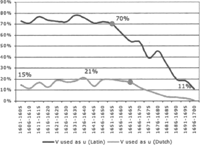 Graph 5. Latin and Dutch title words containing a ‘v’ (or ‘V’) used as ‘u’ (or ‘U’). Information derived from Latin and Dutch language editions published in the Southern Netherlands between 1601 and 1700 as described in stcv (n = 17,780)
| |
ConclusionIn his latest publication the Dutch scholar-librarian Willem Heijting reflects upon our field of study. The author points out that the evolution of the book - in a broad sense - is constantly being pushed forward by history.Ga naar voetnoot38 As one medium amongst other media, the book reacts to changes in society. Whenever societal norms begin to shift, this necessarily impacts on the book, because the book, as a material support of text, information, knowledge and meaning, is an artefact which is intimately interconnected with societal norms. And as the book does so, it confirms altered social norms by integrating them into its own appearance and functions. | |
[pagina 59]
| |
This article describes what happens in the book when specific social norms begin to change. This becomes apparent in the formal presentation of content on the title-page during the sixteenth and seventeenth centuries. As people take more and more interest in the organisation and presentation of information, this is reflected in a more analytical formal representation of that information. As a result, slowly but surely, patterns which favoured traditional and more organic ways of representing the structure of a text fall into disuse and are replaced by new ones. In the early modern printed book, the typographically broken word never represents just a broken word, and neither is the epigraphical v just a substitute for the u. For those who pay attention to the delicate processes of book design, the effects of the new societal needs are visible in the way typographers re-evaluate the mise-en-page and the mise-en-texte of books in the course of the two centuries surveyed here, both in the way books are presented to the general public and in the way some macro-structural elements of the layout of the text proper are being revised. The societal changes driving typographical metamorphoses addressed in this article reach far beyond the fairly small but productive region of the Southern Netherlands. Further research is needed in order correctly to assess cultural changes on an international level and their impact on the book. It is clear that the layout and design of this pre-eminent support of our culture has not yet yielded up its secrets. Paradoxically, a medium itself for knowledge and wisdom, the mechanisms and code of this medium have for a long time escaped thorough analysis. If the academie society truly believes in groundbreaking work, innovative and fundamental research that is relevant to our history and culture, it should take on this task.Ga naar voetnoot39 |
|

