Jaarboek voor Nederlandse Boekgeschiedenis. Jaargang 19
(2012)– [tijdschrift] Jaarboek voor Nederlandse Boekgeschiedenis–
[pagina 101]
| |
Niki Sioki & Mary C. Dyson
| |
[pagina 102]
| |
The earliest known printed Greek alphabet bookTraditionally, in the Greek educational system reading was taught through alphabet booksGa naar voetnoot4 (alphavitaria) and reading books (anagnostika). These books represented two different levels of development in reading skills. Alphabet books were used in the first year of primary school and aimed to introduce young children to learning to read the letters of the alphabet, syllables and simple words. They usually consisted of two parts: in part A children learned how to decode letters; part B represented an advanced stage in reading. Children gradually became fluent and started to read for understanding the meaning of the text. The difference between the two parts of the books was typographically signaled. By contrast, reading books taught young children how to read and interpret different kinds of texts. They were used throughout the remaining grades of the primary school. The first printed Greek alphabet books, which introduced a specific method for the teaching of reading, started to appear in the last decades of the eighteenth century, during the period of the Neohellenic Enlightenment, and continued to be published up to the beginning of the nineteenth century. As artefacts, they tended to share some characteristics. First, most contained in their title the word alphavitarion (alphabet book), since learning the alphabet dominated the early teaching of reading; a single method was adopted by all of them.Ga naar voetnoot5 First, small letters in alphabetical order and also in the reverse order were presented;Ga naar voetnoot6 then, the same was done with capital letters, and finally with columns of syllables. Thus, children proceeded from the naming of letters and the recognition of letterforms to spelling syllables which were combinations of different sounds, those of vowels and consonants, and had no concrete meaning. Second, their content had a common structure. Only a small number of pages were dedicated to teaching the reading mechanism: approximately six to nine pages at the beginning of the book. They were followed by a variety of texts, mainly of religious and ethical content. Third, they were produced outside the contemporary Greek territories and addressed a readership of native speakers who were mainly members of Greek communities established in major European commercial centres. In the period under examination, Greek books were printed for the Greek communities (paroikies) which were established throughout the Mediterranean, the Balkans, central Europe and southern Russia.Ga naar voetnoot7 During a period of almost 300 years (sixteenth-eighteenth centuries) Venice was the printing centre for the production of Greek books. Three printing establishments owned and run by Greeks (Glykis, Saros and Theodosiou) were responsible for the majority of the published titles. In the beginning of the nineteenth century printing | |
[pagina 103]
| |
houses which produced Greek books were found in 33 cities. Besides Venice, Vienna, Paris, and Constantinople had also become printing centres where many Greek titles were produced.Ga naar voetnoot8 They were manufactured in those cities by local compositors and printers, ‘accustomed to the conventions of the Latin alphabet’,Ga naar voetnoot9 who worked with types designed and engraved by skillful craftsmen also of foreign origin. 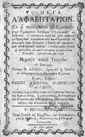 Figure 1: M. Papageorgiou, Mega alphavitarion.
Vienna: Joseph Kurzböck, 1771. Thessaloniki, Aristotle University of Thessaloniki Library, PA1059.P36 1771 The Mega alphavitarion (‘The grand alphabet book’) by Michael PapageorgiouGa naar voetnoot10 (1727-1796) (fig. 1) is a typical alphabet book of the kind used up to the first decades of the nineteenth century. This book succeeded what was known as the traditional ‘religious alphabet book’ entitled Chrisimos paidagogia (‘Useful pedagogy’). Called ‘fyllada’ (broadsheet), it was printed on a single sheet of paper to produce sixteen octavo size pages. This constituted the main instructional tool used for teaching reading during the Ottoman rule over the Greek territory, that is from the middle of the fifteenth to the early nineteenth century. The dual alphabet, capitals and lower case letters, was presented in the alphabetical and reverse order in the limited space of a few introductory | |
[pagina 104]
| |
lines, and was followed by prayers and liturgical texts. The woodcut that depicted a teacher and his pupils (at the top of the first page) and the alphabet were the only visual clues to the potential instructional usage of the book. Chrisimos paidagogia was a tool generated within a period where an organised educational system was absent and the church ideology dominated every aspect of everyday life. Thus, when the Mega alphavitarion first appeared in 1771 in Vienna, it signaled a transition to a new era. Printed by Joseph Kurzböck (1757-1792),Ga naar voetnoot11 it can be considered an original product of the Neohellenic Enlightenment mainly because it was tailor-made for reading instruction, and signified the abandonment of traditional reading tools such as liturgical books. Still its content continued to express the strong influence of the church. Papageorgiou was a well educated member of the clergy. Having studied philosophy and medicine, he was teaching in Greek schools in Vienna and Pest. He had experience of authorship since he had previously published two educational books. As indicated in the preface, the author addressed the content of the book to a specific age group, notably young children who were learning the alphabet, taking into consideration their cognitive skills; older children were not included in his target readership. The instruction was twofold: in the first stage children were taught to read the range of letter forms they would be confronted with later in life. This included learning to decode the 24 letters of the Greek alphabet, the different forms in which some of the letters could be written, and ligatures and contractions encountered in contemporary documents; in the second stage they learned how to read continuous texts ‘in the right way’ by following the accents, the breathings and the punctuation marks. There is no indication that learning to write was addressed. The type used for the composition of the text embraced the characteristics of the Garalde letter: inclined (though certain letters may appear less so), based on a cursive hand, with condensed counters, contrast between thick and thin lines and numerous ligatures and contractions. The font contained the alternative forms of small letters β, γ, δ, θ, π, ρ, σ, and τ, had a limited number of ligatures, and was characterised by a heavily inclined stress. The ligatures used throughout the book were και, ου, σχ, σθ, στ, λλ, and the Greek equivalent to the Latin ampersand. A comparison of the Mega alphavitarion with other Greek publications printed in Vienna in the last thirty years of the eighteenth century, and more specifically with Greek newspapers,Ga naar voetnoot12 reveals that the typefaces used had the same visual properties, and the fonts employed consisted of the same restricted number of ligatures. Therefore, the features of the typefaces and the way in which type was used did not address the needs of the particular readership nor the special requirements of the intended instructional use of the book. Decisions concerning the choice of type and its use were rather dictated by the everyday printing practice | |
[pagina 105]
| |
of letterpress composition which limited the range of characters that could be printed, and presented a problem to overcome when characters for special situations, for example words in a foreign language, were needed.Ga naar voetnoot13 The first nine pages were dedicated to learning to read through the alphabetical method; content was presented in a gradual progression from simple letters to meaningless syllables created by combining two and three letters. At the same time the graphic organisation of text supported the instructional purpose of the book. The alphabet was presented from A to Ω, then backwards from Ω to A, and finally in an entirely random order (fig. 2).Ga naar voetnoot14 Letters and syllables were arranged one beneath the other in columns as in a table (fig. 3);Ga naar voetnoot15 this kind of text configuration was traditionally considered to have a mnemonic value.Ga naar voetnoot16 Vertical and horizontal spacing was the basic means for organizing such discrete units of information.Ga naar voetnoot17 No particular aids, such as column and row headings and dividing rules, were used to direct looking at and reading the text. Therefore there was no indication of how the table of syllables should be read. The author probably relied on the guidance provided by the teacher. In the copy examinedGa naar voetnoot18 a child's scribbles on the first page could be interpreted as a child's need to further clarify the structure of the content. The content was divided into different sections introduced by a title set in capitals. Subtitles within each section were set in capital and small letters in a larger size than the main text. The important parts of the main text were made to stand out by using a larger size (fig. 4).Ga naar voetnoot19 In this book, variation in size was used for emphasis and was applied in headings, which were meant to direct the teacher, and in continuous prose which addressed an advanced stage of reading. Two different sizes of letters were used. In both sizes, the inclined lower case letters were complemented by upright capitals. For centuries, this had been the norm in Greek type design. As Bowman states: ‘Baskerville's Greek of 1761 seems to have been the first to have capitals sloped to the same inclination | |
[pagina 106]
| |
as the lower case’. But even when inclined capitals were available, upright capitals continued to be more popular among printers.Ga naar voetnoot20 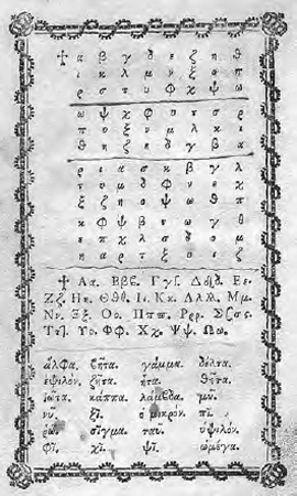 Figure 2: Presentation of the lower case alphabet in Mega alphavitarion
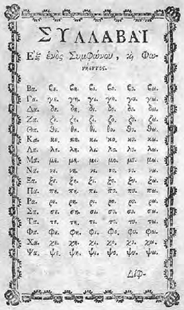 Figure 3: Presentation of syllables in Mega alphavitarion
Overall, the graphic organisation of content was derived from the linear interrupted continuous text resulting in the creation of an instructional environment which was aimed at helping children learn. Learning should take place through memorisation of the alphabet and the practice of reading syllables increasing in complexity. The technologies available, that is manual typecasting and hand typesetting of text, provided the basic means for graphic articulation: the dual alphabet, the use of size for emphasis, and spatial organisation.Ga naar voetnoot21 All these elements were employed towards the creation of a text layout of mnemonic value. No effort was apparently made to render the pages aesthetically pleasing. In the remainder of pages simple prayers, specifically chosen for the particular readership, were set as linear interrupted continuous prose which addressed the practice of | |
[pagina 107]
| |
fluent reading. The appearance of these pages was influenced by the traditional setting of Greek liturgical books where large size initial capital letters introduced the beginning of each prayer. Additionally, a limited number of ornamental typographical rules were used to distinguish each prayer from the following one in an overcrowded page where space was not enough. 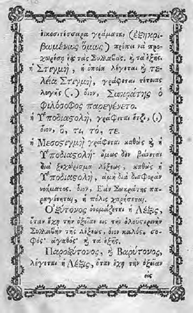 Figure 4: Emphasis was articulated through variation in size. It was applied in continuous prose
Pagination was not applied. The sequence of text from one page to the next was indicated through catchwords set as direction lines at the bottom of each page just below the text. The absence of page numbers probably obstructed random access of the content and the communication between teacher and pupil and could imply the strict sequential usage of the book. All text matter was set within a decorative border following the visual appearance of the title page. Traditionally, as already discussed by Barker,Ga naar voetnoot22 the function of the border | |
[pagina 108]
| |
was to visually support the text and dictate an organised layout within a restricted and given space. The use of the border throughout this book also enhanced the bilateral symmetry of the facing pages, notably in the double-page spread each page was the mirror image of the other; this arrangement reinforced the priority of the spread over the page in the design of the book.Ga naar voetnoot23 Thus, it is most probable that the use of the border was prescribed either by tradition, or by the author's copy or contemporary printing practiceGa naar voetnoot24 and was not related to the intended use of the particular book. The visual structure of the Mega alphavitarion articulated the alphabetical method applied to learning to read; a similar visual appearance was also adopted by the majority of Greek alphabet books which applied the same teaching method, and which were published up to the 1830s. This fact together with the existence of subsequent editions, and the known numbers of the print runs,Ga naar voetnoot25 provides evidence of the long-lasting influence of the book. | |
Types and layout in early Greek alphabet booksA closer look at a sample of books printed up to 1830 supports this statement and at the same time introduces two titles with a different visual approach. All the books in the sample were set in typefaces which resembled those used in the Mega alphavitarion. No significant evolution can be identified in the fonts used for the typesetting of text apart from a reduction in the number of ligatures and contractions which gave to the overall appearance of the Greek typeset page a degree of simplicity. The following are to be found in the main text: και, ου, σχ, σθ, οτ, λλ, and the Greek equivalent to the Latin ampersand. This is a small number when compared to the list of 43 contractions printed at the back of the Mega alphavitarion, and departs from the common setting of Greek type in that period. Therefore, the focus is on the layout of the page. What is encountered is basically a repetition of the text configurations already applied in the Mega alphavitarion enriched by changes which improved the graphic representation of the content on the page. Poikili didaskalia (‘Various teachings’) by Polyzois Kontos (1806) and Alphavitarion aploellinikon (‘Simple Hellenic alphabet book’) by B.P. Efthimiou (1807) are two alphabet books written by clergymen and printed in Vienna at the printing office of Georgios Vendotis.Ga naar voetnoot26 An interesting feature of both books is those parts of the text where the structure of the content has been graphically reinforced to facilitate the learning process. | |
[pagina 109]
| |
In Kontos' alphabet book the lower case alphabet was presented in different arrangements. Each one was separated by horizontal lines organizing the content in short textual segments (fig. 4). Those lines were used to avoid confusion because space was not adequate. It was a rational printer's decision that helped the reader as the scribbles on the copy of the Mega alphavitarion suggest (fig. 2). 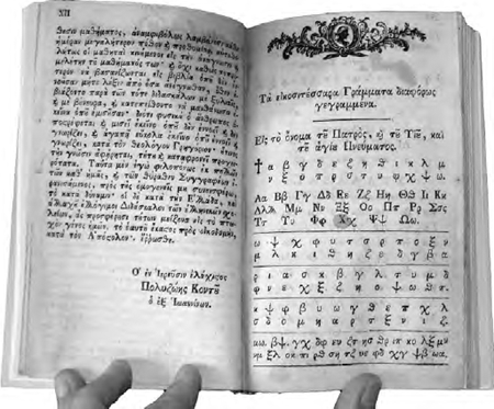 Figure 5: P. Kontos, Poikili didaskalia. Vienna: Georgios Vendotis, 1806. Gennadius Library, American School of Classical Studies at Athens, mgl 157.4
In Efthimiou's alphabet book children were first introduced to the dual form of vowels and consonants arranged into text segments of no more than two lines divided by topical headings. This information was repeated on the next page where it was arranged in a table of four columns separated by vertical lines to compensate for the lack of space. Column headings were added at the top of the table indicating the content of each column and directing the reader to read the text vertically. Moreover, each letter followed by each name was arranged and presented in a matrix configuration based on the use of space without rules (fig. 5). In the following pages syllables were still presented in spaced columns, a structure already used in the Mega alphavitarion. Finally words increasing in their complexity were arranged in numbered text sections no longer than five lines. The organisation of text in short segments was traditionally used as a mnemonic aid. | |
[pagina 110]
| |
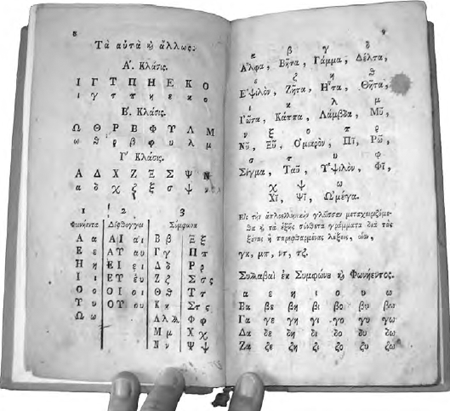 Figure 6: B.P. Efthimiou, Alphavitarion aploellinikon, Vienna: Hellenic printing office of Georgios Vendotis, Vienna 1807. Gennadius Library, American School of Classical Studies at Athens, mgl 1199.31
Ten years later an alphabet book entitled Hellenic alphabet book reproduced the text and the visual organisation of Efthimiou's book. The book was printed by De Hirschfeld in Vienna in 1816, probably the same year that Efthimiou died.Ga naar voetnoot27 No author's name appeared on the title page, and the preface, unlike Efthimiou's, was signed by the publisher. As indicated on the title page it was not an original work but a collection of material that had been previously published. In any case the choice to reproduce it could be interpreted as an acknowledgement of its quality and influence. It could also be a wise publishing decision since it was an established policy among printers to produce their own alphabet book, firstly because it had a low production cost, and secondly because of the added value such a title offered in their publisher's catalogue.Ga naar voetnoot28 | |
[pagina 111]
| |
Protopiria aploelliniki (‘First experience in simple Hellenic’) was published in 1818 in Vienna by Dimitrios Darvaris (1757-1823). He was an experienced author of educational books and one who had already acknowledged the importance of reading books in an essay entitled ‘About the reading of books’ published in Logios Ermis in 1812. Protopiria was the second alphabet book that Darvaris published. It was printed by Anton von Heykul who, although of German origin, had experience in the printing of Greek books. The visual appearance of the content does not dramatically differ from the books already discussed. Columns are the preferred configuration. All introductory content is organised in short textual sections divided by a rule shorter in length than the width of the text (fig. 7). This is the only alphabet book where the title ‘Table of syllables’ defines the section devoted to syllables. Two important points are worth mentioning. As explained in the preface the children first encountered the handwritten letter shown on the blackboard and then they came across the printed one in the book. The book was meant to be used for practicing oral reading after a new reading element was introduced on the blackboard. Thus, work in the classroom addressed both the auditory and the visual senses. Moreover, at the elementary stage, children were encouraged to run their finger along the line they were reading to help their eyes follow the correct sequence of letters and words. Looking at the way the letters and the syllables are arranged, it is not difficult to imagine a child's small finger fitting in the space between words. 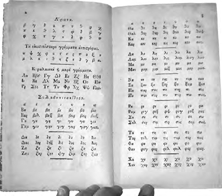 Figure 7: D. Darvaris, Protopiria aploelliniki, Vienna: Anton von Heikul, 1818. Gennadius Library, American School of Classical Studies at Athens, mgl 225.4
| |
[pagina 112]
| |
As a final example Rousiadis' (1783-1854) Neon alphavitarion (‘New alphabet book’) was selected to stress how different it is from the previous books and to what extent its visual appearance failed to realise the author's principles of learning. The principles presented in the instructions provided by the author to the teacher primarily exalted the importance of learning through the eye. This principle justified the heavy use of the blackboard in the classroom for teaching, but it did not exercise any influence at all on the appearance of the alphabet book, which was mainly used as an auxiliary tool. The content was presented as continuous prose with no provision to aid learning through the organisation of the text (fig. 8). As a result the child encountered a dense page with no space available for the eye to rest and the finger to point at. 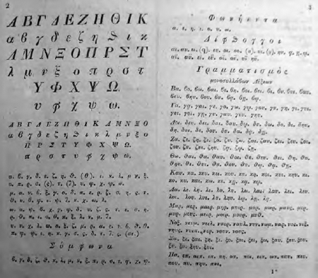 Figure 8: G. Roussiadis, Neon alphavitarion. Pest: J. Trattner, 1829. Athens, National Library of Greece, EKΠ 922 si
In all the books which shared the same visual organisation of content, size was the predominant factor which defined the design solutions. No book was larger than octavo and smaller than a sedecimo. All sizes could be easily handled by small children, although the choice of size relates more to technological reasons and a taste in book manufacturing than the intended use of the books. As testified in a book written by one of the authors, Dimitrios Darvaris, a preference for small and manageable book sizes | |
[pagina 113]
| |
was manifest at the end of the eighteenth century. In 1797, Darvaris was writing ‘today very few people enjoy reading large books; on the contrary, all prefer their books to be small, elegant, easy to fit in a pocket’.Ga naar voetnoot29 This preference for small sizes, mainly because of the improved portability, was associated with the emergence of a reading culture during the Enlightenment. Changes in reading attitude were followed by changes in the appearance of books. The size of books was affected by a gradual decrease, and 16mo, applied to novels, proved to be the one most preferred.Ga naar voetnoot30 | |
The graphic articulation of the alphabetical method of readingThe observation made above has clearly shown that within the framework of the alphabetical method the basic reading mechanism was gradually imparted through spatial organisation of the content. Text was organised in columns and short textual segments. Both these text configurations were traditionally associated with the mnemonic function of layout as it was widely applied in the manuscript book of the Middle Ages. The choice of typeface used could not be related either to the intended usage of the book or the skills and experience of the target readership; on the contrary, the types used belonged to the common printer's armory. Although the author, in most cases, explicitly expressed his intention to stimulate the child's curiosity and love for learning, such an intention was not reflected in the visual appearance of the books. Pictorial language was avoided since the cost of book production increased when illustrations were included.Ga naar voetnoot31 Knowledge was transmitted exclusively through words. Greek pupils had to wait until 1860 for the first alphabet book with illustrations to appear. The alphabetical method adopted in these books for learning to read transformed not only the way reading had been taught, but also the graphic articulation of their content. For Greek children a more radical change was taking place. What was abandoned was not just a book of no instructional merit but also a book that in many cases was handwritten. For almost 300 years, the manuscript book had been the main book available for studying. In the preface of his alphabet book Polizois Kontos explicitly recounts his own experience as a small child when he learned to read using ‘a manuscript alphabet book’ and then struggled to practice fluent reading with books so ‘incomprehensible’ that even the teachers could not understand them. For this reason he compiled Poikili didaskalia with the aim of making children ‘recognise accurately the letters, various syllables, words, and sentences’.Ga naar voetnoot32 This statement appears to make a reference to the visual authority and standardisation of the printed book. | |
[pagina 114]
| |
Similarly, in the preface of his primer Alphavitarion apploellinikon, Efthimiou, advising the future teacher of the common school on how to use the alphabet book, recommended ‘to use in practice this alphabet book and teach, not blind as we have learned to do, but by applying a rational judgment and a right method’.Ga naar voetnoot33 And further down he explicitly stated that one of his intentions was ‘to help the teacher avoid writing the alphabet, daily, in a bad script, on the pupils' slates’.Ga naar voetnoot34 So, the alphabet book was meant as a substitute for slates and handwriting and represents an improvement and evolution towards the better appearance of letters. However, it seems that for this particular author the role of the book was much more meaningful since it was presented as an agent of reason and method in teaching. | |
Serving the reader: the case of two alphabet booksIn this landscape dominated by the primacy of the text and the total absence of pictorial elements, the publication of two titles stands out, because their content was visually enriched. The Vendotis alphabet book of 1792 printed in Vienna and the Kokkonis edition of 1817 printed in Constantinople are two books whose visual appearance drew children's attention. This was explicitly expressed on the first page of each book. In both cases the presentation of the alphabet in a display mode announced what the book was intended for and the profile of the reader. In Vendotis, ornamental letters of 16 mm height were arranged within a rectangular page border, presenting the capital alphabet (fig. 9). As Vendotis explained in his preface ‘First the 24 letters are presented (...) with ornaments in order to be pleasant for the children’. In the following pages of the book, content was presented with the correct balance of black and white space and the common text configurations were orderly arranged in a symmetrical spread. This was probably the result of a charismatic personality being involved in the making of the book. As already mentioned, Vendotis was not only the printer of the book but also a scholar with a long experience in writing and translating contemporary European works. Therefore, he possessed the theoretical knowledge to embrace a methodological approach that originated in the second half of the eighteenth century and would dominate European education throughout the nineteenth, that is learning by vision. At the same time his long preoccupation with printing offered him the technical knowledge and skills to articulate this method by typographical means using the available technology, letterpress and woodcut letters. In the same vein, Kokkonis' book was clearly compiled for use by children. On the title page, it is explicitly announced that this is an ‘attractive and methodical book for learning to read easily’. Thus, in the first two pages the intention to create a visually stimulating composition could be detected: the lower case alphabet was presented in two display plates (fig. 9). Letter forms, reproduced in copper engravings, had the characteristics of handwritten forms. Hooked terminals and a slight difference between | |
[pagina 115]
| |
thick and thin strokes were the only features they shared. Apart from these similarities, each character had a unique form. Improvisation in the forms of the letters could probably be attributed to a craftsman who had no acquaintance with the Greek alphabet, or a rough sketch probably drawn by the author himself in order to guide the engraver. It may have been done on purpose to counteract the austerity of the printed page and endow the book with a childish and more enjoyable appearance. 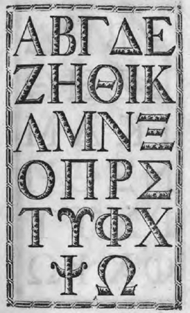 Figure 9: Alphavitarion micron, Vienna, Hellenic printing office of Georgios Vendotis, 1792. Athens, Library of the Hellenic Parliament, ΣΒΕ 1792 ΑΛΦ
In fact, Kokkonis had received a good education. At the time of the book's compilation he worked as a private tutor in Constantinople. His preface provides evidence that he was well informed about the methods employed for teaching reading in Europe at the time. He compiled the book with the intention of solving children's difficulties in learning to read and making the process more enjoyable. This is the main reason why having rejected the alphabetical method, he adopted a new one, the phonic, considering it quicker and more effective. Although these two books apply a different method of learning to read, their visual appearance testifies to what they appear to have in common: both compilers were | |
[pagina 116]
| |
likely to support the principle that ‘learning is best when enjoyable’, promulgated in the eighteenth century by European educators such as Johann Bernhard Basedow (1724-1790) in Germany.Ga naar voetnoot35 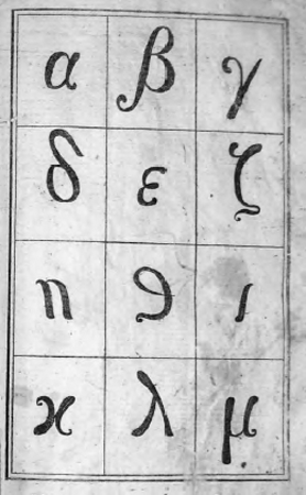 Figure 10: I. Kokkonis, Paidagogos ton neon.
Constantinople 1817. Gennadius Library, American School of Classical Studies at Athens, mgl 218.5 To conclude, in all books discussed above the method adopted for introducing children to read was graphically articulated by text configurations traditionally associated with learning and typographical variables related to letterpress printing. It seems likely that the quality of the final page layout was the result of the collaboration of the author, who was always a teacher, and the printer. There is no evidence to help us determine whether the final product followed the author's manuscript or was merely the result of the printer's experience with earlier similar works. In each case, the quality of the final visual presentation relied on the motivations and skills of both professionals. In the history of the Greek alphabet book the relationship between the author and the printer emerged as a significant contextual influence on the making of the books. |
|

