De Gulden Passer. Jaargang 81
(2003)– [tijdschrift] Gulden Passer, De–
[pagina 115]
| ||||||||||||||||||||||||||||||||||||||||||||||||||||||||||||||||||||||||||||
Hendrik D.L. Vervliet
| ||||||||||||||||||||||||||||||||||||||||||||||||||||||||||||||||||||||||||||
[pagina 116]
| ||||||||||||||||||||||||||||||||||||||||||||||||||||||||||||||||||||||||||||
teius (Visagier) is quite explicit, praising Colines, Estienne and (Francis?) Gryphius as follows: Inter tot, norunt libros qui cudere, tres sunt
Insignes: languet caetera turba fame.
Castigat Stephanus, sculpit Colinaeus: utrunque
Gryphius edocta mente manuque facit.
(Vulteius, Epigrammata, Lyons, 1536, 54)Ga naar voetnoot10
Third, the coherent design of the typefaces used in his books points to a single hand. Moreover, their use is restricted to Colines's own press and those of his stepchildren (Robert Estienne from 1526, Francis Estienne from 1537 and Chaudière mainly from 1545/6 onwards) or those of his partners (mainly Blaubloom in the years 1529-1536). The limited distribution of these faces suggests that they were proprietary to their maker and that their engraver was not serving other presses. Finally there are two documents indirectly originating from the elder Guillaume Le Bé. He must have known the aging Colines or learned about his reputation during an apprenticeship in the 1540-50s at Robert i Estienne's and Claude Garamont's premises. Le Bé later specialized in cutting music and Hebrew types. Towards the end of his life († 1598) he owned a unmatched collection of punches and matrices by Garamont, Granjon, and other contemporary masters; it became a basis for the main Paris typefoundry which was headed by four generations of Le Bés and two of Fourniers and lasted until the beginning of the nineteenth century.Ga naar voetnoot11 The first Le Bé document is an inventory of his typefoundry, preserved in an eighteenth-century copy in the hand of the elder Fournier.Ga naar voetnoot12 The exact date of the lost original is unclear but it may have been written or updated by the younger Guillaume (ii) Le Bé after 1608, a date which is affixed to the entry of an antiphonal music.Ga naar voetnoot13 It probably dates from around 1618, as the inventory includes punches and matrices from the Du Chemin heritage.Ga naar voetnoot14 The c.1618 Le Bé inventory regularly describes the founts by their size and the punchcutter's name. It mentions three romans by Colines; they are described below in §§ 9, 10 and 16. The other Le Bé document is a memorandum of chiefly biographical notes about French punchcutters, typefounders and printers active in the sixteenth and the early seventeenth centuries. Its first part was compiled and written by the same Guillaume ii Le Bé about 1643. His father evidently was the main source for the earlier part of the story. The memorandum cites Colines as a ‘homme expert aux caracteres’ and as instructor of Robert i Estienne in the craft of typefounding and punchcutting; it mentions a Petit-texte roman of Colines (probably his Minion; see § 10), his italics and, in a general way, that he was the first in France to copy the Aldine romans.Ga naar voetnoot15 | ||||||||||||||||||||||||||||||||||||||||||||||||||||||||||||||||||||||||||||
[pagina 117]
| ||||||||||||||||||||||||||||||||||||||||||||||||||||||||||||||||||||||||||||
However, Colines's authorship of the types he used - allowing for some exceptions at the start and the end of his career - should not be overstated. It would be a misconception to think that Colines was the sole or anyhow one of the very few letter-cutters working in Paris. At the beginning of his career, about 1518-20, there were several of them and at its end they were numerous. Guillaume Le Rouge, the only other Paris type-engraver known by name,Ga naar voetnoot16 may just about then have passed on, but exquisite gothic typefaces were still available in Paris, though I lack information whether new types were engraved or rather the old ones recast. About 1519-21 Vatel engraved his two Greeks.Ga naar voetnoot17 About he same time, an anonymous punchcutter provided Gourmont with the first typecast HebrewGa naar voetnoot18 and was Gromors enabled to display a fresh Great-primer roman and an italic on Long Primer.Ga naar voetnoot19 Desprez introduced in 1519 a new Saint-augustin;Ga naar voetnoot20 Vidoue in 1521-23 a new Nonpareil romanGa naar voetnoot21 and Brevier roman.Ga naar voetnoot22 Still about 1519, there was or were the punchcutter(s) making the rough Paris imitations of the R8.5 Basle capitals.Ga naar voetnoot23 Towards the end of the 1520s Vidoue (or his engraver) produced his ornate imitations of the same R8.5 Basle capitals in several sizes,Ga naar voetnoot24 while new Chevallon romans (rough, uncouth and much unlike the refined Colines types) had appeared a few years earlier. Finally, to conclude this surely incomplete survey, there is the 1529 italic of Jerome Denis which MoreauGa naar voetnoot25 associates with Nicolas Savetier. And then, kindled no doubt by passionate discussions - as reflected in Tory's Champfleury (1529) and its Italian and German forerunners - how to restore the vetustioris literae maiestas, extolled by Petrarca and his disciples,Ga naar voetnoot26 there follows in Paris the outburst of what has been labelled the ‘Aldine revolution’ with punchcutters as Augereau, Arnoul, Garamont, the mysterious Maitre Constantin, all listed by the Le Bé documents.Ga naar voetnoot27 To this list I must add the conjectural work of the Estienne master, of Francis Gryphius and the shadowy minor masters, like those who engraved the Tory Greek and the two (or perhaps three) sets of his titlings, the Wechel, Buffet and Loys romans, and by the end of the 1530s, the Postel Arabic and the inept Vidoue Gros-canon roman (R280).
Colines's career as type-engraver can conveniently be divided into four periods, viz. first, a learning period from 1518 to 1522; then, from 1523 to 1531, the mature period; third, the years of the challenge of and confrontation with the Aldine revolution in Paris typography, say from 1531 to 1536; finally, a time of resting and harvesting, to 1546, the year of his death. Colines's first period (1518-23) clearly is a learning phase. Starting namelessly at the press of Henry i Estienne (with Badius, then the leading humanist printer in Paris), he cut one fount a year: five romans and a Greek. See below, §§ 1-5 and 26. Intended to blend with Estienne's incunabular romans, Colines's early romans retain most characterics of the Basle style, the broad E and H, the downward-beaking G (a feature which Colines seems to have fancied), the doubly-serifed M and N, the tilted-bowl e, the heavy g with oversized top, the stunted extenders, the heavy arms of z, the lozenge-shaped punctua- | ||||||||||||||||||||||||||||||||||||||||||||||||||||||||||||||||||||||||||||
[pagina 118]
| ||||||||||||||||||||||||||||||||||||||||||||||||||||||||||||||||||||||||||||
tion. However, in some of these earlier letterforms - see his dotted i, idiosyncratic R, most of his woodcut initials and title headings - a new sensibility and consideration for the elegance of humanist lettering seem to surface. Colines's earliest period (1518-22) has been studied by Vervliet.Ga naar voetnoot28 Colines's mature period starts in 1523 with three new typefaces, a Bourgeois roman (63 mm/20 lines) and two titlings of 4 mm and 5.5 mm respectively. See below, §§ 6-8. With a series of open outlined 12 mm (probably woodcut) initials, they are the characteristic faces of a popular series in sextodecimo of parts of the bible, published from 1523 onwards under the editorship of his stepson Robert i Estienne and constantly reprinted by Colines. The Bourgeois was praised by Robert i Estienne, who described it as a ‘belle lettre’.Ga naar voetnoot29 The new founts are designed boldly and forcefully. With six larger-sized romans appearing at Colines's press in the following seven years, they constitute a coherent group of bold romans. They are distinctive for Colines's publications and may therefore be attributed to him. They are the first romans cut in France whose designs clearly outclass the Basle typefaces, the then current standard North of the Alps. They can fully compete with the renowned Aldine models.Ga naar voetnoot30 For sure, Colines's romans only gradually shook off the archaisms present in his earliest production and borrowed from the fifteenth-century Venetian and the subsequent Basle romans. At least until the early 1530's, Colines's romans retain the heavier weight of the older designs and withstand the general vogue for an airy lightness, introduced in Parisian typography in the 1520's, mainly but not exclusively by Tory's woodcuts (1525) and by the new romans of Estienne (1530), Augereau and Gryphius (1531). This is especially perceptible in Colines's lower case sorts, where archaisms remain as in the tilted-bowl e, the g with broad upper and lower counters, the stroked i in the ligatures fi and si, the unflared y, the z with thin diagonal, the oversized comma and the lozenge-shaped colon, period, question-mark. The capitals, however, have lost most reminiscences of the Basle style, the only conspicuous exceptions being the E, which stays broad, and the G with a downward beak. Their design can be considered as the first proper typographic rendering, North of the Alps, of the classical capitalis monumentalis, well before this was popularized there by the treatises of Dürer (1525) and Tory (1529); at any rate, they are clearly more elegant than the preceding Ratdolt, Froben and Strasburg titlings.Ga naar voetnoot31 We have no clue to decide under what influences Colines redrew their design. He could have had knowlegde of earlier treatises of Damianus Moyllus (1483) and Luca de Pacioli (1509); he may have found inspiration in first French manuscripts written in the first decades of the 1500s in the littera humanisticaGa naar voetnoot32 or in the Aldine type designs of Francesco Griffo, or in the sketches which Tory may have shown. Tory about 1522 had returned from Rome and precisely in 1524 resumed his publishing activities, indeed at Colines's press.Ga naar voetnoot33 Most type historians tend to consider Tory as the most likely source of Colines's inspiration. However, some restraint may be in order here. Unlike Colines, Tory was a rather poor typographer, as far as both his style and cases are concerned. His Champfleury did not provide any | ||||||||||||||||||||||||||||||||||||||||||||||||||||||||||||||||||||||||||||
[pagina 119]
| ||||||||||||||||||||||||||||||||||||||||||||||||||||||||||||||||||||||||||||
model for lower case romans nor did Colines (or any other contemporary letter-cutter) follow the patterns and ratios of the capital letterforms advocated by Tory. During this second period Colines cut also two italics, and one (or two) Greeks. The first italic is a splendid English-sized chancery italic which easily rivals the best of the Italian designs. The second is small-sized Bourgeois in the Aldine fashion. Colines's italics remained unequalled until the arrival about 1543 of Robert Granjon in this domain. See below, §§ 22-23. The Greek is the renowned Sophocles Greek of 1528. It is the first decent Greek cursive to be cut in France. The other Greek is a small-sized face, less elegant and whose attribution to Colines is questionable. See below, §§ 27-28. The third period of Colines's type production starts in 1531. It is a time of challenge by and confrontation with the newly styled Estienne romans in three sizes, which by the end of 1530 revolutionized Paris roman type design.Ga naar voetnoot34 In several aspects they are the antipodes of Colines's preferences. They were light and airy. They respected the proportions of the classical epigraphic capital and embraced most features of the Aldine romans, with capitals somewhat below the ascender line, the narrow E, F, S, the one-eared M, the lower case e with horizontal bar, the z with heavy diagonal. I do not know who engraved the Estienne romans, although in the c.1618 Le Bé inventoryGa naar voetnoot35 the smaller of them types is referred to as the ‘Saint Augustin Sylvius de Coline’.Ga naar voetnoot36 The attribution to Colines is puzzling and must be an error - one of the very rare in that document.Ga naar voetnoot37 In fact, the Sylvius roman (or any other of the new Estienne founts) does not occur in Colines's printing, though Colines engraved a close copy of it in 1533. This is described below in § 16. As the engraver of the new Estienne romans, Garamont is cited frequently - in my opinion, somewhat overhastily. I rather guess Robert i Estienne contributed substantially to the design of the new romans, though not in their actual cutting. Estienne has been praised appropriately as a scholar and publisher. But his merits as a typographer should not be underrated.Ga naar voetnoot38 From 1530 onwards his headlines switch from roman capitals to a large-sized lower case roman introducing for the next decades a new style in title-page design. About the ideal form of roman type too, he probably had personal ideas and his schooling in the craft of typefounding and punchcutting is reported by Guillaume ii Le Bé.Ga naar voetnoot39 But as yet I have no name to propose as to who may have done the letter-cutting of that paramount distinction. It is not simple to determine the relation, whether friendly or strained, of Colines with the most famous of his stepsons. When the latter, after marrying the well-endowned Perrette Bade in 1526, moved into the family mansion (causing Colines to move out) and started his own printing office, he obtained founts (or matrices) of the Colines's current roman and Greek types, some of which he continued to use unto well into the 1530s. But he had no access to the updates or to the new Colines Greek or italics, at least not before Colines's death in 1546. Moreover, Colines co-published or printed several titles for Robert's eldest brother, Francis, but, so far as I know, not for Robert. However, before suggesting a conflictual separation of Colines and Robert Estienne in 1526, it would be better to wait for the results of a study of initials, which both printers possibly shared.Ga naar voetnoot40 | ||||||||||||||||||||||||||||||||||||||||||||||||||||||||||||||||||||||||||||
[pagina 120]
| ||||||||||||||||||||||||||||||||||||||||||||||||||||||||||||||||||||||||||||
Anyhow, other Paris type-engravers, such as Gryphius or Augereau, were eager to follow the new Estienne roman letter design. After a couple of years Colines too bowed to the new trend. He revised most of his romans bringing them more in line with the lighter fashion. The only conspicuous exception is his 8.5 mm titling, described below in § 13, but which he used more sparingly from 1536 onwards. In the area of italics, Colines's superiority remained unchallenged. He added two more sizes, the first, a chancery italic, on Great Primer, the other, an Aldine italic, on Pica (§§ 24-25). For years, they remained miles ahead of what Estienne and other Paris printers could offer in this respect. Colines's fourth period starts in 1536 and lasts until his death ten years later. I have titled it a period of resting and harvesting. The customary production of one new typeface a year ceases. The two type faces which appear in this period were probably not of his own cutting. See below, §§ 20-21.
This paper attempts to catalogue exhaustively the types Colines may have cut. But it does not include typecast flowers and decorative materials or woodcut lettering, however important these may be for a full appreciation of Colines's aesthetics. Nor does it include the older typefaces used by Colines and taken over from Henry i Estienne (2 romans, 2 gothic texturas, one Greek)Ga naar voetnoot41 or acquired on the local market (one Bastarda; some uncials). The paper describes 28 founts Colines may have cut (21 romans, 4 italics, 3 Greeks). There are, however, three or four founts missing: an early roman, one (or two) Hebrews, and a small gothic Rotunda. The early roman is a Great Primer roman (116 mm) used by Henry i Estienne for his 1516 Dioscorides edition.Ga naar voetnoot42 Theoretically, this roman falls within the time frame one might envisage for a young Colines starting out as a punchcutter. Its design clearly betrays a lack of experience in handling roman letterforms. Could it be the first hesitating step of an as yet inexpert Colines? Some resemblances with later Colines romans were suggested by Amert.Ga naar voetnoot43 But three points seem to contradict this hypothesis. The first is the complete incongruity of the letterforms with those I can observe in the other early work arguably by Colines. Secondly, it reappears from 1517 onwards at the presses of Didier Maheu and Guillaume Le Rouge. The latter belongs to a family of illuminators and punchcutters. Perhaps he may be credited with this rough roman (and a square Greek of the same low quality appearing in the Le Rouge imprint). Finally, the fount was never used by Colines. The Rotunda is used for the lemmata of the Colines/Du Pré editions of Gagny's In Pauli epistolas scholia, 1538 sqq.Ga naar voetnoot44 The Hebrew fount (or founts) occurs in the various editions of Erasmus's Colloquia (a few lines in the Convivium religiosum) and in the Colines/Du Pré 1541 folio Bible.Ga naar voetnoot45 My guess is that Colines acquired them on the local market. But it is best to await further research on both the Paris gothics and Hebrews before attempting an attribution. | ||||||||||||||||||||||||||||||||||||||||||||||||||||||||||||||||||||||||||||
[pagina 121]
| ||||||||||||||||||||||||||||||||||||||||||||||||||||||||||||||||||||||||||||
The following notes describe 21 romans, 4 italics and 3 Greeks making a total of 28 typefaces. They are presented in chronological order according to the date of the earliest publication in which I have been able to trace the fount, viz.
A table at the end of this paper displays the typefaces by size. | ||||||||||||||||||||||||||||||||||||||||||||||||||||||||||||||||||||||||||||
[pagina 122]
| ||||||||||||||||||||||||||||||||||||||||||||||||||||||||||||||||||||||||||||
In the rubric of the type size the descriptions of the founts below use the following formula:
In spite of their mathematical look, all measurements are approximate. The measurement of 20 unleaded lines is exposed to change with the typefounders mould, which mostly was borrowed from printer's stock or was locally made.Ga naar voetnoot46 Even in different copies of the same impression or on different pages of the same impression uneven wetting may cause the handmade paper shrinking differently and yielding slightly different measurements. Finally, the apparent measure of single sorts can be inflated by a coarse inking or hard to ascertain because of unevenly designed sorts. The values given in Anglo-American and Didot points are only rough equivalents to the sixteenth-century type sizes. Similarly the reconstructed ancient size names are at best approximate projections.Ga naar voetnoot47 Size names are documented in several Paris contracts from the 1520s onwards. Some standardisation occurred, albeit with notable regional differences, only after the middle of the sixteenth century, i.e. after Colines's death, and it is not sure that Colines would have used these terms or that he even would have understood them. The rubric on ‘Early appearances’ does not attempt completeness. Intended to give a rough idea of the spread and lifetime of the face, it is to be considered merely as an indicative, not as an exhaustive listing (it will be a pleasure to receive corrections and additions). Moreover, it mentions the names of printers, booksellers and publishers indiscriminately. Illustrations are at actual size and unretouched. | ||||||||||||||||||||||||||||||||||||||||||||||||||||||||||||||||||||||||||||
[pagina 123]
| ||||||||||||||||||||||||||||||||||||||||||||||||||||||||||||||||||||||||||||
A. Roman Types1. Colines's roman titling on Two-line Great Primer or Deux points de Gros-romain (1518)Ga naar margenoot+This titling is the first Parisian answer to a well designed 8.2 mm roman titling, appearing in 1517 at the Froben press in Basle and probably cut by Peter ii Schoeffer (Vervliet, 1968, 238; Carter, 1969, 110). The Basle roman became rapidly very popular throughout Europe but infiltrated into French typography only at the very end of the 1520s, in particular through the presses of immigrant printers, such as Badius, Morrhy, Wechel, Loys in Paris and Gryphius in Lyons. This Parisian titling occurs only in Henry Estienne's last years of activity (1518-20) and thereafter in the printing of his successor Colines or stepson Damien Higman. The publication in which this titling first was seen was also sold by Regnault i Chaudière, who was to become Colines's stepson-in-law in 1521/22 and in 1546 eventually his successor. The titling, I presume, was one of the earliest typefaces from Colines's hand. The face clearly is immature and rather weakly designed, but some letters, as for example the M and R, are in his style. Colines used it first for headlines on title-pages, later as initials for chapter beginnings. In the first function it was rapidly superseded by the typical Colines titling on a somewhat smaller body (8.5 mm) introduced about 1529. The present Colines titling is of a much better quality than the rough 8.5 mm titling appearing from the summer 1519 onwards at the presses of P. Vidoue, N. Desprez, G. Desplains, J. Badius, N. de La Barre, P. Gromors, A. Bocard, among others (Shaw, 1981, 332, n. 9) and in some Low Countries imprints (Vervliet, 1968, 234).  Fig. 1a. Colines's roman titling on Two-line Great Primer as it appears on the title-page of the second volume of J. de Montholon, Promptuarium, Paris, Colines, 1520. Courtesy of the City Library Antwerp.
 Fig. 1b. Colines's roman titling on Two-line Great Primer assembled from J. de Montholon, Promptuarium, Paris, Colines, 1520. Courtesy of the City Library Antwerp.
| ||||||||||||||||||||||||||||||||||||||||||||||||||||||||||||||||||||||||||||
[pagina 124]
| ||||||||||||||||||||||||||||||||||||||||||||||||||||||||||||||||||||||||||||
2. Colines's first English-bodied or Saint-augustin roman (1519)Ga naar margenoot+Up to 1519 the range of roman text types used by Henry i Estienne was rather limited; his Great Primer or Gros-romain (102 mm) and Pica or Cicero (78 mm) were old designs belonging to the standard equipment of an average Parisian printing office of the early sixteenth century; both date from the end of the fifteenth century. See Vervliet, 2002a, §§ 1 and 3. The Saint-augustin is a close copy on reduced body of the old Great Primer used by Henry i Estienne. In 1520 a new lower case g and dotted i were added to it; the new sorts may be seen in the first and last quires of the Estienne-Colines Montholon of October 1520 (Moreau, 2: 615, no. 2429). In 1522 the capitals E, M, N and R were amended. Date, evolution and distribution of the typeface tentatively point to a young Colines. In 1526 he introduced a new Saint-augustin, described below § 11. 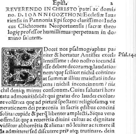 Fig. 2. Colines's English-bodied roman as it appears in J. Clichtove, De necessitate peccatae Adae, Paris, Henry i Estienne, 1519, fol. a2. The small capital Z in the 3rd line is a wrong sort. Courtesy of the University Library Ghent.
| ||||||||||||||||||||||||||||||||||||||||||||||||||||||||||||||||||||||||||||
[pagina 125]
| ||||||||||||||||||||||||||||||||||||||||||||||||||||||||||||||||||||||||||||
3. Colines's first Bourgeois or Gaillarde roman (1520)Ga naar margenoot+The Montholon edition of October 1520 is one of Henry i Estienne's last and probably Colines's first; Estienne's name appears on the title-page and in the colophon, but in the privilege Simon de Colines is quoted (Schreiber, 1995, 3). Besides the usual Gros-romain and Cicero romans of Estienne it exhibits the three new types which I think Colines had created up to then: the 9.5 titling of § 1, the 90 mm Saint-augustin of § 2 and this new Bourgeois or Gaillarde. It is a faithful copy of Colines's English-bodied roman, described above in § 2, though on a smaller body. The face occurs in two versions, Montholon's quire a and its last quires (from ggg onwards) exhibiting the revision. Pierre Viart used the second state in a publication which tentatively has been dated 1516 but rather should be put back into the 1520s (Moreau, 2: 364, no. 1326). More research is needed to ascertain whether the roman in this size, used by the anonymous press of the Crowned Dolphins (Moreau, 3: 155, no. 415), is this type in its second state. In 1523 Colines introduced a new and more mature Bourgeois roman, described below in § 6. | ||||||||||||||||||||||||||||||||||||||||||||||||||||||||||||||||||||||||||||
[pagina 126]
| ||||||||||||||||||||||||||||||||||||||||||||||||||||||||||||||||||||||||||||
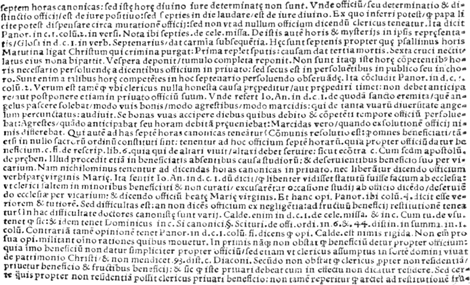 Fig. 3a. First state of Colines's first Bourgeois roman as it occurs in J. de Montholon, Promptuarium, Paris, Colines, 1520, vol. 2, fol. vii. Courtesy of the City Library Antwerp.
| ||||||||||||||||||||||||||||||||||||||||||||||||||||||||||||||||||||||||||||
[pagina 127]
| ||||||||||||||||||||||||||||||||||||||||||||||||||||||||||||||||||||||||||||
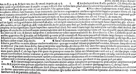 Fig. 3b. Second state of Colines's first Bourgeois roman as it occurs in J. de Montholon, Promptuarium, Paris, Colines, 1520, vol. 1, fol. vii. Courtesy of the City Library Antwerp.
| ||||||||||||||||||||||||||||||||||||||||||||||||||||||||||||||||||||||||||||
[pagina 128]
| ||||||||||||||||||||||||||||||||||||||||||||||||||||||||||||||||||||||||||||
4. Colines's first Small Pica or Philosophie roman (1522)Ga naar margenoot+I have only seen this Small Pica appearing in J. Lefevre d'Etaples's, Epitome... in libros arithmeticos... Boetij of 1522 (Moreau, 3: 137, no. 346). But I guess that a more thorough search will yield earlier occurrences. Anyhow, it was a little used face, Colines apparently preferring to use the 1499 Tholoze Pica (Vervliet, 2002a, 279-81, fig. 3) and from 1524 onwards the famous second Small Pica roman of § 9 below. Its relation of the 1519 Saint-augustin small capitals, mentioned above in § 2, deserves further research. 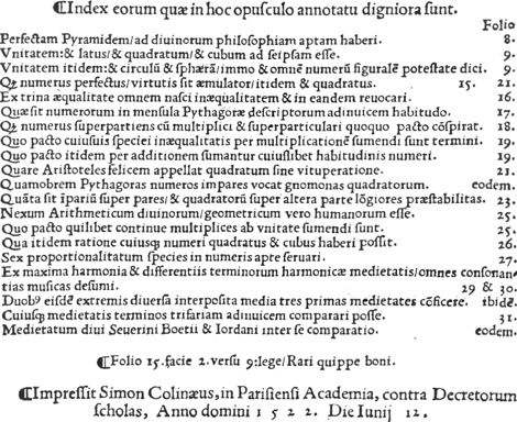 Fig. 4. Colines's first Small Pica or Philosophie roman (1522) as it appears in J. Lefevre d'Etaples, Epitome... in libros arithmeticos... Boetij, Paris, Colines, 1522, p. 48. Courtesy of the University Library Copenhagen.
| ||||||||||||||||||||||||||||||||||||||||||||||||||||||||||||||||||||||||||||
[pagina 129]
| ||||||||||||||||||||||||||||||||||||||||||||||||||||||||||||||||||||||||||||
5. Colines's first roman titling on Two-line Long Primer or Deux points de Petit-romain (1522).Ga naar margenoot+From 1522 onwards this titling replaces the earlier, rather weakly designed 9.5 mm capitals on Colines's title-pages, described above in § 1. Though still imbued with a certain archaism the face exhibits a tendancy towards newer and more elegant letterforms (as for instance, in the M, Q, T). Its design is certainly much better than any other roman titling then appearing in Paris. Could Colines have had access to the drawings of roman lettering, which Tory doubtlessly brought home? Or was he inspired by the first French manuscripts in the littera humanistica, which then became fashionable (Orth, 1983)? It is also much lighter than the two bold titlings of 5.2 and 8.5 mm (§§ 8 and 13) which succeeded it in 1524 and 1529 and which became the hallmark for Colines's mature typography. 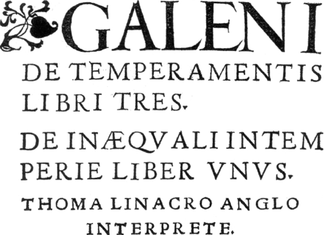 Fig. 5. Colines's first roman titling on Two-line Long Primer as it appears on the title-page (lines 2-5) of Galenus, De temperamentis, Paris, Colines, 1523.
The woodcut headline is probably also by Colines. Courtesy of the City Library Antwerp. | ||||||||||||||||||||||||||||||||||||||||||||||||||||||||||||||||||||||||||||
[pagina 130]
| ||||||||||||||||||||||||||||||||||||||||||||||||||||||||||||||||||||||||||||
6. Colines's Second Bourgeois or Gaillarde roman (1523)Ga naar margenoot+Small-sized bibles or parts of them became popular with Paris publishers in the early 1520s (Shaw, 1974). For a series of Bible parts in sextodecimo, published from 1523 onwards under the editorship of his stepson Robert i Estienne (Armstrong, 1986, 325), Colines apparently engraved three new typefaces, a Bourgeois and two titlings of : 4 mm and : 5.5 mm respectively (apart from a series of open outlined 12 mm, most likely woodcut, initials). The Bourgeois was praised by Robert i Estienne, who described it as a ‘belle lettre’ (Armstrong, 1986, 325). The three new founts are designed boldly and forcefully. With four larger sized romans appearing at Colines's press in the following five years, they form a coherent group of bold romans. They are characteristic of Colines's publications and may therefore be attributed to him. They are the first romans cut in France whose designs surpass the current Basle typefaces, and they can compete with the renowned Aldine models (Barker, 1974, 8). The new Bourgeois roman replaced Colines's first Bourgeois roman cut for Henry i Estienne in 1520; see above, § 3. Its size of 63 mm for 20 lines is between Brevier (or Petit-texte; 55 mm) and Long Primer (or Petit-romain; 67 mm). In the Plantin inventories the term for this type size is ‘Colineus’; it may originate from this face (Wolf, 1979, 106). Colines used this second Bourgeois from 1523/4 to about 1536, when he changed over to his third Bourgeois roman (see below, § 18). | ||||||||||||||||||||||||||||||||||||||||||||||||||||||||||||||||||||||||||||
[pagina 131]
| ||||||||||||||||||||||||||||||||||||||||||||||||||||||||||||||||||||||||||||
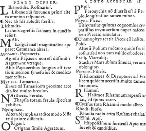 Fig. 6a. Colines's Second Bourgeois or Gaillarde roman (1523) as it appears in Textor, Stirpivm differentiae, Paris, Colines, 1534, fol. 15. Courtesy of the City Library Antwerp.
 Fig. 6b. Colines's Second Bourgeois or Gaillarde roman (1523) assembled from Textor, Stirpivm differentiae, Paris, Colines, 1534. Courtesy of the City Library Antwerp.
| ||||||||||||||||||||||||||||||||||||||||||||||||||||||||||||||||||||||||||||
[pagina 132]
| ||||||||||||||||||||||||||||||||||||||||||||||||||||||||||||||||||||||||||||
7. Colines's roman titling on Two-line Brevier or Deux points de Petit-texte (1523)Ga naar margenoot+Two new titlings, this one on: 4 mm, the other on: 5.2 mm (see § 8 below), appear from 1523/24 onwards in Colines's books. More decisively than the capitals of the new Bourgeois roman (§ 6) they break away from the Basle tradition of type design and introduce in France elements of Aldine letterforms. Colines used this titling rather sparingly. From the early 1530's onwards he tends to prefer the capitals of his Terentianus roman, described below in § 14. 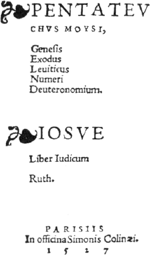 Fig. 7. Colines's roman titling on Two-line Brevier or Deux points de Petit-texte (1523) as it appears on the title-page of Pentatevchvs Moysi, Paris, Colines, 1527. Courtesy of the Aargauische Kantonsbibliothek Aarau.
| ||||||||||||||||||||||||||||||||||||||||||||||||||||||||||||||||||||||||||||
[pagina 133]
| ||||||||||||||||||||||||||||||||||||||||||||||||||||||||||||||||||||||||||||
8. Colines's second roman titling on Two-line Long Primer or Deux points de Petit-romain (1524).Ga naar margenoot+In 1523/24, barely two years after he introduced his first titling of this size (§ 5), Colines began to use two newly cut roman titlings respectively on: 4 (§ 7) and this one on: 5.2 mm. Its capitals have lost most reminiscences of the Basle style, the only conspicuous exceptions being the E, which stays broad, and the G with a downward beak. In general, however, their design can be considered as the first proper typographic rendering, North of the Alps, of the classical capitalis monumentalis, well before this was popularized there by the treatises of Dürer (1525) and Tory (1529); they are more elegant at any rate than the preceding Ratdolt, Froben and Strasburg tidings (Johnson, 1937). We have no clue to decide what influences Colines may have undergone. He could have had knowlegde of earlier treatises of Damianus Moyllus (1483) and Luca de Pacioli (1509); he may have found inspiration in the Aldine type designs of Francesco Griffo or in the earliest French manuscripts in the littera humanistica formata or in the sketches of Tory, who about 1522 had returned from Rome and precisely in 1524 resumed his publishing activities, indeed at Colines's press (Barker, 1974, 7, n. 10). Colines used this type throughout his career, adding in the early 1540's a lower case to the titling. See below, § 21.  Fig. 8a. Colines's second roman titling on Two-line Long Primer or Deux points de Petit-romain (1524) as it occurs on second line of the title-page of J. Clichthove, Propvgnacvlvm ecclesiae, Paris, Colines, 1526. Courtesy of the City Library Antwerp.
 Fig. 8b. Colines's second roman titling on Two-line Long Primer or Deux points de Petit-romain (1524) assembled from Textor, Stirpivm differentiae, Paris, Colines, 1534. Courtesy of the City Library Antwerp.
| ||||||||||||||||||||||||||||||||||||||||||||||||||||||||||||||||||||||||||||
[pagina 134]
| ||||||||||||||||||||||||||||||||||||||||||||||||||||||||||||||||||||||||||||
9. Colines's second Small Pica or Philosophie roman (1525)Ga naar margenoot+Even more than Colines's 1523 Bourgeois roman (§ 6), this Small Pica represents a break from the earlier Basle or Basle-styled romans, which Paris printers had exploited up to then. The Horae of 1525 which feature this new type, are renowned for their illustrations, drawn by Geoffroy Tory in an open, Poliphilo style much contrasting with the overdecorated, crowded and shadowed illustrations of the earlier Parisian Books of Hours. The year before (1524 n.s.) Colines had printed Tory's elegies for his beloved daughter, Tory's first publication I know of after his return from Rome (Moreau, 3: 195, no. 584). The contacts between the printer and the theoretician apparently date from these years, leading to the hypothesis that Tory's influence on Colines's type design was decisive (Carter, 1969, 83). As Johnson (1928, 12-3; 1928a, 64-5), however, appropriately pointed to the poor typography and lettering in the publications issued from Tory's own press, this thesis may be questioned. The Horae of 1525 also display accented sorts. Tory was an early advocate of them; but so was Robert Estienne, Colines's press director. He introduced them into Colines's printing in 1522. Moreover, the Colines letterforms are quite dissimilar from those advocated in Tory' 1529 Champfleury. This Small Pica is sometimes, though improperly in my opinion, considered as Colines's first typeface (Barker, 1974, 8). Surely was it Colines's workhorse for compositions in the octavo format. He used it over his whole career, albeit more sparingly from 1536 onwards, when his new Cicero (§ 19) became available. Robert i Estienne used this Small Pica roman as his standard text type at the start of his independent activity as a printer. From 1529 onwards he had it cast on the larger size of Pica, which he used till 1537 when he changed over to a lighter-weight roman in this size. Colines's contractor Louis Blaubloom had it too and he may be the source of the occurrences with a few other Paris imprints (Moreau, 4: nos. 316, 363, 1111). Whether he used this type in 1534 with diacritics of Augereau as noted in Renouard (1964, 4: 94) deserves closer examination. The Le Bé inventory of c.1618 records a set of matrices for a ‘Petit Cicero’ of Colines, which I suppose is for this type (Morison, 1957, 19). The 1685 Cottin inventory of the same foundry lists ‘vune frape de cicero petit oeil dit philosophie... dit gravé de Colines jmparfait des chiffres et assez mal justiffié...’ (Paris, Archives nationales, mc 70, 182). | ||||||||||||||||||||||||||||||||||||||||||||||||||||||||||||||||||||||||||||
[pagina 135]
| ||||||||||||||||||||||||||||||||||||||||||||||||||||||||||||||||||||||||||||
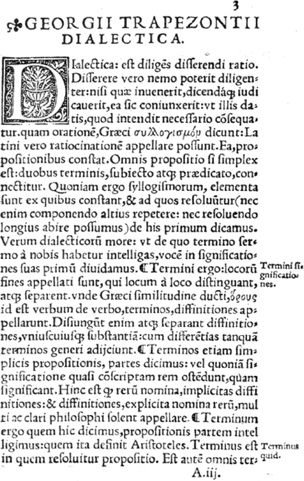 Fig. 9a. Colines's Small Pica or Philosophie roman (1525) as it appears in G. Trapezuntius, Dialectica, Paris, Colines, 1528, fol. a2v.-a3r. Courtesy of the City Library Antwerp.
 Fig. 9b. Colines's Small Pica or Philosophie roman (1525) assembled from P. Anghiera [Pierre Martyr], Extraict ov recveil des isles, Paris, Colines, 1532. Courtesy of the City Library Antwerp.
| ||||||||||||||||||||||||||||||||||||||||||||||||||||||||||||||||||||||||||||
[pagina 136]
| ||||||||||||||||||||||||||||||||||||||||||||||||||||||||||||||||||||||||||||
10. Colines's Minion or Mignonne roman (1526)Ga naar margenoot+Mostly used for marginalia and in the same bold style as the other Colines romans of the period, this Minion has not been seen outside the Colines and Blaubloom presses, except for a few appearances in some other Paris imprints, which probably can be attributed to Blaubloom's press (Moreau, 4: nos. 316, 586 and 1111). The entry for a set of matrices of a ‘Mignonne Rommaine de Colines’ in the c.1618 Le Bé inventory (Morison, 1959, 20) as well as the reference to a roman Petit-texte by Colines in the c.1643 Le Bé memorandum (Carter, 1967, 15) are probably for this type. In his 1685 inventory of the Le Bé foundry, Philippe Cottin mentions ‘vune frape de mignonne nommee Colignes’ (Paris, Archives nationales, mc 70, 182). Colines may have updated this face in the early 1540s, e.g. in the sidenotes of his 1543 Gagny edition (Schreiber, 1995, 165, no. 201) but that deserves nearer inspection. The Colines face is distinguishable from the Minion roman occurring at the press of Francis Gryphius in 1534. 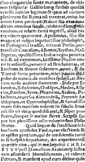 Fig. 10. Colines's Minion roman (1527) as it appears in the Pentatevchvs Moysi, Paris, Colines, 1527, fol. a2v. Courtesy of the Aargauische Kantonsbibliothek Aarau.
| ||||||||||||||||||||||||||||||||||||||||||||||||||||||||||||||||||||||||||||
[pagina 137]
| ||||||||||||||||||||||||||||||||||||||||||||||||||||||||||||||||||||||||||||
11. Colines's second English-bodied roman or Saint-augustin (1526)Ga naar margenoot*Colines used this Saint-augustin sparsely, mainly between 1526 and 1531. It seems to appear mostly cast on a mould of 88 mm, tending to mutilate the extended sorts. It succeeded to Colines's first Saint-augustin (1519) in Basle style, described above in § 2. This second Saint-augustin contrarily is wholly in Colines's own rather forceful style. In its turn, it became outdated after the aesthetic revolution introduced by the Estienne romans (1530) and was abandoned in 1533 for Colines's third roman on this size, described below in § 16. Estienne used it in its first version at the start of his printing career; Colines's contractor Louis Blaubloom had it too and he could well be the source of the occurrences in some other Paris imprints (Moreau, 4: nos. 586 and 1111). The frequent reworking of some sorts has lead Amert (1991, 27 and 30) to assume the existence of two nearly identical founts, one on Saint-augustin (90 mm), the other on Cicero (88 mm). She may be right but, as the younger fount on Cicero seems to drive out the older one, I have chosen to consider them as one fount with variant sorts. | ||||||||||||||||||||||||||||||||||||||||||||||||||||||||||||||||||||||||||||
[pagina 138]
| ||||||||||||||||||||||||||||||||||||||||||||||||||||||||||||||||||||||||||||
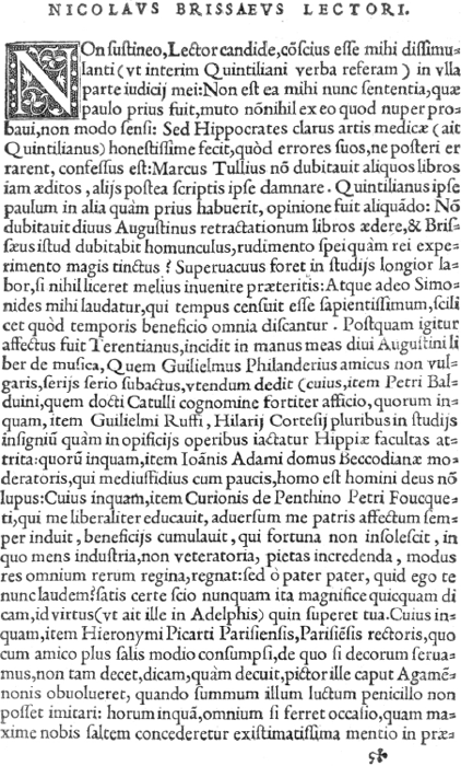 Fig. 11. Third state of Colines's second English-bodied roman or Saint-augustin (1526) as it appears in Terentianus, De literis, Paris, Colines, 1531, fol. §1. Courtesy of the City Library Antwerp.
| ||||||||||||||||||||||||||||||||||||||||||||||||||||||||||||||||||||||||||||
[pagina 139]
| ||||||||||||||||||||||||||||||||||||||||||||||||||||||||||||||||||||||||||||
12. Colines's first Great Primer or Gros-romain roman (1528)Ga naar margenoot*Mid 1528 Colines ceased using the 1494 Bergmann Great-Primer roman as the usual text type for his quartos and folios. Henri i Estienne had used it since 1501 and Colines since 1520 (Vervliet, 2002a, 274-8, fig. 1a-c). Colines's new type retained some design features which recall the older Basle face and would come to be viewed as outmoded already in 1530 after the revolution of the Estienne romans. See for instance its titled-bowl e, unflared y, lozenge-shaped punctuation. At the same time its capitals reveal the new sensibility of a talented type designer for imitating more closely the letterforms of the classical inscriptional capital, as shown in the Aldine romans or as prescribed by Pacioli, Dürer or, the next year, by Tory. In comparison with the Bergmann roman, the effect of the new type is, in the words of Barker, of a ‘light and spacious grandeur’. This Great Primer has not been seen outside the Colines and Blaubloom presses, except for an appearance in a Wechel imprint, which probably can be attributed to Blaubloom's press (Moreau, 4: no. 316). In 1531 Colines revised the lower case of this face. In this later form it is known as the Terentianus roman of Colines. For the sake of convenience, it is discussed separately, below in § 14. 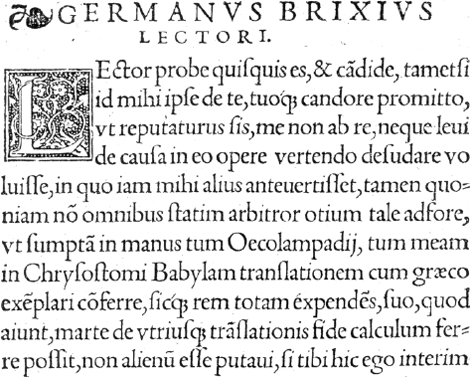 Fig. 12. Colines's first Great Primer or Gros-romain roman (1528) as it appears in Joannes Chrysostomus, Liber contre gentiles, Paris, Colines, 1528, fol. a1. Courtesy of the University Library Ghent.
| ||||||||||||||||||||||||||||||||||||||||||||||||||||||||||||||||||||||||||||
[pagina 140]
| ||||||||||||||||||||||||||||||||||||||||||||||||||||||||||||||||||||||||||||
13. Colines's roman titling on Two-line English or Deux points de Saint-augustin (1529)Ga naar margenoot*Used primarily in the headlines of his title-pages, this titling supersedes from 1529 onwards the first and rather weak 9.5 mm titling Colines engraved for Henri i Estienne in 1518 (see above, § 1), as well as the woodcut headline lettering appearing from 1523 onwards or the 5.2 mm roman titling of § 8 above. In this function it was itself supplanted by the ‘Finé’ Gros-canon of 1536, described below in § 20. Apparently it was not used outside Colines's own press and those of his contractors Blaubloom and Nyverd (Moreau, 4: nos. 316, 586; 1111; 1306; Renouard, 1964, 4: 100, no. 111; Schreiber, 1995, 113-5, no. 126). A few appearances in some other Paris imprints may be attributable to Blaubloom's press (Moreau, 4: nos. 316, 586 and 1111). Its letterforms are strong, sturdy, bold. These features seem to summarize Colines's thought about the ideal roman letterform. Except in his open outlined woodcut (or metal) capitals (1523), he manifestly wished to ignore the fashion toward airiness and lightness, appearing in Estienne's printing from 1530 onward and thereafter spilling over Paris and Europe (Kemp, 1991). Nevertheless, and despite some irregularities in its height - the capitals F, H, L, N, P, R, T are a bit short - it is, in my opinion, a wholly satisfying typeface, one of the best to appear in the sixteenth century. At the time of its appearance in 1529, it had in Paris, qualitatively and aesthetically, no competitor. The other Paris printers, even the more important ones such as Badius, Vidoue, Wechel, Morrhy, Loys, had to rely on the older 8.2 mm roman titling, appearing in 1517 at the Froben press in Basle and probably cut by Peter ii Schoeffer (Vervliet, 1968, 238; Carter, 1969, 110) or its local, rather crude, imitations. The Colines titling is contemporaneous with the 7.5 and 5.5 mm roman titlings appearing in Tory's Champfleury of April 1929 and his Eusebius of 1532. All three designs share the characteristic swelling strokes towards top and foot; they have a distinctive Q with a tail disconnected from the bowl; all three straightforwardly disregard the proportions and forms of the capitalis monumentalis as advocated in Tory's book. But in the end the Tory titlings seem less well designed and cut. I surmise that neither of Tory's two faces was engraved by Colines. The availability of another punchcutter may explain the occurrence of the r7.5 titling at Roigny's press in 1530 (Moreau, 3: no. 2081) and the introduction of larger r8.5 mm titling in the same style in 1535 (Moreau, 4: no. 1348).  Fig. 13b. Colines's roman titling on Two-line English or Deux points de Saint-augustin (1529) assembled from P. Anghiera [Pierre Martyr], Extraict ov recveil des isles, Paris, Colines, 1532 (Courtesy of the City Library Antwerp) and Galenus, De cavsis respirationis, Paris, Colines, 1533. Courtesy of the Royal Library The Hague.
| ||||||||||||||||||||||||||||||||||||||||||||||||||||||||||||||||||||||||||||
[pagina 141]
| ||||||||||||||||||||||||||||||||||||||||||||||||||||||||||||||||||||||||||||
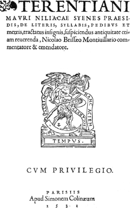 Fig. 13a. Colines's roman titling on Two-line English or Deux points de Saint-augustin (1529) as it occurs on the title-page of Terentianus, De literis, Paris, Colines, 1531. Courtesy of the City Library Antwerp.
 | ||||||||||||||||||||||||||||||||||||||||||||||||||||||||||||||||||||||||||||
[pagina 142]
| ||||||||||||||||||||||||||||||||||||||||||||||||||||||||||||||||||||||||||||
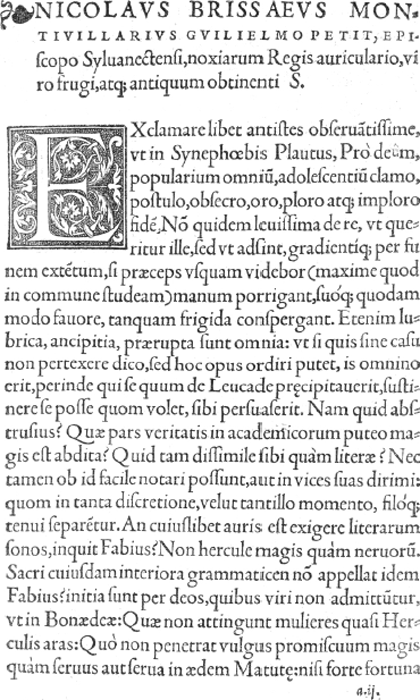 Fig. 14a. Colines's second Great Primer roman or Gros-romain (1531) as it occurs in Terentianus, De literis, Paris, Colines, 1531, fol. a2. Courtesy of the City Library Antwerp.
| ||||||||||||||||||||||||||||||||||||||||||||||||||||||||||||||||||||||||||||
[pagina 143]
| ||||||||||||||||||||||||||||||||||||||||||||||||||||||||||||||||||||||||||||
14. Colines's second (‘Terentianus’) Great Primer roman or Grosromain (1531)Ga naar margenoot*This is the famous roman of Colines, eponymously known as the Terentianus roman after the Terentianus Maurus, De literis (Moreau, 4: no. 292; Schreiber, 1995, 72), published by Colines in 1531 and one of his earliest imprints to show this face. With the new Estienne romans (which preceded it by a few months) it has been heralded as the best expression of a true Renaissance roman. It is very like Colines's first roman on this size (see above §12), but unimpaired by its most obvious archaisms such as the tilted-bowl e or the lozenge-shaped period and colon. The capitals of both faces seems to be identical, but the long letters of the lower case were made a bit longer. The earliest dated occurrence in Colines's printing is in his Basilius edition of 27 May 1531, but it has been noted that the face occurs already in March and May 1531, in two leaflets by Guillaume Bochetel on the Entry and Coronation of Queen Eleonora (Moreau, 4: nos. 54-5), both published by Geoffroy Tory but quite certainly printed by Colines (Johnson, 1927, 64-5; Barker, 1974, 13). In 1533 Colines revised this face again, mainly by outfitting it with a new and lighter set of capitals. For the sake of convenience, this state is reviewed apart, below in § 17.  Fig. 14b. Colines's second Great Primer roman or Gros-romain (1531) assembled from Terentianus, De literis, Paris, Colines, 1531. Courtesy of the City Library Antwerp.
| ||||||||||||||||||||||||||||||||||||||||||||||||||||||||||||||||||||||||||||
[pagina 144]
| ||||||||||||||||||||||||||||||||||||||||||||||||||||||||||||||||||||||||||||
15. Colines's Nonpareil roman (1533)Ga naar margenoot*A tiny roman in a new style with narrow g and horizontal bar to the e appears from 1533 onwards in Colines's books. It is unmistakenly in his style. The reference by Veyrin-Forrer (1995, xxv) to its occurrence in Viexmonts's Methodus confessionis of February 1533 (Moreau, 4: 269, no. 836) deserves a new probe. 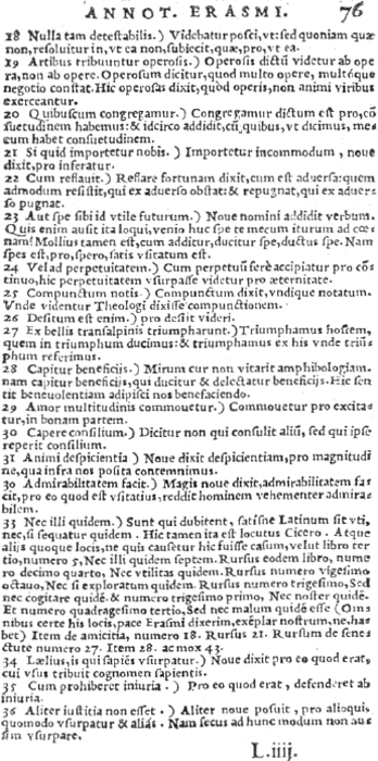 Fig. 15. Colines's Nonpareil roman (1533) as it appears in Cicero, Officia, Paris, Colines, 1538, fol. l4. Courtesy of the University Library Ghent.
| ||||||||||||||||||||||||||||||||||||||||||||||||||||||||||||||||||||||||||||
[pagina 145]
| ||||||||||||||||||||||||||||||||||||||||||||||||||||||||||||||||||||||||||||
16. Colines's third English-bodied roman or Saint-augustin (1533)Ga naar margenoot*As Barker (1974) has shown, the appearance in 1530 at Estienne's press of three newly-styled ‘Aldine’ romans changed the Paris typographical scene in a fundamental way. Main characterics of the innovation were the capitals somewhat smaller than the ascenders, the narrow E, F, S, the one-eared capital M, the e with horizontal bar, the z with heavy diagonal. Except for Badius, Wechel, Morrhy who kept their Basle-styled romans and more conservative printers as Buffet, Vidoue, Gromors or Chevallon (the latter at least in his earlier period), most Paris typographers were eager to emulate Estienne's example. Augereau, Francis Gryphius, Colines, Loys, Chevallon imitated them in the following years. Most of these founts are quite similar to the Estienne model and it calls for a careful examination to distinguish them. In Colines's face some letterforms of his earlier Saint-augustin, described above in § 11, reappear as duplicates, for example, in the doubly-serifed M and the narrow lower case g. It is not clear whether these were odd sorts or intended by Colines as duplicates. The c.1618 Le Bé inventory (Morison, 1957, 18) refers to a ‘Saint Augustin Sylvius de Coline’. But it is commonly thought that this entry refers to the 1530 Saint-augustin roman of Robert i Estienne (Carter, 1967, 40, n.15) rather than to this face. The attribution to Colines is puzzling and must be an error - one of the very rare in the c.1618 Le Bé inventory (Veyrin-Forrer, 1956, 107-112; 1987, 6-7). In fact, the Sylvius Saint-augustin roman does not occur in Colines's printing (nor any other of the new Estienne founts).  Fig. 16a. Colines's third English-bodied roman or Saint-augustin (1533) assembled from f. §2v-6 of the Index in Galenus, De cavsis respirationis, Paris, Colines, 1533.
Courtesy of the Royal Library The Hague. | ||||||||||||||||||||||||||||||||||||||||||||||||||||||||||||||||||||||||||||
[pagina 146]
| ||||||||||||||||||||||||||||||||||||||||||||||||||||||||||||||||||||||||||||
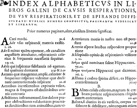 Fig. 16b. Colines's third English-bodied roman or Saint-augustin (1533) as it appears on fol. ♣ 6 of the Index in Galenus, De cavsis respirationis, Paris, Colines, 1533. Courtesy of the Royal Library The Hague.
| ||||||||||||||||||||||||||||||||||||||||||||||||||||||||||||||||||||||||||||
[pagina 147]
| ||||||||||||||||||||||||||||||||||||||||||||||||||||||||||||||||||||||||||||
17. Colines's third Great Primer roman or Gros-romain (1533)Ga naar margenoot*It is unclear whether Colines completely recut his second Great Primer roman, described above in § 14, rather than changing some characters, bringing them more in line with the lighter fashion as present in the new Estienne romans (1530). Anyhow the change is gradual from 1533 on. Spot letters are the narrow capital E, the non-beaking G, the steep R, the smaller lower case g and the bulbous tail of the y. Barker (1974, 17) suggested (mainly on stylistical grounds) that Antoine Augereau was involved in its cutting. Augereau was a colleague punchcutter, collaborating precisely in these years in a couple of cases with Colines (Moreau, 4: nos. 880, 996; Schreiber, 1995, nos. 110, 115). Moreover, Colines seems to have ceased to cut new types in the mid of the 1530's, and an attribution to him of the 1536 Finé Gros-canon and the lower case of the 1542 Gros-parangon seems to be questionable (see below, §§ 20-21). On the other hand, an attribution to Colines must not be excluded, as he quite certainly continued to produce new typefaces up to 1536. See §§ 18, 19, and 25. | ||||||||||||||||||||||||||||||||||||||||||||||||||||||||||||||||||||||||||||
[pagina 148]
| ||||||||||||||||||||||||||||||||||||||||||||||||||||||||||||||||||||||||||||
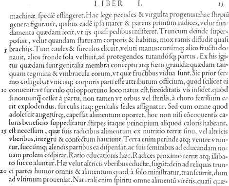 Fig. 17. Colines's third Great Primer roman or Gros-romain (1533) as it occurs in J. Ruel, De natura stirpivm, Paris, Colines, 1536, p. 13. Courtesy of the City Library Antwerp.
| ||||||||||||||||||||||||||||||||||||||||||||||||||||||||||||||||||||||||||||
[pagina 149]
| ||||||||||||||||||||||||||||||||||||||||||||||||||||||||||||||||||||||||||||
18. Colines's third Bourgeois or Gaillarde roman (1536)Ga naar margenoot*In 1536 Colines began to use a new Bourgeois roman, the third in his punchcutting career. It is the successor to his 1523 Bourgeois, the workhorse for his sextodecimo editions, which is described above in § 6. The major differences between the two founts are noted in the Key Letter rubric. The new roman was more in line with the style of the new Aldine romans, introduced in Paris during the early 1530s (Barker, 1974). It nevertheless retains many characteristics typical of Colines, making it possible to attribute this small face to him. It was perhaps his last. Amert (1991, 25) seems to date its introduction as early as 1531, but I have been unable to confirm that. 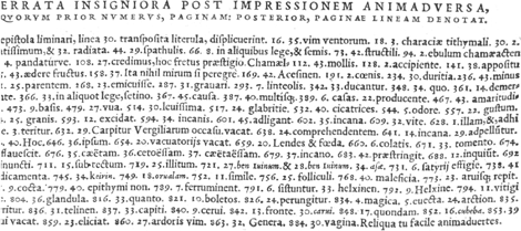 Fig. 18. Colines's third Bourgeois or Gaillarde roman (1536) as it appears in J. Ruel, De natura stirpivm, Paris, Colines, 1536, Index, fol. h6 v. Courtesy of the City Library Antwerp.
| ||||||||||||||||||||||||||||||||||||||||||||||||||||||||||||||||||||||||||||
[pagina 150]
| ||||||||||||||||||||||||||||||||||||||||||||||||||||||||||||||||||||||||||||
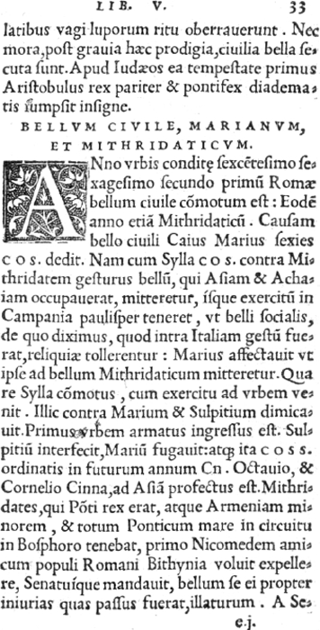 Fig. 19a. Colines's Pica roman or Cicero (1536) as it appears in Eutropius, De gestis Romanorum, Paris, Colines, 1539, fol. 32v.-33r. Courtesy of the City Library Antwerp.
| ||||||||||||||||||||||||||||||||||||||||||||||||||||||||||||||||||||||||||||
[pagina 151]
| ||||||||||||||||||||||||||||||||||||||||||||||||||||||||||||||||||||||||||||
19. Colines's Pica roman or Cicero (1536)Ga naar margenoot*In 1536, an update appeared of the 1527 Small Pica roman (§ 9), which Colines had been using as his usual roman text type for octavos. The new type is a bit larger than the earlier one, but otherwise very similar. The most conspicuous characteristics are noted in the rubric on Key Letters. This could well be the last letter engraved by Colines himself. Its occurrence in a 1554 Boursette imprint (Morison, 1924, pl. 145-7) could not be certified.  Fig. 19b. Colines's Pica roman or Cicero (1536) assembled from J. Ruel, De natura stirpivm, Paris, Colines, 1536, Index, fol. a8-g7. Courtesy of the City Library Antwerp.
| ||||||||||||||||||||||||||||||||||||||||||||||||||||||||||||||||||||||||||||
[pagina 152]
| ||||||||||||||||||||||||||||||||||||||||||||||||||||||||||||||||||||||||||||
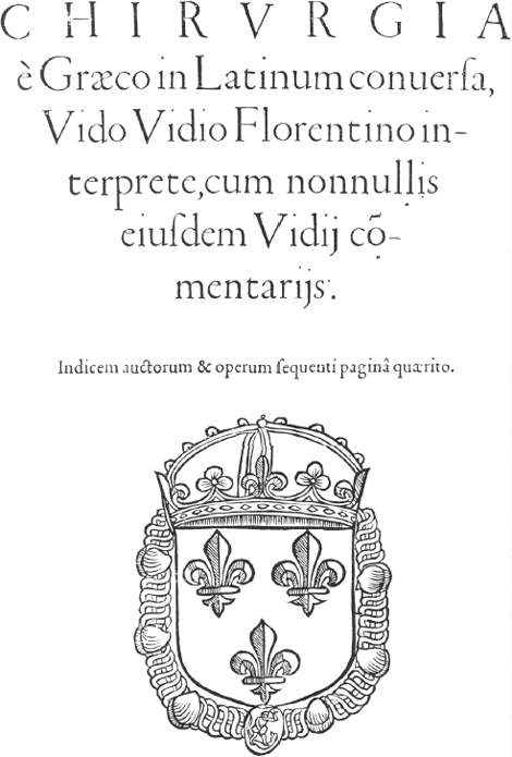 Fig. 20. The ‘Finé’ Double Pica roman or Gros-canon as it appears on the title-page of Guido Guidi, Chirurgia, Paris, P. Gaultier, 1544.
| ||||||||||||||||||||||||||||||||||||||||||||||||||||||||||||||||||||||||||||
[pagina 153]
| ||||||||||||||||||||||||||||||||||||||||||||||||||||||||||||||||||||||||||||
20. The ‘Finé’ Two-line Double Pica roman or Gros-canon (1536)Ga naar margenoot*This is the third Gros-canon roman to appear in Paris in the early 1530s. The first was that of Estienne, appearing in September 1530; the second that of Francis Gryphius, appearing a good year later (Kemp, 1991, 46). The third was introduced by Colines in 1536. In 1539 a rough imitation appeared at the presses of Vidoue and Gromors. This early group of Paris Gros-canon romans is distinguishable by a so-called Bembo M (without right-hand top serif). This M-form was introduced in Bembo's De Aetna, printed by Aldus Manutius in 1496. The asymmetric M originated perhaps by accident through deficient casting (Mardersteig, 1964, 134). It became fashionable with Paris type designers in the 1530s, in the Low Countries during the 1540s and 1550s. Italy seems to have stood by its preference for the more classic winged-like doubly-serifed letterform; the only Italian exception I know of is the Gros-canon with a Bembo-M, engraved by Guillaume i Le Bé at Venice in 1546 and used mainly in Florence by Torrentino and in Venice by the Giuntas (Vervliet, 1967, 31, no. 28). Though used by him, I doubt whether this Gros-canon was cut by Colines. Its style differs noticeably from his other typefaces and its later wide distribution does not fit in with Colines's restrictive policy of non-trading type material. Garamont has been suggested as its engraver, mainly because it occurs in the 1540s at the presses of known Garamont customers such as Gaultier, Barbé, Mesvière (Renouard, 1964, 3: 33; 5: 140; Veyrin-Forrer & Parent, 1974, 82). It is a much weaker design than the 1530 Estienne Gros-canon, which some also attribute to Garamont. It seems implausible to ascribe both faces to the same type designer. This face occurs seemingly as early as 1535 in Lyons at the press of Denis de Harsy, e.g. in the preliminaries of his 1535 Tractatus universi iuris (Gültlingen, 1992, 4: nos. 72-82). My guess is that Harsy rejuvenated older presswork by inserting cancels. But an early use seems quite probable, as f.i. in Clichthove's 1535 Introductiones (Gültlingen, 1992, 4: no. 69), Erasmus's 1536 De conscribendis epistolis (DeReuck, 1993, 57, no. 120; Gültlingen, 1992, 4: no. 86) or Rabelais's 1537-38 Pantagruel (Rawles-Screech, 1989, nos. 10 and 21). More research is on order here. | ||||||||||||||||||||||||||||||||||||||||||||||||||||||||||||||||||||||||||||
[pagina 154]
| ||||||||||||||||||||||||||||||||||||||||||||||||||||||||||||||||||||||||||||
21. The ‘Ammonius’ Double Pica roman or Gros-Parangon (1542)Ga naar margenoot*From 1542 onwards, a lower case accompanies Colines's second titling on Two-line Long Primer, described above in § 8. I hesitate to attribute this lower case to Colines, though I have no other name to propose. The only clue I have is to Robert Granjon, who began cutting in the early 1540s and whose popular Two-English roman (1547) may have been modelled on the typeface used by Colines (Vervliet, 1998, 20). But it seems too good for an attribution to a young Granjon. | ||||||||||||||||||||||||||||||||||||||||||||||||||||||||||||||||||||||||||||
[pagina 155]
| ||||||||||||||||||||||||||||||||||||||||||||||||||||||||||||||||||||||||||||
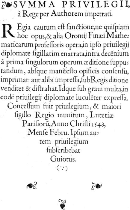 Fig. 21. The ‘Ammonius’ Double Pica roman or Gros-Parangon (1542) as it appears in O. Finé, Quadratura circuli, Paris, Colines, 1544, fol. [aldine leaf] 1v. Courtesy of the University Library Ghent.
| ||||||||||||||||||||||||||||||||||||||||||||||||||||||||||||||||||||||||||||
[pagina 156]
| ||||||||||||||||||||||||||||||||||||||||||||||||||||||||||||||||||||||||||||
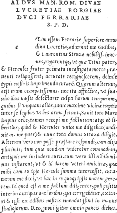 Fig. 22a. Colines's chancery italic on English or Saint-augustin (1528) as it occurs in E. Strozzi, Strozii poemata, Paris, Colines, 1530, fol. a1v.-a2r. Courtesy of the City Library Antwerp.
| ||||||||||||||||||||||||||||||||||||||||||||||||||||||||||||||||||||||||||||
[pagina 157]
| ||||||||||||||||||||||||||||||||||||||||||||||||||||||||||||||||||||||||||||
B. Colines's Italics22. Colines's chancery italic on English or Saint-augustin (1528)Ga naar margenoot*Mainly used for a series of classical and neo-Latin poetry, Colines introduced in 1528 a new italic in the chancery style, ostensibly inspired by the Arrighi and Tagliente italics of 1524 (Johnson-Morison, 1924, 41). It is a very elegant face. Even more than his romans, it reveals Colines's mastery as a punchcutter and designer. Colines engraved three more italics, two of them in the Aldine style, appearing in 1530 and 1534, and one other in a formal chancery style (1532). See below, §§ 23-25. This typeface has not been seen outside the Colines and Blaubloom presses, except for an appearance with a Wechel imprint, which probably can be attributed to Blaubloom's press (Moreau, 4: no. 316). A poor copy by an unknown Low Countries letter-engraver appeared in Antwerp, London and Dublin from 1530 onwards (Johnson, 1936, 79; Vervliet, 1968, 294).  Fig. 22b. Colines's chancery italic on English or Saint-augustin (1528) assembled from Silius Italicus, De bello Punico, Paris, Colines, 1531. Courtesy of the Plantin-Moretus Museum, Antwerp.
| ||||||||||||||||||||||||||||||||||||||||||||||||||||||||||||||||||||||||||||
[pagina 158]
| ||||||||||||||||||||||||||||||||||||||||||||||||||||||||||||||||||||||||||||
23. Colines's Bourgeois or Gaillarde italic (1530)Ga naar margenoot*Tory's Aediloquium of 1530 is set entirely in Colines's English-bodied italic of § 22, except for a short note on the dangers of love: ‘Vale viator, et in amoris vias, si potes, ne venito...’ appearing on the verso of fol. b8. Its five lines are set in a new and smaller italic, which reappears from 1531 onwards in Colines's editions of classic and Neo-Latin literary authors, either in the side-notes of the octavos, or as text type for the sextodecimos. An early example of the latter is the Horatius of 1531, whose colophon refers to the typis suis of Colines (Renouard, 1894, 181). I have failed to spot in Colines's printing an even smaller italic on Brevier (55 mm), which is mentioned by Carter (1969, 121). It may be a slip of the pen. I guess he refers to Colines's Pica italic of § 25. 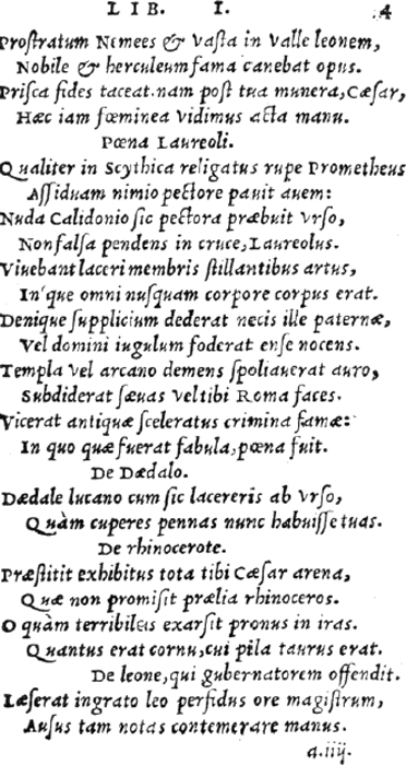 Fig. 23a. Colines's Bourgeois or Gaillarde italic as it appears in Martialis, Epigrammaton libri xiiii, Paris, Colines, 1533, fol. 4r.
Courtesy of the City Library Antwerp. 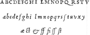 Fig. 23b. Colines's Bourgeois or Gaillarde italic assembled from Martialis, Epigrammaton libri xiiii, Paris, Colines, 1533, fol. 5v.-7r.
Courtesy of the City Library Antwerp. | ||||||||||||||||||||||||||||||||||||||||||||||||||||||||||||||||||||||||||||
[pagina 159]
| ||||||||||||||||||||||||||||||||||||||||||||||||||||||||||||||||||||||||||||
24. Colines's Great Primer chancery italic or Gros-romain (1532)Ga naar margenoot*Like Colines's earlier English-bodied italic (§ 22), this type was modelled after an Arrighi model, though in a more formal chancery style, the cancellaresca formata of the writing-masters (Johnson-Morison, 1924, 41). Arrighi introduced it in 1526 (Balsamo-Tinto, 1967, 136, fig. 55). Colines's design became quite popular in Paris. Four similar italics originated in the years to follow. Two of them have been attributed to Garamont (Vervliet, 1999).  Fig. 24a. Colines's Great Primer chancery italic or Gros-romain (1532) assembled from L. Alamanni, La coltivatione, Paris, R. i Estienne, 1546. Courtesy of the Plantin-Moretus Museum, Antwerp.
| ||||||||||||||||||||||||||||||||||||||||||||||||||||||||||||||||||||||||||||
[pagina 160]
| ||||||||||||||||||||||||||||||||||||||||||||||||||||||||||||||||||||||||||||
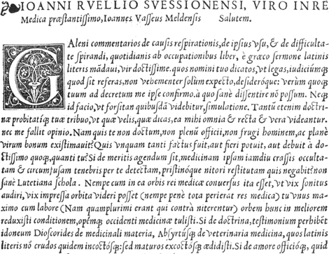 Fig. 24b. Colines's Great Primer chancery italic or Gros-romain (1532) as it appears in Galenus, De cavsis respirationis, Paris, Colines, 1533, fol. ♣2r. Courtesy of the Royal Library The Hague.
| ||||||||||||||||||||||||||||||||||||||||||||||||||||||||||||||||||||||||||||
[pagina 161]
| ||||||||||||||||||||||||||||||||||||||||||||||||||||||||||||||||||||||||||||
25. Colines's Pica italic or Cicero (1534)Ga naar margenoot*Apart for the early Kerver/Le Rouge/Gromors italics (Johnson, 1959, 97), the use of a Pica-sized italic was rare in Paris before the 1520's. The Schoeffer Pica italic, originating in Basle about 1519 (Carter, 1969, 118), was introduced in Paris by Vidoue in 1523 and adopted later by Wechel, Badius, Morrhe, Loys, Blaubloom. Robert 1 Estienne had his own italic on this size engraved in 1532, using it until 1542, when he changed to another one. Colines's Pica followed in 1534. As were most early italics, the Colines typeface is a close imitation of the Aldine italic, including its small-sized upright capitals, but the Colines lower case is sturdier than the Aldine and somewhat reminiscent of the Schoeffer design. I have not seen the Colines Pica italic used outside his own press. The 1542 Estienne Pica italic is a very close, though in my opinion somewhat inferior, copy of the Colines face, differing only in a few letters. Estienne's displays a narrow H, broad L, top serifs of T slanting to the left, winged Y, lower case g with a small egg-shaped bowl. Amert (1991, 35) suggests that Colines had already introduced a first state of this face in 1533. No reference is quoted and I suspect that the italic, used in Colines's 1533 Solinus (Moreau, 4: 265, no. 821; Schreiber, 1995, 96, no. 104) is referred to. As this is the Schoeffer italic, the work was probably printed by Blaubloom, who owned a fount of that face (Renouard, 1964, 4: 94; pl. Biii 17, no. 137). | ||||||||||||||||||||||||||||||||||||||||||||||||||||||||||||||||||||||||||||
[pagina 162]
| ||||||||||||||||||||||||||||||||||||||||||||||||||||||||||||||||||||||||||||
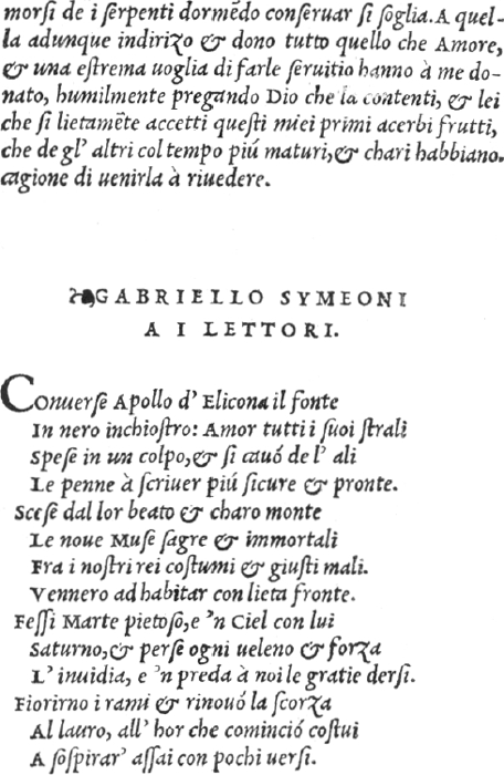 Fig. 25a. Colines's Pica italic or Cicero (1534) as it appears in Amomo, Rime toscane, Paris, Colines, 1535, fol. a3v.-a4r. Courtesy of the Royal Library The Hague.
 Fig. 25b. Colines's Pica italic or Cicero (1534) assembled from Demochares, In octo libras Topicorum Aristotelis...hypomnema, Paris, Colines, 1535, fol. 1r.-4v. Courtesy of the City Library Antwerp.
| ||||||||||||||||||||||||||||||||||||||||||||||||||||||||||||||||||||||||||||
[pagina 163]
| ||||||||||||||||||||||||||||||||||||||||||||||||||||||||||||||||||||||||||||
C. Colines's Greeks26. Colines's Pica Greek or Cicero (1522)Ga naar margenoot*Usually it is thought that the Sophocles 1528 Greek was Colines's first. However, at the very beginning of his career he used Gourmont's Greek (Vervliet, 2002, 7-9) and then, from the end of 1522 to June 1528 (e.g. in Erasmus, De recta... pronuntiatione, 1528), a new Greek cursive, somewhat smaller than the Sophocles face and surely less elegant. From 1527 onwards, he had yet another one for marginal notes on Brevier or Petit-texte (55 mm), described below in § 27. There are few stylistical indications to ascribe both founts to the young Colines, but date and distribution seem to support such an attribution. Robert 1 Estienne used this Pica Greek (on a body of Small Pica or 74 mm) until by the mid 1530s, when he switched to Augereau's 90 mm Greek. 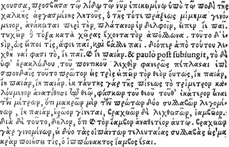 Fig. 26a. Colines's Pica Greek as it appears in A. Manutius, Institutionum grammaticarum libri iiii, Paris, Robert 1 Estienne, 1531, p. 314. Courtesy of the Royal Library Brussels.
 Fig. 26b. The Colines Pica Greek assembled from Alphabetvm graecvm, Paris, Robert 1 Estienne, 1528, fol. a1 vo. Courtesy of the Service Communication, Bibliothèque de la Ville de Chaumont, Coll. des Silos.
| ||||||||||||||||||||||||||||||||||||||||||||||||||||||||||||||||||||||||||||
[pagina 164]
| ||||||||||||||||||||||||||||||||||||||||||||||||||||||||||||||||||||||||||||
27. Colines's Minion Greek or Mignonne (1527)Ga naar margenoot*An exceptionally small Greek used sparingly mostly in marginal and other notes occurs in Colines's printing from 1527 onwards. Its relation to similar small Greeks occurring at the presses of P. Gromors (1523), G. de Gourmont & P. Vidoue (1528), P. Gaudoul & P. Gromors (1529), Robert 1 Estienne (1533), Fr. Gryphius (1535) deserves more scrutiny. If they prove to be identical, an attribution to Colines, who avoided sharing his own types, becomes unlikely. 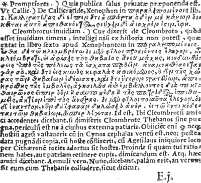 Fig. 27. Colines's Greek Minion or Mignonne (1527) as it occurs in Cicero, Officia, Paris, Colines, 1538, fol. e1. Courtesy of the University Library Ghent.
| ||||||||||||||||||||||||||||||||||||||||||||||||||||||||||||||||||||||||||||
[pagina 165]
| ||||||||||||||||||||||||||||||||||||||||||||||||||||||||||||||||||||||||||||
28. Colines's ‘Sophocles’ Greek on English or Saint-Augustin (1528)Ga naar margenoot*In 1528 Simon de Colines started publishing a series of Greek texts (Moreau, 3: nos. 1402, 1418, 1481-2, 1503-4, 1609), composed in a new Greek typeface. It is, I think, the first decent Greek cursive to be cut in France. Its capitals are wholly in Colines's style and the fact that it was only used by Colines and his contractor Blaubloom confirms the attribution. Scholderer (1927, 9) suggested that the lower case was inspired by Callierges's style, but I fail to see the relation or likeness. The face is known as the Sophocles type, after the publication by Colines of Sophocles's Tragoediae septem in December 1528. Occasionally, Colines used other Greek founts, for instance Petreius's (mostly in association with Jean Loys) or Schoeffer's (mostly with Francis Estienne). In the 1534 Greek New Testament (Schreiber, 1995, 100, no. 110), Colines used Augereau's Greek, but it may be questioned whether he actually printed that work himself, though its title-page displays his device and address. See Vervliet, 2002, 17-8. 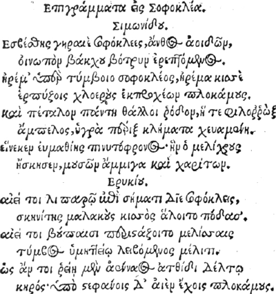 Fig. 28a. Colines's Greek on English or Saint-augustin (1528) as it appears in Sophocles, Tragoediae septem, Paris, Colines, 1528, fol. a2. Courtesy of the University Library Ghent.
 Fig. 28b. Colines's Greek on English or Saint-augustin (1528) assembled from N. Clenardus, Institvtiones in lingvam graecam, Paris, Blaubloom, 1530, fol. 3. Courtesy of the Bibliothèque nationale Paris.
| ||||||||||||||||||||||||||||||||||||||||||||||||||||||||||||||||||||||||||||
[pagina 166]
| ||||||||||||||||||||||||||||||||||||||||||||||||||||||||||||||||||||||||||||
Colines's types by family (roman, italic, Greek) and size (mm/20 lines)A. Roman types
| ||||||||||||||||||||||||||||||||||||||||||||||||||||||||||||||||||||||||||||
Roman titlings
| ||||||||||||||||||||||||||||||||||||||||||||||||||||||||||||||||||||||||||||
B. Italics
| ||||||||||||||||||||||||||||||||||||||||||||||||||||||||||||||||||||||||||||
C. Greeks
| ||||||||||||||||||||||||||||||||||||||||||||||||||||||||||||||||||||||||||||
[pagina 167]
| ||||||||||||||||||||||||||||||||||||||||||||||||||||||||||||||||||||||||||||
References
| ||||||||||||||||||||||||||||||||||||||||||||||||||||||||||||||||||||||||||||
[pagina 168]
| ||||||||||||||||||||||||||||||||||||||||||||||||||||||||||||||||||||||||||||
| ||||||||||||||||||||||||||||||||||||||||||||||||||||||||||||||||||||||||||||
[pagina 169]
| ||||||||||||||||||||||||||||||||||||||||||||||||||||||||||||||||||||||||||||
SummaryThis paper attempts to present a survey of the typefaces that Simon de Colines (Paris, fl. 1518-1546) may have cut. Colines is credited with the introduction, North of the Alps, of the first coherent and aesthetically satisfying set of roman and italic type founts. The article is an update of earlier studies by Barker (1974), Amert (1991; 2001), Vervliet (2002a). In order of the date of their first occurrence, it describes 28 typefaces (21 romans, 4 italics, 3 Greeks). | ||||||||||||||||||||||||||||||||||||||||||||||||||||||||||||||||||||||||||||
SamenvattingDit artikel beoogt een overzicht te bieden van de drukletters die wellicht gesneden werden door Simon de Colines (actief in Parijs, 1518-1546). Colines wordt geacht de eerste coherente en esthetisch overtuigende romeinen en italieken ten noorden van de Alpen te hebben geïntroduceerd. Het artikel is een voortzetting van eerdere studies van Barker (1974), Amert (1991; 2001) en Vervliet (2002a). Het beschrijft 28 lettertypes (21 romeinen, 4 cursieven en 3 Griekse); de volgorde is chronologisch op datum van eerste verschijning. | ||||||||||||||||||||||||||||||||||||||||||||||||||||||||||||||||||||||||||||
RésuméCet article s'efforce de répertorier les caractères probablement gravés par Simon de Colines (actif à Paris, 1518-1546). On lui attribue l'introduction au nord des Alpes du premier ensemble cohérent et esthétiquement satisfaisant de caractères romains et italiques. L'article complète les études antérieures de Barker (1974), Amert (1991; 2001) et Vervliet (2002a). Il décrit 28 caractères (21 romains, 4 italiques, 3 grecs) dans l'ordre chronologique de leur première apparition. |
| |||||||||||||||||||||||||||||||||||||||||||||||||||||||||||||||||||||||||||

