|
| |
| |
| |
[De Gulden Passer 1950]
Oldřich Menhart Czech printer, type-designer and penman
by O.F. Babler
(Olomouc, Czechoslovakia)
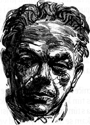
Woodcut by Jaroslav Lukavský.
Czech typography and calligraphy has to-day a representative who is raising it to the highest international level. The title of the present article bears his name, and the article itself will try to tell of some of his merits and successes.
But let us start with some personal information which is worth setting on record, and let us be thankful that we are allowed to give it by Mr Menhart's own words. In a short autobiographical sketch -
| |
| |
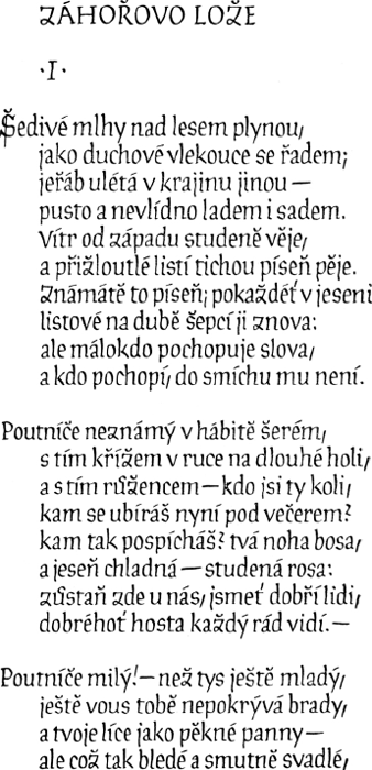
Page from the hand-written book,
Kytice, by Karel Jaromír Erben (1940).
| |
| |
one of the very rare occasions on which this modest artist speaks of himself - he says of his own life: ‘I am a descendent of a large family of craftsmen. My father was a goldsmith, in the mediaeval sense of the word. Of four brothers I was the youngest, being born in 1897, and we were all skilful designers, modellers and engravers, as we had, from our youth, the opportunity of learning all these crafts in my fathers workshop. My parents were poor, so a long period of attendance at school was out of the question. I was learning typography just when the first World War broke out. For five ensuing years I was, in the uniform of an Austrian soldier, driven from one front to another; and when I finally got home, I returned to the printing-shop. From my boyhood years, I was intensely interested in the wealth of letter forms, and I studied lettering first from old sepulchral monuments in churches and in churchyards, and later from books and prints in museums and libraries. But my tasks in the printing-shops offered no opportunity for my lettering talent. On the contrary, even as a foreman in large printing-offices I did no creative work, being allowed to do no more than the work of a technician. While travelling abroad I became convinced that my instincts were right. I studied ancient and modern lettering, and became aware of the contemporary revival of calligraphy. My first journey led me to the Musée Plantin-Moretus, at Antwerp, where in 1924 I passed some weeks in close researches. I later visited many libraries, type foundries, printing-offices and exhibitions in the more important cities of Western Europe. After a few years I was ready for my task. It is rather a paradox that I had first to leave my job in the printing-shop to be able to devote myself to calligraphy, type-design and book architecture; and still more, that I had to work in foreign countries, in type foundries outside my native land. From 1929, I worked as an independent
calligrapher and type-designer, but ten years later one of the greatest publishing houses of Czechoslovakia engaged me permanently. Then the second World War broke out, and our country had to endure six years of Nazi occupation. The book was one of our spiritual weapons of defence during this most fateful period of our history against the cruel oppression of our foes. In those years I created most of my typefaces and bookdesigns. The
| |
| |
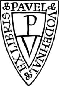

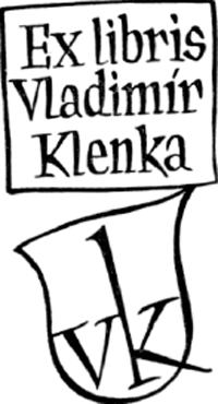
Bookplates (1942-1945).
exhibition of my work, arranged in 1948 by the Hollar Society of Czech Graphie Artists at Prague, was a full chronological survey of my creations. Although there is not much work left for me to do, I hope that the few remaining tasks I set myself in youth may be accomplished.’
Central in Mr Menhart's interest is the book. And though from the outset his activity has appearently been threefold, the unity of his work is astonishing, and establishes the truth that typography, calligraphy and bookdesign are mutually interwoven, all being put at the service of the book.
Through typedesign Mr Menhart has deeply influenced Czech typography and achieved more than any other Czech artist or craftsman before him. Czech typedesign has not, until recently, gained any great prominence, and so has yet no established tradition. Czech typefounding in the 19th century suffered much from the strong competition of German type-production and died out long before the first World War. Following the liberation of the Czech people, in 1918, new attempts were made to produce native type-faces, though hindered by the lack of technical equipment and of experienced workers. The first modern Czech printing types were designed, for the most part, in the period between the two World
| |
| |

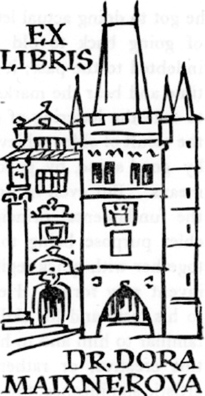
Bookplates (1946-1947).
Wars, by the Czecho-American graphical artist, Vojtěch Preissig, by Slavoboj Tusar, by the fine painter and book-designer, Karel Svolinský, and by the Director of the State Printing-Office, Karel Dyrynk. From their designs types were produced by Czech workshops, but none of these alphabets proved worthy of world interest or fit for competition with foreign designs.
The one man who was predestined to hold first rank in Czech typographie art, both by his intense studies of typography and lettering and by his skill and taste, was Oldřich Menhart. During the last two decades he has created twelve typefaces of challenging capacity and variety. Each alphabet shows a high degree of charm and vigor and craftsmanly skill; each is fashioned in conformity with tradition; an in each is found an inner discipline. As a young student fervently devoted to the service of calligraphy, graphie arts and fine printing, Mr Menhart studied Roman inscriptions, old Slavonic letters and mediaeval scripts, the pure Caroline letter of the eleventh century as well as the spiky Gothic script. But when
| |
| |
he got to doing actual lettering work for wide use, he saw the folly of going back to old models. A type-face must not only be indebted to the past; it must also follow the traditions of our own time and bear the marks of our own national character. We have to take the lettering of our own period which is at the same time the result of older achievements, and whenever necessary improve it by good sense, by good workmanship and by available technical means. But even in times of industrialization and rationalization the fundamental principles of lettering remain unchanged, their chief purpose being to achieve maximum beauty and harmony together with quick legibility. In no case does the letter-designer invent new forms. He is only concerned in making, according to his taste and his skill, and to the usage of his time, the forms familiar to him and to his world. It would be difficult to describe this creative, or rather recreative, process in its technical and artistic significance, the matter being complicated by the differences of individual temper and mentality. ‘Letters are things, not pictures of things... Lettering is a precise art and strictly subject to tradition. The “New Art” notion that you can make letters whatever shapes you like, is as foolish as the notion, if anyone has such a notion, that you can make houses any shape you like. You can't, unless you live all by yourself on a desert island - and die there’, says Eric Gill in his Autobiography (London, 1940, p. 120).
The current typographical dilemma between functionalism and traditional style in typedesign is solved in Mr Menhart's alphabets. His printing types, though they bear no striking signs of Czech folk-lore or of Czech decorative elements, are somehow typically Czech, and such a slightly Slavonic note is one of their charms. He avoids mere ornament, there are no ‘fancy letters’, or other vulgarities that seek to make something seem better than it really is. Mr Menhart's types are astonishing in their conformity between Roman and Italic; and the relation of the capitals to the lower-case shows sensitive proportions, all endowed with beauty and perfection of form. Remaining faithful to the tradition of calligraphy, Mr Menhart (unlike most of his predecessors) designs all his types not on a constructional basis but on that of handwriting. But though his type-designs are derived from calligraphy, they aim
| |
| |
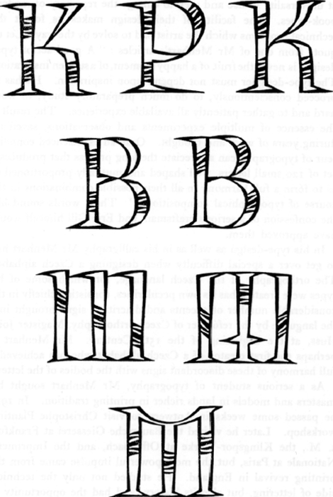
Initial letters, from Mabinogi (1944).
| |
| |
at universality in use and seek to enlarge the repertory of modern book-types. The facility of their design makes us forget the technical problems which the artist had to solve by the way. Let us quote from one of Mr Menhart's articles: ‘A good set of type-designs is never the fruit of a happy moment, of a sudden inspiration. The type-designer must not depend upon inspiration. He has to proceed conscientiously, to do much preparatory study, to work hard and to gather patiently all available experience. The result is the essence of multiple experiments and observations, saved up during years of work and thought. Only an experienced connoisseur of typography can appreciate the long process that produces a set of 120 small letters, well shaped and mutually proportioned so as to form a full harmony in all their possible combinations in the course of typographical composition...’ These words sound like the confession of a serious craftsman, and Eric Gill himself would have approved them.
In his type-design as well as in his calligraphy Mr Menhart had to get over a special difficulty when designing a Czech alphabet. The orthography of the Czech language, for which some of his types were created, has its own pecularities, consisting chiefly in the considerable number of accents and diacritical signs brought into the language by the reformer of Czech orthography, Magister John Huss, at the beginning of the 15th Century. Mr Menhart is perhaps the first creator of a Czech alphabet who has achieved a full harmony of these discordant signs with the bodies of the letters.
As a serious student of typography, Mr Menhart sought his masters and models in lands richer in printing tradition. In 1924 he passed some weeks in Antwerp to visit Christophe Plantin's workshop. Later he visited the Bauersche Giesserei at Frankfurt a. M., the Klingspor-Werke at Offenbach, and the Imprimerie Nationale at Paris, but the most powerful impulse came from the printing revival in England. He studied not only the technical side of lettering, but also its history, and had the opportunity of getting acquainted with the noblest achievements of human skill. We may quote him, when he gave his interviewer, Mr Rudolf Hála, the printer, this outline of the history of typography for the Czech quarterly Hollar: ‘Each period had its masters of type-
| |
| |

Calligraphic one-line title of a weekly paper (1948).
designing. But the validity of their work is unequal. The classical letters of the first three centuries of printing, the mediaeval types of Garamond, Caslon, Janson, are always beautiful and useful, and enjoy great favour even to-day, as they were created in accordance with calligraphy, in the manuscript tradition. The types of the Empire period, like Didot, or Bodoni, are not so popular, and their renewed fame is passing, because they were created in disagreement with the logic of the written organism of the letter signs. Though Edward Johnston and Cobden-Sanderson are dead, their seed is now ripening and bearing fruit. The revival of calligraphy, its ascension from a half-buried past is taking place at the same time and in the same manner in many countries of a mature book-culture, and has its influence on the creating of modern types. The revival of contemporary letter-design will spring from that fact.’
But the moment has come to give an account, or rather a chronology, of Mr Menhart's typedesigns as they issued from several type-foundries in his native land as well as abroad. Here is a list of them:
| ANTIQUA, designed in 1930, cut in 1930-1935 |
} |
Mr Menhart's first type designs, produced by the Bauersche Geisserei, Frankfurt a. M. |
| ITALICS, designed in 1931, cut in 1931-1935 |
} |
Mr Menhart's first type designs, produced by the Bauersche Geisserei, Frankfurt a. M. |
| BOLD ANTIQUA, designed in 1935, cut in 1936 |
} |
Mr Menhart's first type designs, produced by the Bauersche Geisserei, Frankfurt a. M. |
| ROMAN MONOTYPE, designed in 1933, cut in 1934-1936 |
} |
Cut by the Lanston Monotype Co., London. |
| ITALIC MONOTYPE, designed in 1934, cut in 1934-1936 |
} |
Cut by the Lanston Monotype Co., London. |
| |
| |
| ROMAN FIGURAL, designed in 1940, cut in 1949 |
} |
Cut by the State Printing-Office, Prague. |
| ITALIC FIGURAL, designed in 1945, cut in 1950 |
} |
Cut by the State Printing-Office, Prague. |
| ANTIQUA AND BOLD VICTORY-INTERTYPE |
} |
Designed in 1942-1943, during the Nazi occupation. Now in course of production by the Intertype Corporation, New York. |
| ITALIC VICTORY-INTERTYPE |
} |
Designed in 1942-1943, during the Nazi occupation. Now in course of production by the Intertype Corporation, New York. |
| MANUSCRIPT ROMAN, designed in 1944, cut in 1945 |
} |
Published by the Czech Type Foundry, Prague. |
| MANUSCRIPT ITALIC, designed in 1945, cut in 1950 |
} |
Published by the Czech Type Foundry, Prague. |
| UNCIAL, designed in 1945, cut in 1949, by the State Printing-Office, Prague. |
| HOLLAR, designed in 1939, cut in the same year, only in a single size, for Jaroslav Picka's private press. |
A craftsman in the noblest meaning of the word, Mr Menhart has achieved great success in allying art to type-making. Having seriously studied mediaeval models, he adapted them to modern requirements and thereby attained his mastery of the art of lettering. His types have had immediate and widespread success and have won the praise of the world's leading typographie authorities.
When the Bauersche Giesserei, Frankfurt a. M., published specimens of Mr Menhart's types, Mr E.R. Weiss, the great graphic artist and book-designer wrote to him in a letter, dated March 3, 1934: ‘Ich möchte Ihnen auch meine hohe Anerkennung Ihrer Antiqua und Ihrer Kursive aussprechen, die in den veränderten strengeren Formen der geschnittenen Schrift doch das Persönliche und Charaktervolle der ursprünglichen geschriebenen Schrift so weit bewahrt hat, wie das eine geschnittene Schrift überhaupt darf... Ich bin objektiv genug in meinem Urteil, zu sehen, dass Ihre Schrift, sowohl die Antiqua wie die Kursive, und ganz besonders diese Letztere, in jeder Beziehung eine meisterhafte Leistung sind, die sich neben die edelsten alten Schriften stellen kann.’ And on another occasion Prof. Weiss wrote: ‘Ich finde die Menhart-Schrift ganz ausgezeichnet gemacht, eine der geschmackvollsten und gelungensten Arbeiten, welche die Bauersche Giesserei herausgebracht hat...’ Mr A.A.M. Stols of The Hague, another great book-architect of our time, expressed his appreciation with the words: ‘Le caractère de Oldřich Men- | |
| |
hart compte à mon avis parmi les plus beaux caractères de notre siècle.’ Den Gulden Winckel, Amsterdam, wrote: ‘Welnu, Menhart's letter is zeer leesbaar, goed geproportionneerd en rustig. Zij laat zich kennen als een der beste moderne Europese typen.’ Stanley Morison of London, one of the highest authorities in modern typology, wrote: ‘The Menhart fount is a straight-forward book-face unspoiled by the excessive “individualismus” so noticeable in German efforts.’ And finally Mr J.A. Howard: ‘Menhart's latin characters form a handsome type which looks well in the mass on a page, and from a lengthy examination of it, it does not appear to tire the eye, as do some of the recently
designed types.’
Among the faces designed by Mr Menhart the Manuscript-Type adapts formal script to typographical usage; yet with most of his other types it shares the advantage of not representing too exclusively the atmosphere of some remote period. ‘One of the most alluring enthusiasms that can occupy the mind of the letterer is that of inventing a really logical and consistent alphabet having a distinct sign for every distinct sound’, says Eric Gill in his Essay on Typography. Mr Menhart has done much to reconcile the old traditions of lettering with the demands of originality and modernity in this Manuscript-Type. He has taken particular pains to create a type for purely decorative printing as well as for printing some unusual book, and there is no doubt that he has been rewarded by a type exceptionnaly interesting and beautiful, a successful piece of drawing. Even its slight irregularities in design and cutting are no impediment to easy and pleasurable reading, but these faces show the general love of symmetry and rhythmic stress of the old writing-masters. A page set in this type has clarity, grace, unity and proportion; and even the problems peculiar to Czech orthography are here solved happily. Though this fount is, somehow, deeply traditional, it has no obvious affinities with older styles and bears a distinctive individuality of design. The Manuscript-Type is, of course, no letter-type for the ephemoral book; but it can be strikingly used for fine editions, as in the Regule kaligrafů, one of Mr Menhart's own charming prints. This type discloses very clearly the common roots of calligraphy and typography. But let
| |
| |
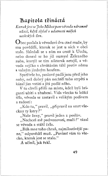
A page from Charles De Coster's Légendes Flamandes (1944).
| |
| |
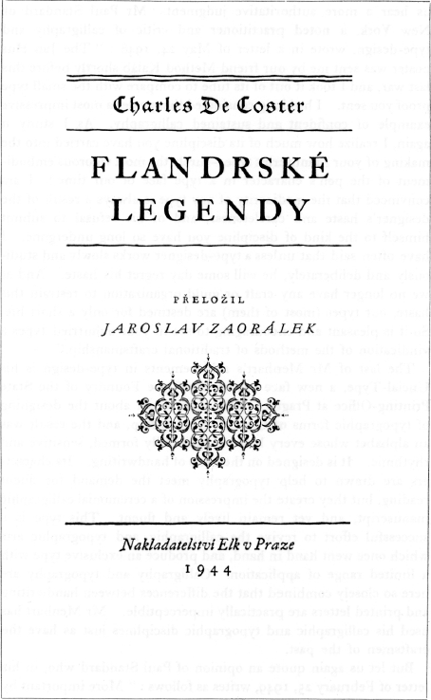
The title-page of Légendes Flamandes.
| |
| |
us hear a more authoritative judgment. Mr Paul Standard of New York, a noted practitioner and critic of calligraphy and type-design, wrote in a letter of May 24, 1948: ‘The Jan Hus poster was sent me by our friend Method Kaláb shortly before this last war, and I took it out of its tube to compare with the small type proof you sent. I had long considered that poster a most impressive example of confident and sustained calligraphy. As I study it again, I realize how much of its discipline you have carried into the making of your Manuscript type - surely the most vigorous embodiment of the pen's character in a type face of our time! I am convinced that the mediocrity of any type is always a result of the designer's haste and carelessness, and of his refusal to submit himself to the kind of discipline you have so long undergone. I have often said that unless a type-designer works slowly and studiously and deliberately, he will some day regret his haste. And as we no longer have any craft or guild organization to restrain this haste, our types (most of them) are destined for only a short life. So it is pleasant and encouraging to see in your unhurried types a vindication of the methods of traditional craftsmanship.’
The last of Mr Menhart's achievements in type-design is his Uncial-Type, a new face cut by the Type Foundry of the State Printing-Office at Prague. This time he set about the designing of typographic forms of Caroline penmanship, and the result was an alphabet whose every letter is splendidly formed, sensitive and rhythmic. It is designed on the basis of handwriting. Its characters are drawn to help typography meet the demand for fluent reading, but they create the impression of a ceremonial calligraphic manuscript, and yet remain lively and fluent. This type is a successful effort to revive the calligraphic and typographic arts which once went hand in hand, and produce an exclusive type with a limited range of application. Calligraphy and typography are here so closely combined that the differences between handwriting and printed letters are practically imperceptible. Mr Menhart has used his calligraphic and typographic disciplines just as have the craftsmen of the past.
But let us again quote an opinion of Paul Standard who, in his letter of February 25, 1949, writes as follows: ‘More important by
| |
| |
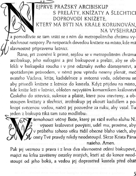
Page from the Coronation-Ceremony of the Czech Kings (1940).
| |
| |
far is the proof of the first size of your Unciale face. I cannot recall any uncial of modern times with as much color as yours. It matches Victor Hammer's in vigor, but shows, I think, more variety in its undulating weights of stroke. This latter factor it is that makes your uncial the liveliest I have yet encountered. It should have a wide appeal, for its versatility will surely extend its use into many quarters that would normally be timid about the uncial form. Your forms are splendid, almost every character showing the happy result of your long scribal discipline. Your a c d g q j n - how could these be bettered? And your ingenious way of subduing the hailstorm of Czech accents should make you the world's leading authority on that baffling subject.’
Oldřich Menhart is acknowledged as the most active agent of the revival of interest in and enthusiasm for calligraphy. He considers penmanship the most important part of his work. If he had not done so much to improve inscriptions, much of the inscribed work in Czechoslovakia would be worse than it is. It lies in this artist's ability to seize the major points of a concrete scriptural problem and to provide a solution that will have much more than interest or taste: the fitness and simplicity of the finest craftsmanship. His studies, as well as his own achievements in writing, are based not only on a knowledge of the manuscript hands of the Caroline and Renaissance period, but also on an acquaintance with the forms of the Glagolitic writing of the Orthodox East. The letters of his handwriting are beautifully shaped. Thicks and thins are formed entirely by the pen itself as it turns corners or reaches the end of a stroke. His whole hand, though quite formal, is splendidly rhythmic and easy, without exaggerations or excentricities; it is extraordinarily vital, and there is a firm composition which builds up the letters into words and words into sentences.
Mr Menhart himself has written down his experiences in calligraphy and published them in a fascinating pamphlet Regule kaligrafů, i.e. The Calligraphers Rule, and we are glad to be able to present it here in full:
The calligraphers' rule is a severe one: it requires much patience, discipline and respect for tradition, but it offers little hope of creating a work completely original and never seen before. In the
| |
| |
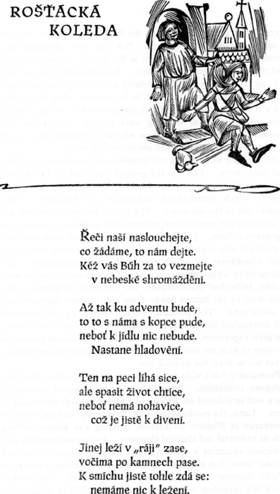
Page from the book, Songs of the Vagrant scholars (1948).
| |
| |
hierarchy of graphic arts this is the least popular order, poor in number of adherents, neglected. Not long ago, calligraphy was proclaimed to be an anachronism in the century of mechanization and the general victory of the press. But calligraphy has not died out; on the contrary it shows a vitality and validity more and more recognized. However, it is not to be expected that the modest place it holds among the graphic disciplines will rise to a higher rank. The nature of lettering work excludes adepts too self-confident, and the number of those who will persevere even in spite of failures and temptations will always be only small.
All lettering work entails two fundamental conditions: legibility and noble form. There is the general view that, in this regard, contemporary typography has reached the highest grade of perfection, which overshadows calligraphy and banishes it from modern life to the museums. The scribe, however, does not aim at achieving the monotonous, mechanically-polished appearance of typographic faces. Calligraphy cannot and even does not wish to compete with typography in mathematical precision and superficial smoothness by which typography is distinguished. The rudiments by which calligraphy lives and creates are of another sort: vitality, individual manifestation, the immediate impression of a work done by the human hand - these are the main characteristics of calligraphy. The penman, unencumbered by the technical and mechanical limits of the printing craft, enjoys a full liberty. But great experience, assiduous endeavour and an almost passionate devotion to work are necessary to reach a level where a written work is not worse than the printed one.
Penmanship has a wide and glorious tradition which is older than European civilization. Long before the invention of printing it was a well established art which was fostered through thousands of years. Latin, the mother-tongue of Christianity, was the common inheritance of Western civilization, imbuing also Roman writing with its universal and classical character. In various centuries and in various countries it yielded to the varying historic styles and national tastes; but essentially it did not change, being a matter of definite character. This fact must be emphasized. The scribes before the invention of printing had a vast field of calligraphic
| |
| |
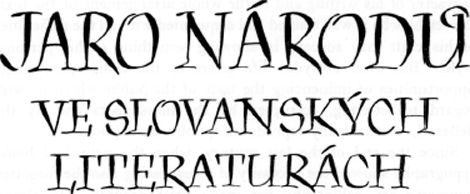
Title-inscription for a book-cover (1948).
activity. This has dwindled since the time when the forms of the Roman letters reached their crystalline purity and essentiality, being gradually deprived of all archaic and purely decorative appendages.
It is obvious that even modern calligraphy cannot create quite new and unknown letter-forms. Nobody would understand them. Even experiments aimed at modifying the essential of the script would be a mistake. The penman can only test his skill by varying, rearranging or alternating traditional forms of Roman script and of the scripts derived from it (Uncial, Italic, Gothic, etc.). The writing instrument and material are important factors in this activity which consists chiefly in two tasks: a faultless mastering of the correlative forms of the whole alphabet, and the placement of the text area on the given surface. The idea of calligraphy is, of course, not confined to manuscripts in the narrow sense of the word (i.e. documents, books), but means all sorts of lettering: monumental inscriptions on stone, metal, wood, or other material, formed by relative processes of calligraphy. Letters constructed or reproduced mechanically do not belong to the sphere of calligraphy.
Calligraphy cannot be superseded wherever a sole and unique copy of a given text is to be produced. In this traditional work the practice of the modern penman does not differ much from that of a mediaeval scribe. The material for a ceremonial document or a charter is still parchement or hand-made paper, the scribe's tool is still a swan or a turkey quill, as in olden times. Only in the
| |
| |
character of his writing and in the whole arrangement of the text, the scribe who is well trained and acquainted with all the difficulties of his craft may succeed in showing something of his personal style. But even everyday life offers to the calligrapher many opportunities of influencing the taste of the public which is, with regard to lettering, corrupted by the newspapers and by the debased, mechanically-reproduced public inscriptions.
Since the end of the last century, when the revival of book-typography showed the necessity of resuscitating also the forgotten penman's art, calligraphy has made great progress. In almost every European country we know of scribes whose definitely formed work is a valuable contribution to the contemporary graphic arts. Working societies and national schools of calligraphers are rising whose founders, like Edward Johnston, Alfred Fairbank, Stanley Morison in England, Rudolf von Larisch at Vienna, Rudolf Koch at Offenbach a. M., W.A. Dwiggins, T.M. Cleland, Paul Standard, Raymond DaBoll in USA, Jan Tschichold in Switserland, are not only counsellors and educators in their own circle, but give us also reference-works about calligraphy which are necessary for theoretical studies. But even modern industry endeavours to facilitate the scribe's activity by producing metal pens suited for his special tasks. In that respect, we may not complain: the choice of writing tools and implements is increasing, and gives proof of the fact that the art of writing is winning interest. In foreign countries, numerous manuals, occasional exhibitions and collections in museums are helping to promote the understanding of penmanship. New methods of teaching calligraphy at the primary schools are tried out from time to time, and this also shows that the interest in penmanship is still vivid, though from the results of all this endeavour it is obvious that even the best educationalists are not always connoisseurs of writing.
If we speak of letter-shaping, not only the pure formal drawing line is concerned. Though the creative phantasy of the penman is fettered by the severe laws of the letter-shape and by the nature of the material and tool which he uses, the fountain of the formal wealth of writing will never be exhausted. It is a well-known fact that handwriting is an unconscious indicator of the temperament
| |
| |

Calligraphic heading for a literary paper (1946).
and the character of the writing person. Calligraphical handwriting can therefore - as each real craft - intentionally bear the imprint of every mood, passion, inclination, or melody, and may be able to raise the impression of the written text to the height of an artistic experience. The script is not just a dry means of understanding if the calligrapher is able to imbue it with deep feeling enthusiasm, grief, axiety or wrath. The pulse of life beats in the classically plain contours of the letters. But it is necessary to have feeling and perception enough to understand the mysterious fluency of the writing-forms. But alas! even in our national sanctuary, in St-Guy's Cathedral, our eyes meet monumental inscriptions of recent date which show that their authors were cold wretches, lacking delight in the inner beauty and generative power of lettering!
The community of the connoisseurs and lovers of calligraphy is increasing, especially in the countries of a writing culture. In Bohemia and Moravia the evolution of the Roman alphabet has no firm roots. The first national script of the Czechs was the Old Slavonic alphabet of St. Cyril. But this alphabet was soon replaced by the Roman script which was gradually forced out by all sorts of Gothic script throughout Central Europe, and this script held its place in Czech typography as well as in handwriting until the middle of the last century. This may explain the lack of appreciation of penmanship among the wider circles of the public, but not excuse the officials responsible for the development of arts.
As original written works will always be rare and difficult of access, we may place full confidence only in the modern technical
| |
| |
processes of reproduction which will, no doubt, influence the further development of calligraphy.
So far the Calligraphers' Rule.
Mr Menhart's achievements in calligraphy, which range from labels and posters to documents and whole books, were very warmly appreciated by Paul Standard, and we may be allowed to quote from his letter of July 8, 1948, the following paragraph: ‘How shall I thank you for the two lettered versions of the motto: “Bohu nejprve bud' slouženo!” Each is in its own way imbued with that vigor and grace I have so long associated with your pen and your brush. In the single-line lower-case version you have produced a woven texture of letters; in the quasi-uncial forms each letter is charged with its share of feeling, so that the whole becomes a cry as from the heart of the author, echoed by the hand of the scribe! Yet that scribe, I am sure, was not seeking to be “original”, or to be what is in commerce called “effective”; he had simply studied his text, let his heart respond, and so gave to his hand a power not to be summoned by a mere act of will; rather does it come only from deep conviction. That is why I cannot think of any rival motto from the hand of any other living scribe. The only parallel is Rudolf Koch, who in his very death is far more alive than most of our living practitioners are today. We have many gifted scribes with us today, but their aspiring talents are suppressed or dwarfed by the unworthy commissions they receive from commercial clients. That is why the sight of your present commission is so heartening to the spectator and so creditable to scribe and publisher and printer alike!...’ And here is a paragraph from another letter of the same correspondent, dated January 29, 1949: ‘Please don't mistake my silence for indifference or ingratitude! For of course you know that I am more than casually interested in all that you do in every branch of letter forms. You remember that the manna fed in Biblical times to the desert-wandering
Israelites tasted (for each individual wanderer) like that food which he liked best! So it is with the undersigned: such specimens of calligraphy and typography as you send seem always to be exactly what I like best. And the same is true of the friends to whom I show your work - these being largely professional book artists; they too are all full of admiration
| |
| |
for your versatile and vigorous work, even though their standards of judgment are of course stricter than any lay criticism could possibly be. Your bold and forthright hand shows to every seeing eye the firm root from which all your other work springs - and this includes your decoration, which seems to me a written, a calligraphie and not a drawn decoration, as your simple panel for Vyšehrad clearly shows. The same is true of your decorative devices on the splendid government poster. The resuit is a unique harmony - as of everything growing directly out of a searching & active & inspired pen. And what makes this pen so powerful is its native avoidance of mere complexity in favor of the barest and clearest simplicity.’
There are, to-day, few real writing-masters left. The hand taught in the schools at the beginning of this century was so lacking in feeling and character that the prevalence of bad writing can be no surprise. Of handwriting to-day little good can be spoken, the form of our writing being often a disgrace to civilization. But there is no reason why the form of the letters of our handwriting should not be as beautiful as possible - especially when there is a reasonable premise that the most beautiful hand is at the same time the most legible. As beauty and legibility go hand in hand, an improvement in handwriting is desirable both from the aesthetic and the practical point of view. Children in schools should be led to appreciate that to write beautifully is an achievement, and that good writing is good manners. ‘Modern handwriting, if it is to be reformed at all, must be reformed by the application of a good knowledge of the technique of penmanship to a knowledge of good printing and not by the resuscitation of mediaeval calligraphy.’ writes Eric Gill in his Essay on Typography. It would, I suppose, be vain to insist that everyone should have so capable and beautiful a hand as Mr Menhart's, for that can be achieved only by someone who cares about handwriting for its own sake, as a means of artistic expression. But it would be necessary for nearly all of us to regain some pride in our handwriting by realizing that writing can and should be something more than strictly utilitarian. And it is precisely Mr Menhart who, having attained his own standard of writing without being too much indebted to the past, has helped by his personal example as well as by his teaching to raise the artistic
| |
| |

Page from the book, Mss of Zelená Hora and Dvůr Králové (1948).
| |
| |
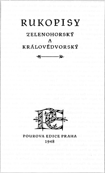
Title-page from the book, Mss of Zelená Hora and Dvůr Králové (1948).
| |
| |
level of writing in Czechoslovakia. The School of Applied Art in Prague which, in the years of the first World War and in the times between the two wars, was already fortunate enough to have on its staff the calligrapher and book designer Jaroslav Benda, an artist remarkable for the originality, beauty and modern style of his lettering, is now still more fortunate to have in Mr Menhart a teacher of such outstanding qualities. These promise a further development of Czech calligraphy under Mr Menhart's influence.
The central point of Mr Menhart's interest being the book, there is much to be said of his bookmaking. Having acquainted himself with all the problems of bookarchitecture and typology early in his career, his chief aim was to reconcile the old standards of solid craftsmanship with the progressive methods of typography and book-production. The chief condition of success is the quality of type-setting and printing, which in this mechanical age is perhaps no worse than in the days of manual work. Mr Menhart's book-designs are simple and sober, planned and produced with rare taste, knowlegde and skill. Type sizes and faces proceed from the nature of the text, the type-area being so placed on the page as to give the reading eye repose, not excitement. His every titlepage proves that he knows how to make this a summary image of the text pages that follow. To him, every book worth publishing at all must be as well produced as possible within its price limits. Such graphic integrity, applied to the whole bookmaking field, has put every bibliophile in Mr Menhart's debt. Czech book-art is fortunate in having many bookmakers who have never lost their personal affection for books; and Mr Menhart's contribution to the revival of Czech bookart ranks him with the graphic leaders in his country.
The merest listing of the books designed by Mr Menhart would surpass the limits of this article, but mention must be made of the handsome volumes of the Atlantis-Collection, published by Jan V. Pojer, at Brno, some of them being remarkably fine achievements, such as for instance the Mabinogion, with its beautiful titlepage. From another publisher came an edition of Charles de Coster's Légendes de Flandre, a very pleasantly-printed book; still another published Paul Claudel's Verlaine, with a very fine titlepage, and
| |
| |
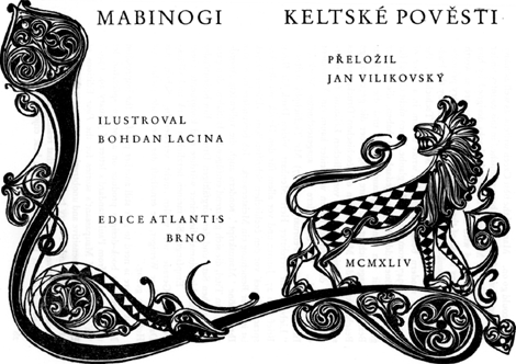
Double-page book-title, with a woodcut by Bohdan Lacina (1944).
| |
| |
so we could go on. Many of the best Czech writers, as well as many an author of world fame, have been published in this country under the supervision of Mr Menhart. All the books designed by him have been produced with the utmost care, and they are as worth collecting as any books of the most famous contemporary printers. Mr Menhart's book-designs were warmly appreciated by the leading authorities of book-production. Mr Jan Tschichold, the master of modern book-typography, wrote to him in a letter of January 24, 1947, from Basel: ‘Ich glaube, Ihnen nicht einmal für die sehr schöne Edda-Ausgabe gedankt zu haben, die ich vor geraumer Zeit von Ihnen zugesandt erhielt und die in jeder Beziehung ausgezeichnet ist. Ihre Klage über die gegenwärtige Beschränkung der Möglichkeiten des čechischen Druckgewerbes scheint mir angesichts einer so vortrefflichen Leistung fast übertrieben. In der Schweiz haben wir leider kaum ein Äquivalent vorzuweisen!... Ich bewundere Ihr ausgezeichnetes Werk...’ In another letter (February 2, 1947) Mr Tschichold writes: ‘Lieber, sehr verehrter Herr Menhart, vielen Dank für Ihren Brief vom 27. Januar und vor allem für den Druck mit der Ansprache Beneš' vor den čechischen Schriftstellern. Dieser Druck ist in jeder Beziehung ein Meisterwerk. Ich bewundere nicht nur Ihre schöne “Manuskript”, sondern auch die vollendete Anordnung, den Titel, die sich glänzend einfügenden Initialen, den ganz vorzüglichen Satz und den sorgfältigen Druck. Ein bedeutender Inhalt hat hier einmal die seiner würdige und kongruente Form gefunden. Empfangen Sie meinen herzlichen Dank und Glückwunsch! Gerade wir wollen nicht verzweifeln. Schon das Dasein einiger Weniger, die ernsthaft das Bleibende suchen, ist Hoffnung genug.’
But if there is need to give still another proof of the impression Mr Menhart's book-designs produce on a foreign spectator, let us quote again from Paul Standard's letter of January 29, 1949: ‘Your design of Maupassant's stories for the Pour Editions of Prague is again so sensitive and unobtrusive as to deserve the thanks of every reader, and of every typophile besides. What our typographers do not seem to understand is that reading is perhaps the last of our quieter pleasures which are best enjoyed in solitude.
| |
| |
And if this solitude is invaded by some noisy typographic circus, the reader's quiet is disturbed at the very moment when he had thought quiet to be assured. On this account we need more typographers-who-also-read! So I give fresh thanks for O.M. & for the book he has designed and sent.’
At this point a special reference must be made to Mr Menhart's hand-written books. It is supreme praise to say that all of them turn out to be both beatiful and legible. The degree of their perfection is not to be surpassed and they rank with the most finished performances of the world's calligraphy. Such, for instance, is the manuscript transcription of a Czech classic, Karel Jaromír Erben's Kytice (of which an exhibit accompanies the present article), reproduced and published, with drawings by Antonín Procházka, by Jan V. Pojer, which is a book of pure and stainless beauty.
Pleasant as well as important by-products of Mr Menhart's calligraphie production are his book-plates which, by their solid craftsmanship and firm design, reach a confident perfection in this minor art. As we have already profited to the full from Paul Standard's judgment to confirm our own statements, let us quote again a short paragraph from his letter of September 6, 1948: ‘But how am I to thank you properly for your generous gifts of books & books labels of your design? All have reached me safely, and I need hardly assure you that I deeply appreciate them and cherish them for themselves no less than for what such rare gifts imply in point of personal regard. The series of Ex Libris labels is of remarkable consistency; and I am glad to find you in agreement with Gordon Craig, who felt that a book label should be simple & unpretentious - that it should not proclaim the fame or talents or honors of the person named, but rather should state simply & modestly (wasting as little paper as possible!) that this book belongs to him, the legend being written in good, clear letters. How few book labels today satisfy these simple conditions! Your ingenious & sensitive use of initials for decoration of the labels has astonished & delighted a number of my friends - notably George Salter, who is himself a deeply-gifted scribe & book-artist. I refer now to the use of P V and P Z and the flowered initials in the
| |
| |
Dagmar Menhartova panel - especially this last - which must be one of your unique powers.’
To the student of calligraphy, of typographic history and of the book-arts much of interest will be found also in Mr Menhart's scattered articles which were published in different papers and publications, each embodying considerable experience and discrimination. They often deal with the problems facing the calligrapher, printer, type-designer and engraver of today, and reveal the author's intense interest in lettering and in all problems of lettering and of book-production in general. As the readers of this article have already had the occasion to read Mr Menhart's Calligraphers' Rule, we have only to mention at least his charming book The Evening Talks of Rubricius the Book-Lover, and Tympanus the Impressor (Kroměříž, printed and published by Karel Kryl, 1947). This pleasant dialogue contains the author's creed as a practising book-designer, all book problems being discussed with humour and deep insight.
Mr Menhart who is tireless in forwarding the artistic side of printing has always shown his awareness of the modern currents in typography marked by the names of Cobden-Sanderson, Eric Gill, or Stanley Morison. But all his works are not only the result of a technical skill and adaptability, but they are also impregnated with deep humanity and warm feeling. František Hrubín, the poet, was right in saying at the opening of Mr Menhart's exposition at Prague, in Spring 1948: ‘The mark of all true art is love... With humbleness of heart Oldřich Menhart advanced towards the ancient art of the letter, and, in the service of the poets, he gave new and clearer light to the pages of their works... His script is so full of life, because even in its finest hair-stroke it imbibes the terrestrial vigour of his country. In the lines of his script Mr Menhart has caught the most noble elements of Czech writing. But now, even foreign words are captured by its arches and bows. On Mr Menhart's trellises even the glorious vine of foreign literatures ramifies. To the eyes of thousands of English and American readers the lines and sentences of their own poets appear in shapes which a Czech artist's skill has lent them.’
When, in 1948, he got the Czechoslovak State Prize for calli-
| |
| |
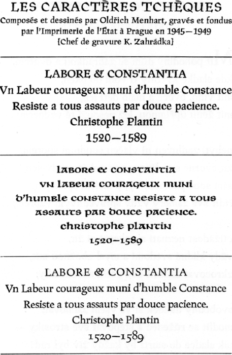
Ce supplément a été tiré par l'Imprimerie de l'État à Prague. Offert à la revue Compas d'Or à Anvers, pour accompagner l'article sur Oldřich Menhart.
| |
| |
| |
| |
| |
| |
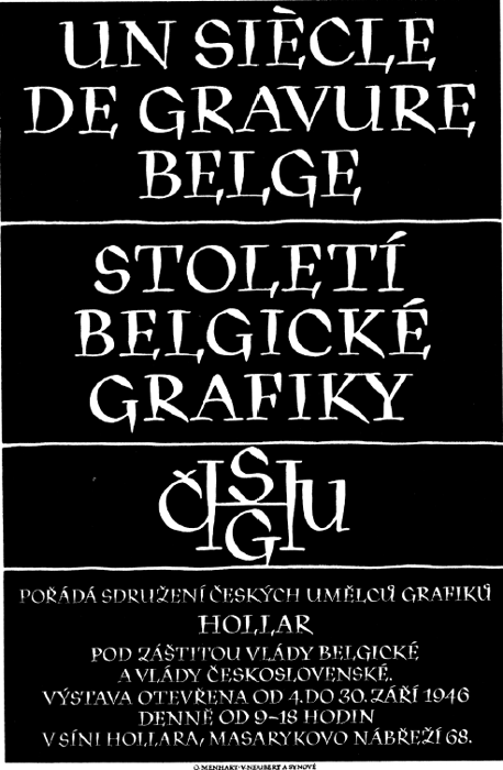
Écriteau d'une affiche d'exposition
| |
| |
graphy, lettering, typography and book-design, no justification was needed for this honor, because his work is far from being a matter of personal ambition. Mr Menhart helps, by his own works as well as by the example he gives to other workers, not only to restore the predominance of culture above civilization, of craftsmanship above technics, of the soul above the bodily substance, but also to bend technology to the advancement of great spiritual values. And that is a task worthy of a disciple of the great printing master Christophe Plantin.
Oldřich Menhart needs no apologist. He can well afford to let his works speak for themselves, and also for himself. And so, if an excuse is needed for this article, it may be found in the fact that his works are dispersed over several countries. Further studies and researches will be needed to keep pace with his future creations, his activities being just now both numerous and various.
|
|