De Gulden Passer. Jaargang 25
(1947)– [tijdschrift] Gulden Passer, De–
[pagina 1]
| |
[De Gulden Passer 1947][Nummer 1-2]The approach to printing as an art in America
| |
[pagina 2]
| |
five-inch lens placed on a map eighty inches broad. The geographical bit best suiting the purpose of detailed observation is the New England region centering in the city of Boston, in the state of Massachusetts. Of course many more books are actually being made in the vicinity of New York, which is also the home of The Grolier Club, the American Institute of Graphic Arts, the Bibliographical Society of America, the American Type-founders' library at Columbia University and other great collections like the New York Public and Morgan libraries; designers, typographers, printers and publishers by the score have headquarters in this North American metropolis. The midwestern challenger is Chicago with its Newberry Library, Society of Typographic Arts and book clubs, to say nothing of commercial houses such as the Lakeside Press. On the Pacific Coast there is also much to interest students of printing - the Grabhorns, the Book Club of California, for example. But the countrywide view is too varied and confusing and we must return to the small sample in the northeast corner. Boston comes under the middle of the lens. Portland, Maine is at the northern rim and New Haven, Connecticut at the southern - about 300 kilometers, roughly the distance from Ostend to Luxembourg. In area the sample is comparable to the Belgian homeland. It includes seaside cities such as Providence, similar in size to Antwerp, and inland centers like Worcester, corresponding in population to Brussels. The metropolis of the region, Boston, is rather more than twice but less than three times the size of Antwerp. Boston, or more precisely Cambridge just across the Charles River from it, is where the first printing press was set up in British-settled North America, under the fledgling wing of Harvard College, in 1638. It followed by a century the continental beginnings at Mexico City where the first press in America was established about the time Christopher Plantin opened his career at Antwerp. The story of the Cambridge Press recently publishedGa naar voetnoot(1) recalls with emphasis how far the Bay Psalm Book lagged | |
[pagina 3]
| |
in workmanship behind the output from the Compas d'Or. The present article seeks to answer a natural question as to the means by which the chasm between American and European standards of printing design and production has been bridged, so that on occasion Belgian connoisseurs can grant interested and respectful attention to books from the United States. It will be concerned most particularly with the development in America of fine printing, or printing marked by an ambition to excel, in the light of traditional performance, the mere business demands of the trade.
Benjamin Franklin, Printer, initiated so many things and labored so effectually to increase the esteem of the new United States in foreign eyes that it would be neat to trace the rise of fine printing back to him. But this (though frequently allowed in anniversary enthusiasm) would not be sound history. The good doctor made his contribution to the development of typography in colonial times, both by his own work and by strengthening the hands of others. He imported the admirable fonts of William Caslon and suggested improvements in the old two-pull wood-framed press. By generous appreciation he encouraged effort toward better bookmaking, and the collection of worthwhile books was second nature to him. His best claim, perhaps, rests on the fine script type, modeled on his own roundhand, that he had cut by Fournier, and on some of the products of his private press at Passy. The fact is that neither the things he had a hand in at the Boston printing office nor the later work at Philadelphia are distinguished by any glow of the inventive genius displayed in other ways. Franklin's naming of his younger contemporary Isaiah Thomas as the ‘American Baskerville’ points to a likelier candidate. But with all his merits as historian and printer (and he doubtless outranked the Birmingham master in some respects) Thomas now appears uncomfortable in that fulsome title. His books show excellences, frequent ingenuity in overcoming difficulties of the time and place, and now and then a promise of finished performance. However, Thomas's intentions rarely transcended | |
[pagina 4]
| |
practicality. Colonial American printers had never heard of hitching their wagons to an esthetic star. Their highest goal was sensible, honest craftsmanship worthy the traditions of Ars Artium, which had nothing at all of the ‘art idea’ about it. At the beginning of the nineteenth century the activities in England led by William Bulmer and Thomas Bensley were accompanied by much popular interest and enthusiasm. That revival of printing - one of several notable turnings-back for inspiration to the golden achievement of the past - touched the ambition of the culturally dependent Americans. From the first decade numerous examples may be found, even from out-of-the-way offices like those of Thomas Wait in Portland or Joshua Cushing of Salem, that reflect a new zeal. Competent authority has awarded the palm to Fry & Kammerer of Philadelphia for their 1807 quarto luxury volume of Joel Barlow's Columbiad - an attainment properly signallized by the modern Columbiad Club of bookmen with headquarters at New Haven. Meanwhile the earliest New England printer's society had taken shape in 1805. It was called The Society of Printers of Boston and its Vicinity, and later the Faustus Association. The master printers who composed the group did not gather to encourage one another toward better standards of workmanship. Rather their purpose was to fix prices for work and to agree on ‘certain rules to be observed in relation to apprentices and journeymen’ who were then tending to become obstreperous. Their concerns were not those of artists or designers, historians or bibliophiles (although such interests were well represented individually) but of prudent tradesmen. As an organization, the closest they ever came to paying respects to fine printing was when they sought to improve the quality of native paper or advocated the advantages of patent leather ink-balls over the common kind, or again when they investigated the comparative merits of American and imported printing types (as to durability, of course, not design). The Society of Printers of Boston and its Vicinity is particularly significant in contrast with the similarly titled but otherwise very different organization formed precisely a century later: The Society of Printers, Boston, for the study and | |
[pagina 5]
| |
advancement of printing as an art. The latter must be considered in detail later on as it provides the most convenient epitome of the ‘art idea’ development under discussion. Following the Bulmer - Bensley revival fine printing made its way into the books as a department of typographic endeavor. Stower's Printer's Grammar, London, 1808, recognized the subject in a separate chapter by that title. A copy of the grammar at hand belonged, the year after publication, to a charter member of The Society of Printers of Boston and its Vicinity who was a printer in the city and in nearby Charlestown, Samuel T. Armstrong, later governor of Massachusetts. Maybe he failed to read as far back as that chapter. His printing (as typified by The Saint's Everlasting Rest of 1811, for example) is distinguished only for a lamentable penchant for the fat-faced letters then coming into favor. With the advancing century such interest and energy as had gone into the making of an occasional fine book turned more and more to job printing. Railroads were pushing westward and on every hand there was tremendous commercial expansion demanding multiform printed necessaries. At the same time America was striving for cultural independence. All native products were jealously compared with the imported and American jobbing work was the ready way to triumph: better than England's! The Yankees boasted of unprecedented speed and fabulous quantity. In place of connoisseurs to keep the standards, like the aristocratic Roxburgh Club, in America the highest authority was a politician to say the old country had been left far behind by the enterprise of the new, that Europe could show nothing like it. The first great period of American letters called for no handsome volumes to clothe the works of Emerson and Thoreau, however; in a land where the widest circulation of the cheapest book was the sovereign aim, there was no place for a Charles Whittingham-William Pickering team. The book tended to become a thing more ephemeral and of less account than the periodical publications. The printing judges at the first exhibition and fair of the Massachusetts Charitable Mechanic Association, held at Boston | |
[pagina 6]
| |
in 1837, indicated the trend of the times. Their highest commendation was bestowed on the specimen book of the Boston Type Foundry as an item of bookmaking. There were other commercial entries in the book division but only a solitary literary entry, a set of the Waverly novels which they disposed of summarily. When they came to the job printing, however, the citations were not at all sheepish. For example, of O. Brewer's exhibit they said, ‘Beautifully executed, exhibiting great taste.’ In another department they awarded a silver medal to the types of the Boston Type Foundry and it is notable in this connection that they spoke of beauty of face as well as of durability of metal. Nineteenth century typefounders receive scant appreciation from modern critics and historians. Serious authority overlooks - with a grimace - almost a century, say from William Martin to William Morris. This must be a grievous surprise to the shades of all those who wrought, so wondrously as they believed and loudly proclaimed, within that period. The present forgetfulness evens the score with their unabashed self-glorification, but it is less than justice to attribute to them only the ‘horse and buggy stuff’ that faddists are digging up these days. Typefounding in the United States, as a matter of fact, began with the seemliest Scots restraint. The earliest specimens issued as books, dated 1809 and 1812, came from Philadelphia, but by the 1820s there were two prominent houses in Boston. Their plain printing types for books were of sound and sober Scotchface with admixtures of formula-correct Didot derivatives and, presently, modernized oldstyle. Display sizes, however, were already being shown in exaggerated fat-faces, with an assortment of ornamental and fantastic letters for the up-to-the-minute job printer. The decorative cuts offered in profusion generally reflected the discipline of the Bewick school of wood-engravers, not a few being direct copies of the English master by admiring Dr. Anderson, father of American wood-engraving. Border units or flowers included favorites of the previous century. From that point the typefounders, intoxicated by technological revolution within the industry, strayed farther and farther from the bookmaking tradition. In the preoccupation with new | |
[pagina 7]
| |
precision machines and mass-production contrivances, with expanding markets and aggressive salesmanship, they contented themselves with stimulating and satisfying by turns the demands of printed publicity. By mid-century they had learned to speak of their novelty fonts as ‘poetic’ and they harped on the elegance of many ingenious absurdities. The expanding ‘front office’ pushed workman and considerations of craft always further to the rear. Typefounding, printing and publishing were business, on the way to being big business, and proud of it. Fashion, that is, the factor of obsolescence, now was vital to the life of trade as durability had been half a century before, and typefaces carried bold body marks with hairline contrasts, delicately traced ornamental work and grapevine curlicues. Printers were beyond boasting ‘as good as England's’ or even ‘better.’ More likely they would have French models in mind, but what they said was ‘as good as copperplate.’ Their fancy bookmaking, in gift annuals and parlor editions, tried to outdo copper engraving in brilliance and to compete with stone lithography in freedom. Similar overreaching ambitions afflicted the wood-engravers who furnished illustrations, especially after the advent of glass-smooth ‘art’ paper and the disuse of the wetting process. After the Civil War both typefounders and wood-engravers magnificently agreed that the ultimate pinnacle of achievement in their respective fields had been attained - which, in a certain sense, was a sufficiently modest statement of the truth. Not everyone joined in this chorus of self-praise. There were some who voiced misgivings about the direction of American achievement in the post-Civil War period. Among them were such influential leaders as Charles Eliot Norton, who had heard and heeded the teaching abroad of John Ruskin in his crusade against the industrial revolution's spawn of ugliness. They helped express and direct a much more broadly based concern for art and for the workingman, both vaguely felt to be imperilled by the oncoming mechanical car of Juggernaut. In the progress of mechanization the handicrafts were indeed often deranged or sharply cut off from the traditions that had | |
[pagina 8]
| |
nourished them. Consequently they became objects of solicitous attention on the part of social reformers. Printing, which Norton counted most important of all as the means of propagating beauty and wisdom universally, became a favorite example of craft menaced by industrial methods and thereby won the interest of many high-minded reformers who had not thitherto been aware of its claims. The movement had a strong adherence of artists and designers generally. Their part in the revolutionary - or counter-revolutionary - trend was natural in view of the sympathetic objectives, but they had been most profoundly aroused by one mechanism in particular: the little box with lens and shutter that mocked their age-old devotion to the imitation of nature at the same time it robbed fellow-craftsmen, such as wood-engravers, of their livelihood. In 1884 ‘art applied to printing’ was formally introduced to Boston in the Art Year Book published by the New England Manufacturers' and Mechanics' Institute. ‘The object of this publication,’ according to the preface, ‘is to present to the world a volume, in which the highest American art products of the year are represented by means of suitable graphic arts, and produced entirely by means of American brains, labor and materials...’ In an introductory note there is further emphasis of the intention to treat bookmaking as an art and a brief critical review of activity in that field during the year. The man responsible for introducing the art of printing in this novel way was named Arthur B. Turnure. Earlier in the same year he had been co-founder of The Grolier Club of New York and someone there at the time said the idea and initiative were his. As early as the spring of 1883 he had announced his devotion to the practical development of the ‘art idea’ applied especially to printing. His Year Book is a significant landmark. Two years after The Grolier took form, the bibliophiles of Boston bestirred themselves. The Club of Odd Volumes was founded there early in 1887. Its announced aims were ‘the promotion of Literary and Artistic Tastes, the Study of the Arts as applied to Booke-making, the establishment and maintenance | |
[pagina 9]
| |
of a Reference Library, and Exhibits of a special or instructive character.’ This statement was subsequently amplified to include the publishing program that has contributed a number of important works to the literature of typography, bibliography and book-collecting interests. The club held its first exhibition in 1889, consisting of a selection of books from the libraries of members. Now in its sixtieth year, the club flourishes and can look forward to a long future of pleasurable and profitable activity to add to its distinguished history. Now the story comes to the Nineties. The historian of the arts in the Boston region says ‘The nineties were not the day for revelations. They were a day of little faith, the day of the epigoni, the successors, in whom the nineteenth century went to seed.’Ga naar voetnoot2. He acknowledges, however, a notable movement in behalf of fine printing and bookmaking just at this time. The movement was so remarkable in this particular field, as a matter of fact, that fine printing in America is often reported to have begun there and then. Historians are apt to see all that went before as a dull, foggy background to the pyrotechnics touched off at the Kelmscott Press by William Morris, and the sparks from Kelmscott first caught overseas, perhaps, in the enthusiastic Will Bradley. Granted that the great sources of literature were closed in the nineties, the Boston neighborhood was buzzing with artist-socialist talk and projects, with poetry and publishing. It was teeming with able young men who ate, drank and skylarked together, then went on to organize themselves into publishing firms and partnerships for design and poetry - Visionists and Pewter Mug Associates turned into Copeland & Day, or Small, Maynard, or Stone & Kimball; Ralph Adams Cram and Bertram Grosvenor Goodhue, on the way to eminence as architectural designers, were absorbed in printing design. Modern Art came from the west and brought Bruce Rogers, who appeared as a designer in the first number of The Chap Book, 1894. D. Berkeley Updike announced the Merrymount Press in very much the Morris style. Presently Frederic G. Goudy moved his Village | |
[pagina 10]
| |
Press from Chicago to Hingham, where W.A. Dwiggins also settled before long for a brilliant career in the graphic arts. On the ground there was also a young man of fervent, steady devotion to the service of fine printing who was both competent and willing to act as organizer, executive and secretary-general of the graphic arts interests centered at Boston, in which informal capacity he continued for about fifty years. Henry Lewis Johnson in the early nineties was editor of The Engraver and Printer. Already, and always, he was the idealist, but one of much practical shrewdness along with exceptional vision - especially so long as the endeavor had no pecuniary advantage for himself! He was diligent and tireless in forwarding any movement to advance the artistic side of printing and his epitaph might well be the simple comment of a great contemporary: No man did more to raise the status of printing in his time than Henry Lewis Johnson. Although Johnson shunned the medieval costume, his magazine showed its awareness of the enlivening currents to which the name of Morris soon became attached. He derided pretenders, self-styled artist printers, with their fancy pieces, rules, decorative monstrosities and strange colors, at the same time that he proclaimed firm faith in America's increasing devotion to art. His own tastes, formed in a literary and artistic home, were especially gratified by some of the French bookmaking and he reported approvingly the program of the École du Livre at Paris. In 1897 Johnson was director of the First Exhibition of Arts and Crafts, of which the immediate issue was the strongly influential Society of Arts and Crafts. After establishing the Society of Arts and Crafts, Johnson's attention swung back to his particular interest: printing regarded as an art. He planned a magazine devoted to color printing and then broadened the scope to include all sorts of printing, history and practice. In 1903 he secured the backing of Mr. W.D. Orcutt, manager of the old John Wilson firm in Cambridge called the University Press, and established The Printing Art monthly. Thenceforth the movement that had begun in the nineties had an ardent and influential champion. The magazine, | |
[pagina 11]
| |
launched on a wave of popular interest following the ‘Morris revival,’ was an outstanding success and (although the founder-editor characteristically left it as poor a man as when he started) The Printing Art's early years set a standard for discussion and demonstration of typography and the graphic arts as yet unsurpassed by any American publication. Any ordinary man would have been absorbed in the demands of a monthly journal which called for extraordinary care, both editorially and in the details of production, but Johnson's capacity for work was boundless. The Printing Art immediately came to be a rallying point for larger undertakings and a channel for directing hitherto random efforts of a surcharged community. In 1904 it arranged the respectable sponsorship of the trustees of the Boston Public Library for a course of four public lectures under the general title of The History and Art of Printing. From the first evening when Will Bradley spoke on ‘Type Display in Modern Printing’ to the last when Henry Turner Bailey discussed ‘Symbolism of Form and Color’ the popular support was astonishing. Some old-line master printers were incredulous, frankly skeptical of newspaper reports that hundreds flocked to hear talk about bookmaking and printing. Printing as an art, of all things! In the midst of the enthusiasm generated by the lectures, Johnson proposed formation of a society for the study and advancement of printing with (it goes without saying) strong emphasis on the artistic side of the subject. Forthwith a committee of five was selected to draw up plans. Besides Johnson, the members were D.B. Updike, C.H. Heintzemann, Bruce Rogers and George French. All but the last-named (author of Printing in Relation to Graphic Art) had been actively engaged in the affairs of the Society of Arts and Crafts. On the evening of February 14, 1905 this committee reported back to the interested group and presented a draft constitution, which was adopted. They proceeded, in accordance with the new constitution, to elect a governing council and thereby the loose fellowship that had called itself informally the Printing Art Club became constituted as The Society of Printers: for the study | |
[pagina 12]
| |
and advancement of the art of printing: Boston. The first honorary member was Charles Eliot Norton. That month The Printing Art noticed editorially ‘a new form of organization for printers.’ Johnson wrote: While there are strong local and national organizations of printers for trade purposes, there has been heretofore none which exerts any critical, appreciative, or technical supervision, or has had, in any way, to do with the improvement of product. A movement has been started recently in Boston, and a form of organization determined upon, for advancing printing as an art... Two definite objectives are sought: - The advancement of the standard of work. The stimulation of the appreciation of printing. By discussion and criticism among themselves the members would advance the standards of their work. They would learn by arranging further lectures and exhibitions of printing. They would teach the general public by encouraging correct lettering and good design in the almost universal public school attention to these subjects and, furthermore, by interesting more librarians and educators in good printing. Another line of effort will be to encourage and influence trade schools in which printing is taught, so as to urge, as far as possible, the adoption of courses of instruction and styles of work approved by the society... It is not planned to undertake technical instruction, but to serve more as a critical and advisory body... The father of the Society of Printers had hopes of it as a kind of academy or royal society in the department of printing, causing the good to flourish and the bad to wither according to its judgment. But this was not to be, for the members themselves shared the native American distrust of authoritarian bodies to the extent that they could never seriously agree to act as arbiters. If the Society has been content to live at a lower level of prestige and with fewer pretensions to authority than the founder visioned, it has over a period of more than forty years constantly served as an ‘invisible university’ for masters, students and amateurs of printing, and the effects are beyond all reckoning. No printers' organization in America, large or small, has done so much to demonstrate that the printing trade can, even in the twentieth century, be practised as an art. | |
[pagina 13]
| |
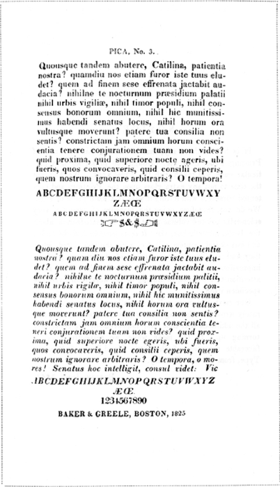 The typefounders were most careful of all to print their specimens worthily and even the imposition of the pages is better than among ‘literary’ books of the time. This is a showing of plain printing types from the New England Type Foundry specimen book, dated 1825.
| |
[pagina 14]
| |
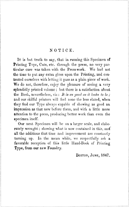 S.N. Dickinson, one of the best printers in the first half of the nineteenth century, set up as a typefounder about 1840.
Preliminary page from his 1847 specimen book. | |
[pagina 15]
| |
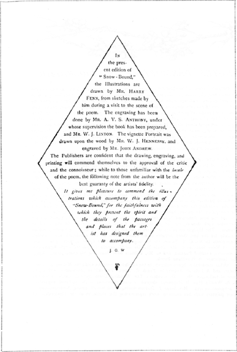 The printers of Ticknor and Fields' 1868 edition of Snow-Bound, as this prefatory note shows, are completely under the thumb of the illustrational interests, although the diamond-shaped note itself indicates some stirring of ambition.
| |
[pagina 16]
| |
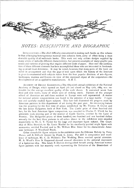
Art Year Book 1884 began speaking the language now familiar to designers, printers and collectors of books. Published at Boston, the year book was printed at the Gilliss press in New York.
| |
[pagina *1]
| |
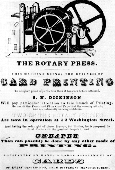 S.N. Dickinson's trade card, in fancy types on enamelled paper, of the printing establishment in Boston
| |
[pagina 17]
| |
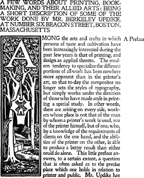 The Merrymount Press received a strong initial impulse from the printing revival in England. This four-page circular, measuring 12 by 9 inches, features work of B.G. Goodhue who with Updike was responsible for ‘an Altar-Book of a sumptuous character’ herein described. The circular is dated 1894.
| |
[pagina 18]
| |
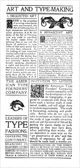 In the first number of Bradley, His Book, published at Springfield, Mass., in May 1896, the American Typefounders' Company took a full-page advertisement in evidence of devotion to the enlightened movement. Both the layout and ‘copy’ of the advertisement are apparently by Will Bradley himself.
| |
[pagina 19]
| |
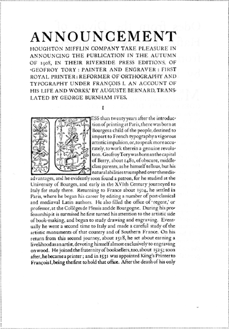 The press of Houghton Mifflin Company formed a special bookmaking department in 1900 with Mr. Bruce Rogers at his head. During more than a decade following the Riverside Press editions set and maintained a standard of the highest excellence. The advertising matter from this department, as in the present prospectus, was planned and executed with the same taste, knowledge and skill as the books themselves commanted.
| |
[pagina 20]
| |
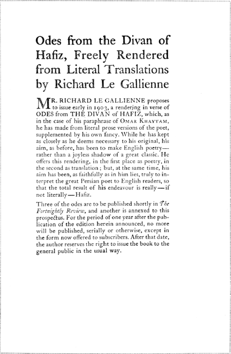 As an apprentice at the Heintzemann press in Boston, Mr. Carl P. Rollins, now printer to Yale University and leading American authority on printing, produced this prospectus, 1902.
| |
[pagina 21]
| |
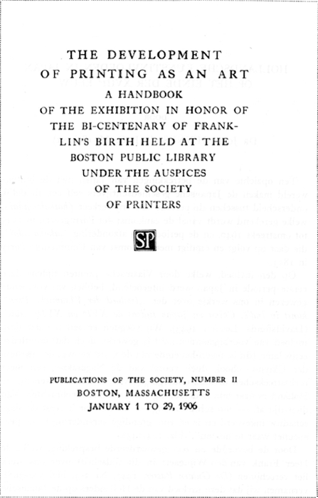 Title-page of the exhibition catalogue which immediately established the Society of Printers as champion of printing as an art. In 100 pages it records a remarkably fine achievement and the notes it contains make it still an important guide to the printing and allied interests of the time.
|
|

