De Gulden Passer. Jaargang 34
(1956)– [tijdschrift] Gulden Passer, De–
[pagina uitklapblad A]
| |
[pagina uitklapblad B]
| |
[pagina 121]
| |
Plantin's types and their makers
| |
[pagina 122]
| |
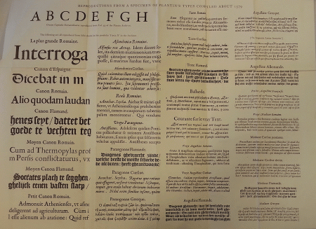
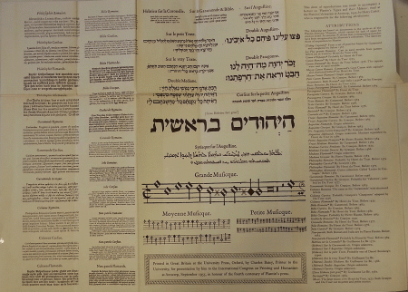
in this Museum last year investigating the punches, matrices and archives; and therefore I stand here to-day.) Those who care to do so will have opportunity to study the specimen, as it deserves, in solitude and at leisure. I do not propose to refer to it in much detail; but by telling you much more plainly than I could what were Plantin's types, I think it will be a great help to you in understanding what I have to say. These, then, are Plantin's types; and I will attempt to-day to tell you what has become of them since he died; to try to clear away misconceptions that seem to me to be common about them; to show how Plantin got them and who made them; to say how important a part they are of Plantin's life's work and how they illustrate his genius and the achievement of the letter-cutters of his day. | |
Plantin's Collection of TypesBy types I mean the ideal entities that survive the destruction by wear or otherwise of the founts of type that are cast for printers to use, and that can be recreated by casting new founts as often as necessary. To recreate the types it is enough to have matrices or even strikes that can be made into matrices; although the form of the letters is due ultimately to the punches from which the matrices were made. Like nearly all printers in a large way of business in the 16th and 17th centuries, Plantin owned a large number of matrices (at the end of his life he had matrices for about 80 different types) and a good many of the punches with which these matrices were struck. Being possessed of these, he could be sure of having all the founts of type that he needed of the design that he liked so long as he could find skilled workmen at hand to cast them. He employed the local typefounders of Antwerp and Ghent as casters, and lent them his matrices. But he bought the matrices or had them specially made for him by the foremost letter-cutters of the time in France or in the Low Countries. Plantin's types were Plantinian inasmuch as he chose them or had them made. He was not a designer and does not seem to have been an innovator in taste or technique. But the collection of punches and matrices that he owned at the end of his life was the largest that | |
[pagina 123]
| |
had ever been got together, and nearly all of it was the work of the best masters of letter-cutting inspired by the Renaissance in Italy and France, an influence which made people like and accept as the normal idiom letters nearer to the best Roman inscriptional models than they have ever liked or accepted before or since. Men in the skilled craftsman's walk of life seem also to have been given a new sense of dignity and responsibility at that time by the choice offered them by the Reformation in religion. Perhaps for a combination of these reasons it was the greatest age of art and skill in cutting printers' letters; and Plantin as an energetic and discerning business man, as well as a man accustomed to have good things about him, made a collection unrivalled for quality as well as quantity. He seems not to have aimed at the exclusive ownership of type-designs, for he sold many duplicates of his matrices; but he had a lively sense of the power that came from being ahead of his competitors in type fashions and being able to trade in matrices struck from his punches. When he was dead, however, his successors valued their exclusive rights in his types very highly, and agreed among themselves to withhold the use of them from other printers. They preserved Plantin's punches and matrices with the greatest piety, as carefully as they kept the contemporary records from which we can still learn how the types and type founding materials were acquired and used. The founts of type used in Plantin's presses, if any survive, are by now in poor condition. Type as old as that would still be usable if it had always been carefully treated and well cleaned. But I do not believe that any of the old founts here are as old as that or that any are in good enough condition to convey the beauty of the designs or represent the skill and taste of the cutters. The punches and matrices, on the other hand, are for the most part unspoiled; in particular the strikes, that is to say the pieces of copper, each impressed with a letter as the first step towards making a matrix, are as good as the day they were struck, and are certainly identifiable as made in Plantin's day. The character and the excellence of Plantin's types can only be judged from clean impressions made from newly cast founts. They are seen to great advantage in the books that Plantin printed. | |
[pagina 124]
| |
Nec laudare opus: I am concerned not to extol them, but to identify them and provide them with the associations that give them meaning in the art and history of printing and letter-cutting. | |
Publications about the CollectionThe collection is best known by the work of the first Curator of this Museum, Max Rooses. But for him we should probably not be here, and we should certainly wish to honour his memory at this Congress. We stand on a construction of knowledge about the history of typography that he helped greatly to build; and thanks to him we can see much that he could not see. The Specimen Characterum Architypographiae Plantinianae, compiled by Rooses and first published in 1896, has given the people who care for such things a mental picture of the typographical collection in this Museum. Its second edition, of 1905,Ga naar voetnoot(1) gave such people, in its introduction, a history of Plantin's acquisitions of type and type-founding material drawn from the archives whose contents Rooses arranged, digested and did much to publicise. The introduction had been printed the year before in the periodical Tijdschrift voor Boek- en Bibliotheekwezen, but in a less widely-understood language. Rooses, unfortunately, had no knowledge of typefounding: he seems not to have understood the importance of printing from new type; he appears not to have used or even identified the matrices; he did not distinguish Plantinian from post-Plantinian types and he accepted the names given to the founts used in the Moretus office during the 19th century as being their true descriptions. In his historical introduction he implies that the craftsmen who cast Plantin's founts were responsable for their design. It would surprise many printers to learn that the type-face that they call ‘Plantin’, because it was so conspicuous and so much admired in Rooses' Specimen, was not used by the master and must have found its way here since his day. It was misleading to group together 16th, 17th, 18th and 19th century types under a heading suggesting (if it does not necessarily mean) that Plantin owned them all. | |
[pagina 125]
| |
The great, and well-deserved, reputation of Max Rooses must have put others off going over the ground that he had covered. As far as type is concerned I know that information got from the Plantin-Moretus archives has been published since Rooses' time only by Leonard Willems in an excellent article on Ameet Tavernier in the Tijdschrift for 1907,Ga naar voetnoot(1) by Mr. McMurtrie in his reprint of Plantin's own Index etc. Characterum,Ga naar voetnoot(2) by Maurits Sabbe and Marius Audin in their book on Caractères de Civilité,Ga naar voetnoot(3) whilst much the best account of the subject, and the most corrective of Rooses' mistakes, was given by the present Curator, Dr. Voet, in the catalogue of the exhibition of Antwerp treasures held in Paris in 1954.Ga naar voetnoot(4) | |
Recent ResearchI came here last year to investigate the punches and matrices as a possible source of knowledge about the Fell types at Oxford, on which I am glad to say Mr. Stanley Morison is writing a book. Some of the matrices bought by Bishop Fell from Amsterdam in 1670 and 1672 are evidently of 16th-century origin; and indeed it proved that some of them are duplicated by sets of matrices in this collection, where they not only exist in a state more nearly original but are documented by records in the archives. I could identify the matrices for the larger types by looking at them and the punches by taking impressions from them in soot; but to find out what faces of smaller type are represented by matrices, I had to cast some letters from each alphabet in a hand-mould and get them printed. The result, shown in this pamphlet of 8 pages, does no credit to me as a caster; but it gives an insight into the state of the collection that cannot be bettered for the time being, and it seemed worth offering to you such as it is. Whilst I was here Mme Marthe Van Dessel-Wartel was, like- | |
[pagina 126]
| |
wise at the behest of the Printer to Oxford University, searching the archives for references to types, and I am fortunate in being able to make use of her work. Both of us were given all manner of help and guidance by the Curator and the other officials of the Museum. To one who comes to this place with a mind made up by Max Rooses it is a surprise to find that the punches and matrices correspond only to a limited extent with his Specimen and that Plantin's collection of types as it is listed in his inventories and shown in his specimens, the Index sive Specimen Characterum Christophori Plantini, issued to the world in 1567, and what I have called the Folio Specimen of about 1579, survives virtually entire and in excellent condition in the form of matrices, a large part also as punches, and it only needs a patient and resourceful caster to bring it to life again. There are other unsuspected treasures here: matrices of an earlier day than Plantin's, coming perhaps from the equipment of Willem Sylvius, which Plantin took over at Leyden in 1583 or more likely from an older typefoundry acquired by Henri du Tour at Ghent and included in Plantin's purchase of his stock in 1581. The archives give no hint of the existence, let alone the provenance of this material. There are some rough indications of it in this pamphlet: Ameet Tavernier's larger Gothic script, an old Cicéro (so called on the paper wrapping) No. 145: 6, which I think was used for Robert Estienne's Virgil of 1533 and looks like the work of Antoine Augéreau. At least equally old are several sets of titling capitals and two Lombardic alphabets to be seen in Antwerp books of the early 16th century. On the other hand few of the later types bought by members of the Moretus family and put into the Specimen of 1896 and 1905 are represented by matrices, so far as I can judge. The non-Plantinian material, both early and late, not being recorded in the archives, is more difficult to identify, and I cannot yet describe it with confidence. It would also seem that the task of identifying the potentially existing types with items in Plantin's inventories, therefore of being able at once to display them entire and clearly-printed and associate with them such history as can be gathered from the records within this building and from the world outside, is not so difficult | |
[pagina 127]
| |
that it should not be attempted. I hope to print a book on the subject one day, and in it to justify the attributions which I have put on the sheet of specimens.Ga naar voetnoot(1) A great deal of typographical history and aesthetic appreciation of type have been learned from the books written about the collections of the Imprimerie Nationale, the Oxford University Press and Messrs. Enschedé at Haarlem.Ga naar voetnoot(2) Each of these collections illuminates the others. The Plantin-Moretus collection is by far the richest of the four in 16th-century material: it has at least three times as many sets of matrices dating from that greatest age of type- | |
[pagina 128]
| |
design as the other three put together. It has two other advantages over them: the matrices and punches have been little used, therefore have few replacements due to breakages and losses; and the records of this house are incomparable in point of typographical interest. | |
The State of the CollectionSo much, then, for printed specimens and manuscript records. The custody of the punches and matrices in this house can also yield a great deal of information about their origins and associations. The inventories tell whether Plantin had punches as well as matrices for his type faces: therefore the existence of punches matching sets of matrices is a help to identifying the types made from them. The punches are tied up in bundles and the sets are much mixed, old and new being put together. I do not think their present arrangement has much significance; and the task of sorting and re-classifying them that is now in progress will make them much more accessible as evidence. Photographs have been taken of some of the punches, because it should be possible in time to learn how to recognise styles of workmanship and finish that are characteristic of the several punchcutters. This science is in its infancy; but it seems safe to say that Garamond cut cigar-shaped punches, and Granjon cut them of a rectangular form. What I take to be the oldest set here, a Lombardic alphabet of early 16th-century fashion, is cut almost exactly as a punchcutter would cut them to-day with two carefully trued-up planes at right angles and a file-mark to indicate the foot of the letter. I doubt whether the art of cutting steel punches for letters has made any progress since it was first turned to the service of printing. The matrices and strikes (by which I mean sets of unfinished matrices) are kept in old oak boxes or paper packets. The boxes may well be survivors from Plantin's day. On 25 February 1576 Henri du Tour entered this charge against Plantin in his accountsGa naar voetnoot(1). Delivered and paid for 39 new boxes in which I have arranged in order every set consisting of mould and matrices with their punches, all in proper order; and for this I reckon 3 shillings. | |
[pagina 129]
| |
A fair charge, surely, and as it proved, a long-term investment. Many of the boxes have labels stuck to them with old inscriptions on them, and some have inscriptions on their wooden lids. It is desirable that an expert should date the various handwritings of the legends: they seem to fall into three groups, Secretary of the 16th century, Italian of the early 17th century and round engrossing hand of the 18th century. The wording generally describes only the script represented by the type, such as Roman, cursive, Black, and the body on which they were meant to be cast, but some inscriptions give the names of punchcutters as well. I suspect that the writing in Secretary hand was done by Henry du Tour (or most of it was) and that the Italian hand was that of Christianus Calaminus. He is a person of some importance in this story. Christianus Calaminus was once a professor of theology at Heidelberg, but was unseated because of his Roman Catholic position in Christianity. He came to Antwerp to look after the Plantinian collection of types. So says a testimonial by Balthasar Moretus, which Max Rooses dated about 1620,Ga naar voetnoot(1) and it adds that Calaminus married the daughter of ‘Thomas Strangh, Hibernus’. You may see by reference to the small brochure that a set of matrices (No. 48, Garmond Romein) was bought from the widow of Thomas Strong. A man of this name occurs in the State Papers, Ireland, around 1590Ga naar voetnoot(2) as a bishop of Ossory who had taken refuge in Spain and later as a Franciscan normally living in Flanders, crossing occasionally into Ireland to foment war against the Protestant Englishmen. It is believed that some Irish clergymen of the time married. It would be interesting to know what Thomas Strong did with his Long Primer matrices.Ga naar voetnoot(3) The Irishman makes this fleeting appearance in the story of Plantin's types, but Calaminus left an enduring imprint on it, if I am right in thinking that it was he who parcelled all the loose matrices in paper packets and wrote on these the description of the contents and the number of pieces and then compiled an inventory showing | |
[pagina 130]
| |
their locations in the house.Ga naar voetnoot(1) Everything here must have been kept in excellent shape in his day, and we should honour his memory too. Unfortunately the contents of some of the boxes have been changed since the legends were written, and it is not always easy to think of the sets to which they originally referred. The 18th-century labels (as I guess them to be) give the names that Rooses used in his Specimen of 1896 and 1905 and that you see on the cases in the Composing-Room; and they often disguise old types under new descriptions. If you will look at the smaller brochure you may get some idea of the size and variety of the collection and of the work that remains to be done in sorting and labelling it. You will see in particular that many sets of matrices are here in duplicate; no doubt because after the death of Plantin both his sons-in-law, Raphelengius at Leyden and Moretus at Antwerp, needed one. Those that belonged to the Leyden office were bought by Balthasar Moretus between 1612 and 1624Ga naar voetnoot(2) for fear lest they might get into the hands of competitors. Some sets are in triplicate and there are many strikes made for sale to other printers. A few sets are accessions of the time of Jean Moretus (1589-1610) or later: examples are Nos. 55, 48, 62. | |
Number and Authorship of Plantin's TypesThere are in this house about 5,000 punches and 15,000 matrices and strikes. I think that if sorted out, they would make some 80 sets of punches and 250 sets of matrices and strikes (that is to say, unfinished matrices). Types have been adapted by variant sorts and there are oddments of all kinds, so that after the most careful sorting and labelling, the exact number of sets (each designed for a fount of type) will be a matter of opinion. The punches, of course, are unique; but since many sets of matrices are duplicates or triplicates, the number of type-faces represented is about 120. Of these nearly a hundred were used by Plantin. The remainder may be divided equally into types of an older day than Plantin's | |
[pagina 131]
| |
and those acquired by the Moretus and Raphelengius families after Plantin's death. | |
Claude GaramondThe types that belonged to Plantin may be grouped under the names of their cutters as follows. By Claude Garamond he had the splendid titling capitals on 3-line English body with Greek letters to match. The steel punches in this Museum seem to be a set left incomplete by Garamond and finished for Plantin by Jacques Sabon in 1567.Ga naar voetnoot(1) The matrices are made of lead and are only for the Roman alphabet. The Roman letters were used by many printers in France, the Low Countries and Germany. Sabon evidently had a set of the matrices, for the type is used by his successor, Conrad Berner, in the specimen of the types of his foundry at Frankfurt in 1592. I have not seen the Greek letters in use. The Gros Canon Roman of Garamond is familiar as the type of Robert Estienne's Vulgate printed at Paris in 1549. The fat capitals and shortened letters adapting this noble face for a smaller body that you see in your specimen-sheet were cut for Plantin by Henri du Tour, and the Museum has the punches only for those. Garamond's Romans for Parangonne, Gros Texte, St. Augustin, Cicéro, Petit Romain and Bréviaire were the bread-and-butter types of Plantin's press; throughout his career as a printer the texts of nearly all his books in the French and Latin languages were set in them. Plantin owned punches by Garamond for Roman faces on St. Augustin and Bréviaire bodies and an incomplete set for Petit Canon which Granjon seems to have completed and made into the Petit Canon reproduced on this sheet. Garamond is known to have cut many sets of punches for the commonly-used bodies; so the fact that Plantin owned punches for some of these types does not mean that he had a monopoly of Garamond's types for those bodies.Ga naar voetnoot(2) | |
[pagina 132]
| |
I must not fail to make the point that Garamond's Roman types can be cast nowhere else, apart from a Cicéro and perhaps a Bréviaire at the University Press, Oxford, where they are disfigured by Dutch replacements of a later day. The same may be said of nearly all the 16th-century types here: they are the only sets to survive from that greatest age of type-design. | |
Robert GranjonNext to Garamond the most important artist represented in the collection is Robert Granjon. He, in fact, cut more of Plantin's types than any other. Plantin's purchases from him extend in time from 1556 to 1572 or later. The earliest that can be traced are of two sets of matrices, a Cicéro Italique and one called simply a petite Italique of 1556.Ga naar voetnoot(1) The inventory of 1563 lists matrices for another six: eight in all. By the end of his life Plantin owned sets of matrices for twenty-nine types by Granjon besides those for two music-types and at least six fleurons. For fifteen of the type-faces Plantin owned the punches, and it is a fair inference that he commissioned Granjon to cut them. Six of these commissions are | |
[pagina 133]
| |
fully recorded in the contracts written in Plantin's day-books and signed by the parties.Ga naar voetnoot(1) These 29 types for which the material is still here in good condition must give a fairly round idea of Granjon's life's work; and the accounts kept by Plantin give a few facts about his life. Granjon's presence in Antwerp may be deduced from the documents in these archives from November 1564 throughout 1565 and 1566 until August 1567. In November 1569 until April 1570 he was here again, and in the latter year he printed a specimen of his Gaillarde Roman headed ‘en Anvers 1570’. Whether during all the time that Granjon spent in Antwerp he was wholly occupied with commissions from Plantin we do not know: I have looked for signs that he was making strikes for himself or other people from Plantin's punches and found none. From 1570 until Granjon went to Rome in 1578 he must have met Plantin twice a year at the Frankfurt fairs, where Plantin paid him in 1572 or the following year for a set of Nonpareil Italic matrices.Ga naar voetnoot(2) His relations with Granjon are the best indication we have of Plantin's regard for the beauty of type. It may not be extravagant to regard him as something more than a man of business in this province - perhaps a careful patron or even a collector. No doubt Plantin regarded typefounding material as a capital asset whose value would appreciate and one that he could turn into cash. He had more types by Granjon than he needed; and as new ones were cut, he bought them to supersede the old. He already had an excellent Great Primer Italic by Hautin as well as an old-fashioned one by François Guyot when he bought Granjon's soon after 1570; he replaced Hautin's very good St. Augustin Greek with Granjon's between 1575 and 1581; he bought three different Italics for Cicéro body by Granjon, already having one by Hautin, and three for Petit Romain or very near that body, namely ‘La Poëtique’, ‘La Granjonne’ and ‘L'Immortelle’. Some of Granjon's Italics, particularly the Ascendonica (equivalent to the English printer's Double Pica) commissioned by Plantin in 1570, had a profusion of | |
[pagina 134]
| |
sorts, ligatures, swash letters, alternative forms of letters and letters with final flourishes, that business reasons could not justify. Besides his beautiful flowing cursives, Granjon supplied Plantin with three narrow upright Italics, the Mediane Droicte a l'Allemande, the Philosophie Cursive and the Poëtique for Bourgeois body, of the style that has been named Cancelleresca. They were probably meant for text types, not mere accessories to the Roman. Then, again, Plantin's partiality for lettres françoises, the Gothic script that we know as civilité, had an amateur flavour. He had two scripts by Granjon on Great Primer body, the Bâtarde and the Courante, besides the original on St. Augustin, the script designed (probably) by Pierre Hamon and cut by Hautin for a small St. Augustin, and another left unfinished by Granjon for a body of Petit Romain. The last is not shown in the specimens; but the matrices for it are here, and so are those for Ameet Tavernier's larger civilité, which Plantin never used.Ga naar voetnoot(1) He also had a Civilité by Granjon on Cicéro body. | |
Other Artists who cut Types for PlantinHaving dealt thus briefly with the two most famous masters of this art, Garamond and Granjon, it remains for me just to notice the less famous punchcutters whose work is to be found here. Plantin's working stock of types, illustrated in the Folio Specimen, contains nothing that is not good: none of the types put beside the best by the greatest masters looks notably inferior. Guillaume Le Bé is represented by his Hebrew types: of these there are five certainly and probably one more. All these Hebrews by Le Bé, excepting the ‘Hebrieu de la faceon de Venise’ (described on your sheet as ‘Sur le Texte’), are known by his albums in the Bibliothèque Nationale, where they have his delightful commentary | |
[pagina 135]
| |
scribbled in the margins; but this is the only place where these finest of Hebrew types could still be cast. Pierre Hautin was an excellent craftsman whom history has neglected. There are five of his Roman types in this collection, three Greeks, three or four Italics and a civilité Gothic script - a respectable body of work of great merit. The facts about him are hard to establish; and it is much to be wished that the first appearances of his types could be traced. His Nompareille Roman and Italic, used by Plantin, sold by Conrad Berner and still in use at the University Press of Oxford, must rival the Italic of Granjon as the earliest faces cut for so small a body. Hautin was famous as a cutter of music, and it seems likely that one of the sets of matrices for music-type in this collection is by him. It is noteworthy that the punches for Hautin's civilité are in this house: presumably, therefore, he cut the type to Plantin's order. Very likely Plantin commissioned the design from Hamon and the cutting from Hautin during his sojourn in France in 1562-3.Ga naar voetnoot(1) Henri du Tour, also known by his Flemish name, Hendrik van den Keere, cut nineteen of the types preserved here excluding those for music - some thirty sets of matrices in all. Plantin once described him as insignis characterum impressorum sculptor et fusor,Ga naar voetnoot(2) and he was fairer to him then than he was in a letter to Matthias Gast, printer of Madrid, where he makes an oblique reference to Du Tour thus: As for sending you a good typefounder from here, believe me, I would do it with pleasure, if I knew of a good one willing to go. But since Ameet Tavernier, of this place, died and after him François Guyot, I have not been able to find a capable man save one whom I have formed for our service and whom even now I have continually to tell how to do some parts of the work. I have heard that there are good ones in Germany, but for the most part they are contaminated with heresy, therefore I should not care to have | |
[pagina 136]
| |
any manner of dealing with them at all. If, however, there were ever anything I could do for you, I should be heartily glad to do it.Ga naar voetnoot(1) Connoisseurs of the mind of the Architypographus may well suspect a lack of candour in the depreciation of Du Tour as in the abhorrence of heretical typefounders; for he would not have liked Du Tour to go to Spain or to be deprived on occasion of the services of the Calvinists, Sabon, Hautin or De Vechter. Du Tour's Roman types, the Canon, Reale, Philosophie and Coronelle are very good in a style that leads from the Paris to the Amsterdam school of letter-cutting and his civilité is a marvel of workmanship; but his great work was to supply a range of Flemish Black Letter from Canon to Nonpareil which was used by Plantin for his later books in the Flemish language and was not superseded in many Belgian and Dutch printing offices until the 19th century. Du Tour's father, of the same name, bought the house, and presumably the business, of Joost Lambrecht, medal-cutter, punch cutter, typefounder and printer, who taught his trades to Ameet Tavernier,Ga naar voetnoot(2) and it is not impossible that some of their handiwork survived in the types that Du Tour described as his own. The book of accounts that Henri du Tour kept of his work for Plantin (Vol. 42) is a most valuable record of early typefounding practice; and one that might well be edited for publication in some typographical journal. The inventories include sets of matrices for two types by François Guyot, and one of these is identified by a specimen in the inventory of 1575 (Vol. 43), headed with the legend: ‘Ascendonica Cursive de Guiot’.Ga naar voetnoot(3) The other is an Italic for Texte body. Guyot's types transformed Antwerp printing a few years before Plantin began work from archaic to something like modern, and they were much used by English printers from the middle of the 16th century | |
[pagina *13]
| |
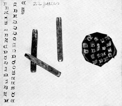
Fig. 1. - Punches for a Lombardic alphabet (Bundle 165) and smoke-proofs made from them. These are believed to be the oldest punches in the Museum.
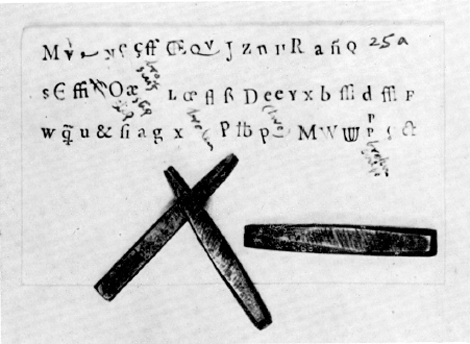
Fig. 2. - Punches for a St. Augustin Roman attributable to Garamond an smoke-proofs of them and other punches in Bundle 25a.
| |
[pagina *14]
| |
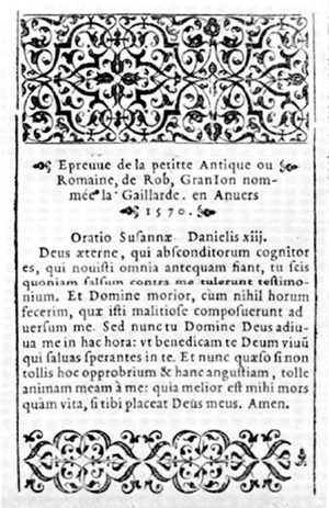
Fig. 3. - A specimen printed for Robert Granjon at Antwerp in 1570 (Vol. 153, following fo. 20).
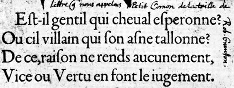
Fig. 4. - One of the specimens of French type sent to Jean Moretus by Guillaume Le Bé the second (Vol. 153, following fo. 20).
| |
[pagina *15]
| |
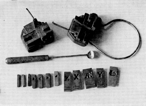
Fig. 5. - A hand-mould (of Canon body) and typefounder's Ladle, probably of the 18th century, and typical copper matrices of the 16th century at the Plantin-Moretus Museum (B, C, D, A are from a strike, the others are justified matrices).
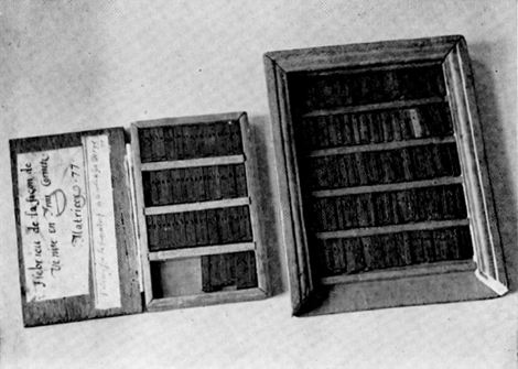
Fig. 6. - Two boxes containing sets of Plantin's matrices as they are now preserved at the Museum
| |
[pagina *16]
| |
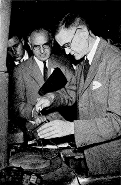
Fig. 7. - Casting type in the old typefoundry of the Moretus printing-office during the Plantin Celebrations, 1955, with the tools preserved there.
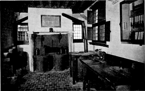
Fig. 8. - The 17th-century typefoundry of the Moretus office, now part of the Plantin-Moretus Museum.
| |
[pagina 137]
| |
until the end of the 17th. I think the two Italics are still here: the matrices for them are in Boxes 31 and 69; and those for a Double Pica Roman much used by the London printer John Day is also here, in Box 77. There may be a clue to further discoveries in the fact that some of the matrices for Guyot's types have the capitals of Tavernier's civilité struck in their sides. | |
Plantin as DesignerI have suggested that Plantin bought or commissioned types because he liked them. Only in one instance is he known to have influenced the fashion of the letters: that was in an order to Guillaume Le Bé, the first, for the type named ‘Hebrieu de la Faceon de Venise’, which has alternative versions of many of the letters in various widths (and not only the customary extended aleph, he, lamed, final mem and tav). Plantin's instructions to Le Bé with his sketches of aleph and beth, pinched and less pinched, may be seen in one of Le Bé's albums in the Bibliothèque Nationale.Ga naar voetnoot(1) Save that he consulted Guillaume Postel about the best forms for the Syriac alphabetGa naar voetnoot(2) and, as I have suggested, got Hamon, the writing-master, to design a script type to be cut by Hautin, Plantin appears to have left design to the punchcutters. | |
Plantin's Sales of MatricesThe eminent servant of humanism may have been an amateur of punches and matrices; but it is certain that he dealt in them, as he did in plums, knives, wine and cloth. He is found writing to his old friend Porret in July 1567: I pray you, also, to get for me from Hautin a truly complete strike of his Greek that we call Cicero or Median... And I must have it by the end of this present month or early in August or by mid-August at the latest, for I bound myself at the last Frankfurt fair to send this Greek of Hautin's, or take it with me, to Frankfurt. But this you need not tell Hautin, lest he grow proud and enhance the price... You may pay for this Greek unjustified (and so I would have it) about 12 crownsGa naar voetnoot(3) | |
[pagina 138]
| |
At one of the Frankfurt fairs of 1579 he sold to the successors of Dietrich Gerlach of Nuremberg strikes of Granjon's ‘Granjonne’ Italic and Gaillarde Roman;Ga naar voetnoot(1) he sent two barrels full of punches and matrices to Hamburg in charge of Christophe Raphelengius, which came back in 1587Ga naar voetnoot(2), and at the end of his life nearly all Plantin's punches, and strikes and some of his matrices were stored at Frankfurt in the Chambre au Coffre and the Pachus.Ga naar voetnoot(3) There can only be one reason why punches and matrices were stored at Frankfurt: they must have been there for hire or sale. This must have had much to do with the diffusion of French types in Germany and northern Europe: it helps to explain how famous presses such as those of the successors to Gerlach in Nuremberg and Vögelin in Leipzig were stocked early with faces cut by Garamond and Granjon. I would like to give you an idea of the scale of these dealings. In 1588 there was a consignment of boxes in the Chambre au Coffre, lately returned by the Gerlach office, containing 19 sets of punches and ten sets of strikes or matrices.Ga naar voetnoot(4) When Plantin died and his stock was divided among his héritiers, the following were sent to Raphelengius at Leyden direct from Frankfurt: 18 sets of punches; 14 sets of strikes and 6 sets of justified matrices.Ga naar voetnoot(5) At the same time there were 17 strikes and 14 sets of matrices that had belonged to Plantin in the Pachus.Ga naar voetnoot(6) How far back did this practice go of storing his typefounding material at Frankfurt? The inventory made about 1576Ga naar voetnoot(7) begins with 15 strikes by Garamond and Granjon followed by the words: ‘Tout cecy est envoye a Francfort.’ That appears to be the earliest mention of Frankfurt in this connexion; but Plantin certainly let his matrices for hire in earlier days: his ‘Journal des Affaires’Ga naar voetnoot(8) records an item at the end of 1564: ‘For the hire of my matrices this past year, 50 florins.’ | |
[pagina 139]
| |
I have dwelt on this brokerage of typefounder's stock because I think it should be borne in mind by the historians of such things and by bibliographers: and if it happened in Plantin's case, it may have happened in others. In particular, there may have been a closer link between this office in Antwerp and the famous Frankfurt typefoundry than appears from the records. I can find no dealings between them earlier than the year 1601, when Jean Moretus had some matrices justified by Conrad Berner;Ga naar voetnoot(1) but I cannot help thinking that from the time of Jacques Sabon onwards the famous foundry dealt in types for which Plantin owned the punches. How else can one explain the close correspondence between Conrad Berner's Specimen of 1592 and Plantin's stock? | |
Plantin's TypefoundryBy selling matrices and letting other printers use his punches to make their own strikes Plantin helped to equip the printers of northern Europe with French designs. He does not appear to have sold type cast from his matrices (though he let his business associates have some as a favour) or even to have cast his own founts. Rooses may have been too confident in sayingGa naar voetnoot(2) that he set up a typefoundry in his office. The day-book on which Rooses reliedGa naar voetnoot(3) shows that from October to December 1563 Plantin bought ingredients for making typemetal in fairly large quantities and built a furnace for smelting and alloying them. He sold 300 lb. of the product to François Guyot. What Plantin called the ‘fonderie’ seems to have been not a typefoundry, as Rooses thought, but a foundry for making typemetal. But Rooses was right in saying that there are payments showing that for a short time Plantin employed Jacques Sabon in Antwerp as a punchcutter and typefounder. The day-bookGa naar voetnoot(4) and accounts with workmenGa naar voetnoot(5) show that Plantin paid Jacques Sabon various sums in April 1565 for cutting and casting fleurons and more in during nine weeks in 1567 for | |
[pagina 140]
| |
cutting punches, justifying matrices and alloying typemetal. Sabon was paid the cost of three files and nine weeks' keep at a florin a week. In addition he paid Sabon by the job: 8 shillings a letter for finishing Garamond's punches for ‘grosses capitales’, making matrices from them and casting the type, and 1½ shillings apiece for justifying 227 matrices for Granjon's Paragon Greek. Thereafter there is no further sign of a typefoundry in the records and abundant evidence that Plantin's founts of type were cast for him by typefounders who had workshops of their own. Sabon, it is known, left his tools at Frankfurt with the widow Egenolff;Ga naar voetnoot(1) and Plantin provided him with a place to work in and a few tools. It does not seem likely that he intended to set up a permanent typefoundry in his office. | |
Plantin's Types in HollandWhen Plantin was dead, his two successors, Raphelengius at Leyden and Moretus at Antwerp, agreed that they would not sell his types to other printers. This pact is referred to by the second Frans van Ravelinghen, who undertook to abide by it, excepting such types as were already common property.Ga naar voetnoot(2) The attempt at restricting the spread of the Plantinian types came too late: Plantin himself had sold too many matrices. It is clear that many of them were current in Holland throughout the 17th century; and I think they found their way there through Leyden, where the foreman in Du Tour's foundry, a certain Thomas De Vechter, and his son of the same name, established a typefoundry in the house of Raphelengius and were well stocked with matricesGa naar voetnoot(3). Du Tour sometimes accepted strikes from Plantin by way of payment for his work,Ga naar voetnoot(4) and though when Du Tour died Plantin bought all his stock of punches and matrices as a kindness to the widow, there was a condition in his agreement binding him to sell them back to Du Tour's | |
[pagina 141]
| |
son or to Thomas De Vechter on demand.Ga naar voetnoot(1) Whether the option was exercised is not known, but the types cut by Henri du Tour, Black Letter and Roman and script, were much used in Holland after his day and with them several cut for Plantin by Granjon: the type-specimen of Johannes Elsevier printed at Leyden in 1658 is especially rich in them. The younger Thomas De Vechter was working in Leyden until about 1618.Ga naar voetnoot(2) I mention this link between Plantin and the great age of Dutch printing because it is too generally assumed that all the French types used in Holland must have come from the Egenolff-Luther foundry at Frankfurt. It deserves to be remembered because it is evidence of the importance of Plantin in the history of the diffusion of the French Renaissance in northern Europe. He was foremost among a generation of printers who brought French printing to Antwerp; but its progress did not stop there. Several men worked for him who afterwards carried his high standards of design and workmanship into Protestant countries: Raphelengius, Elsevier, Guyot, De Vechter. These helped to continue in Holland the work of the French printers and typefounders of the 16th century. In a humbler way they were doing for the Protestant world of the north what Robert Estienne did at Geneva in putting good and learned printing at the service of the reformed church. | |
Plantin's Influence on TypefoundingThough Plantin was a collector, not an originator, of types and typographical designs, he had some influence on their evolution and development. Besides shifting the centre of balance of the printing world to the north-eastward, he had an effect by the scale of his business. The work of the typefounders had to be organised to deal with such a large equipment as his. Whereas his great predecessors Aldus and Froben printed all manner of work in one face of type, Plantin varied his types to suit the formats and purposes of his books. He needed type of all kinds of all sizes; and you see developing in his time and in his office that standardisation of type- | |
[pagina 142]
| |
bodies that becomes inevitable in such circumstances but has rather a bad effect on design. To see instances of it, please look at Garamond's Gros Canon in the specimen sheet, modified to come on Moyen Canon, and the Cicéro in the brochure, No. 145: 6, that I think is by Antoine Augéreau. Those belong to the pre-Plantinian epoch, and they are very close to the Humanistic book-scribe's hand, with much of its grace and elegance of proportions. But Plantin saw that he could get that Gros Canon on a smaller body, and he no sooner saw it than the thing was done with merely the loss of its elegant long descending strokes; and the face, called Cicéro because its value in legibility is Cicéro, needs a large St. Augustin body to accommodate its heads and tails; therefore it is in the scrap-box. A methodically-organised printing business, such as Plantin's, calls for a range of types all of which give the maximum value in legibility for the space they occupy, and it has little use for those that do not. The history of type design since Garamond has been the attempt to rival his elegance and clarity in less room. When Plantin began to print, ideas about a graduated scale of type-bodies were very vague. In 1556 he could describe a face as the ‘Petite Italicque de Granjon’; Granjon called his types by pet names, some of which became names of their bodies, Granjonne, Immortelle, Mignonne, Gaillarde, Nonpareille. Hautin's Cicéro was another man's St. Augustin, and his script was for a body of Petite Augustine. One of Bomberg's Hebrew types used by Plantin required a small Texte body. By the time the Folio Specimen was printed, about 1579, ideas about bodies had hardened: it shows types on Vray Texte, Vray St. Augustin, and Vraye Médiane: if his types had long descenders, he got Henri du Tour to cut shortened letters and fit them on the next regular body of smaller extent. Then, as all printers will, he cast them on bigger bodies when he wanted them to look well or to be readable in a long line. For more than a century after Plantin typefounders made a mould for every set of matrices; but in his time long strides were taken towards the standardising of bodies and the design of type-faces to fit them economically. That, I believe, was the most important development in typography in Plantin's lifetime. Garamond (some would say Aldus) had settled the forms of Roman types for good, and | |
[pagina 143]
| |
Granjon did as much for Italic early in Plantin's career: the great age of letter-design was coming to a close.
That is what I had to say. I have tried to describe Plantin's types and to say something about their associations. The lecture is based on a hurried reconnaissance of the ground; and I hope it may soon be rendered out-of-date by more accurate knowledge. The mood in which to end the lecture is thankfulness for the preservation of these precious relics, another reason for gratitude to our hosts, the City of Antwerp, and a succession of distinguished Curators of the Museum represented by the one who is with us today. May they increase our debt by further publicising the collection of types and putting it to good use. |
|


